W ant to see the best (blog) landing page examples?
You’re in good hands! Because not only will I show you the best business and blog landing page examples to inspire but I’ll also share why they’re so effective and how you can create your own.
This way, you’ll know how to get:
- More email subscribers,
- Generate leads,
- And, of course, more sales and/or conversions.
So, let’s go!
In This Guide:
Key Takeaways For What Makes a Blog Landing Page Effective
- Strong headlines and benefit-focused copy are essential.
- Clear calls-to-action (CTAs) drive conversions.
- Use engaging media like images and videos to boost time on the page.
- Social proof, such as testimonials, builds trust.
- Offer free resources to capture leads.
- And leverage tools like SeedProd to simplify great landing page creation without needing design or coding skills.
- Drag and drop builder with live preview
- Pre-designed landing page templates
- Pre-made landing page blocks like countdown timers, social sharing buttons, and more
- Built-in email autoresponder
- Search engine optimized and mobile-friendly
What is a Landing Page?
A landing page is a standalone website page designed to encourage visitors to take 1 specific action.
Think about the homepage of your blog.
On your homepage, you might display your latest blog posts, link to your About Me page, show an email opt-in form, and more.
Your website visitors can take lots of different actions from this page.

However, an effective landing page is created with a single goal in mind—to generate leads.
Here’s an example of a landing page:

The entire page is centered on one goal.
When users land on the page, there’s nothing else on the page to distract them. This helps make them more likely to take your desired action—whether it’s to subscribe to your email list, book a demo, purchase a product, etc.
Most landing pages offer visitors a free resource in exchange for their email address or other contact information.
For example, you can offer a free ebook to encourage visitors to sign up for your email list and create a landing page for this offer.
On the landing page, you can provide information about your ebook to excite visitors and display an opt-in form so they can provide their email addresses in exchange for the free gift.

Landing pages are highly effective for lead generation.
Plus, when visitors sign up to receive the resource you offered and enjoy it, they’re more likely to become customers in the future.
Notable Differences Between Landing Pages and Blog Posts
Landing pages and blog posts serve different purposes and have distinct structures – but they can certainly complement a comprehensive digital marketing strategy.
Blogs are used to drive traffic with SEO and nurture audiences with educational and entertaining long-form, multi-media content.
Landing pages can then convert interested visitors into leads or customers via persuasive copywriting and calls to action (CTAs).
The target audience and goals of these pages also differ. For instance, a landing page is typically used with middle-to-bottom-of-the-funnel topics—a stage in the ‘buyer’s journey’ where a decision is expected (it could be a sale but also an email lead). Success is measured by conversion rate, whether form submissions, sales, etc.
Regular blog pages, however, are more general, targeting broader audiences and covering a wide range of topics throughout the ‘buyer journey.’
They are intended to attract and ‘nurture’ target audiences in a niche, possibly warming them up for when a landing page is introduced to them.
Success for this content can be measured in pageviews and engagement metrics like time on page (and other things you can measure with Google Analytics), and social shares.
So now, let’s look at some of the best landing page examples and why they work so well.
17 Best Landing Page Examples
Now that you know exactly what a landing page is, let’s dive into the best landing page examples.
1. Taboola – Free Ebook Landing Page

In this landing page example from Taboola, they offer their audience a free ebook in exchange for their contact information.
Offering a free ebook is one of the most popular ways to generate leads. But remember, your ebook has to be relevant to your target audience if you want it to be successful. Taboola, an advertising platform, does this well. Their ebook is filled with successful native advertising campaigns from which readers can learn.
Takeaways from this Landing Page:
- Headline – The headline on the landing page is eye-catching and describes the benefits of opting in.
- Description – Users can check out the short description clearly outlining what they will learn from the ebook.
- Optin Form – Taboola includes an opt-in form to capture valuable user information.
- Call-to-action (CTA) – The CTA button color stands out from the rest of the page and encourages users to click.
2. Foodie Crush – Quiz Landing Page

A food blog, Foodie Crush, uses a unique quiz landing page to grow its email list. Users can take the short quiz to get recipe recommendations based on their preferences.
To get their quiz results, users must provide their email addresses and subscribe to Foodie Crush’s newsletter.

Takeaways from this Landing Page:
- Interactive Content – The interactive quiz format of the landing page is fun for users.
- Images – Foodie Crush adds colorful, delicious-looking recipe photos to make the landing page more engaging.
- Optin Form – Users want to see their results, so they’ll be more likely to subscribe when the optin form is presented at the end of the quiz.
- CTA Copy– Instead of using standard CTA copy like “Submit,” the CTA button says “See My Results,” which is more compelling.
3. Succulents and Sunshine – Ebook Landing Page

Instead of giving away a free ebook, you might want to monetize your blog by selling ebooks. In this ebook landing page example, Succulents and Sunshine does just that.
Succulents and Sunshine is a trusted and authoritative source for growing and caring for succulents. So, users are willing to pay for their expert advice and tips.
Takeaways from this Landing Page:
- Minimalistic – The minimal landing page design and use of white space draw the reader to the most important information.
- Image – The image on the page shows users exactly what the ebook will look like when downloaded to their device (that’s what this landing page highlights).
- Persuasive Copy – The copy is easy to read and demonstrates the benefits of reading the guide.
- CTA Button – Multiple CTA buttons clearly instruct users what to do next—“Click here to buy the ebook.”
4. Slack – Webinar Registration Landing Page

Webinars are a great way to share your expertise with your audience or teach them how to use your product.
This webinar landing page from Slack has a modern design and places the registration button near the top.

Further down the landing page, Slack provides information about what users will learn in the webinar and showcases the featured speakers.
Takeaways from this Landing Page:
- CTA Placement – The CTA button is placed right at the top of the page so users don’t miss it.
- CTA Copy – “Register Now” creates a sense of urgency and encourages users to sign up quickly.
- Webinar Information – A to-the-point description of what users will learn in the webinar.
- Social Sharing – Social share buttons let users easily share the webinar with others on social media, leading to more registrations.
- Images – Adding images of real people to your landing page can help users connect with you or your company.
5. Netflix – Signup Landing Page

Most people have seen this famous, high-converting landing page.
Netflix’s signup landing page gets straight to the point—it offers people unlimited movies and TV shows they can watch anywhere and presents them with a simple opt-in form to get started.
At the bottom of the landing page, Netflix has also included a Frequently Asked Questions (FAQ) section:

These are common concerns that might prevent people from signing up for Netflix. But because Netflix has answered the questions right on their landing page, it will be easier for people to choose to sign up.
Takeaways from this Landing Page:
- Headline – This is an attention-grabbing headline that shows the benefits of signing up for Netflix.
- Background Image – The background image visually represents the endless number of movies and TV shows users can access.
- FAQ Section – Displaying FAQs removes obstacles to signing up.
- Trust – “Cancel Anytime” builds trust with users, making them more likely to sign up.
- Simple Optin Form – To sign up for Netflix, users only need to provide their email addresses. Users are more likely to take action because the first step is so easy.
6. Bluehost – Affiliate Marketing Landing Page

A lot of bloggers make money online with affiliate marketing.
For example, you can affiliate with a company like Bluehost and promote them on your blog. Users who click on your affiliate link will be taken to the affiliate marketing landing page in this example.
This landing page shows what users get when they sign up and how much money they’re saving and builds trust with the “Recommended by WordPress.org” banner.
These elements all help convert visitors into customers, which is great because you make a commission every time someone buys Bluehost through your affiliate link!
Takeaways from this Landing Page:
- Headline – Attention-grabbing headline that lets people know they’re getting a special deal.
- Description – Quick description of what users get when they sign up.
- Savings – Everyone loves getting a good deal. This landing page uses the word “free” and shows the regular price compared to the sale price.
- Trust – The “Recommend by WordPress.org” banner acts as social proof.
- CTA Button – The green CTA button stands out from the rest of the page.
7. Writing Revolt – Course Landing Page

Writing Revolt’s course landing page design is bold and engaging, with a large image of the blog owner, Jorden, front and center.
Jordan also features testimonials from real people who took her cold emailing course:

Testimonials are a powerful way to turn visitors into customers.
Takeaways from this Landing Page:
- Copy – The copy throughout this landing page focuses on the course’s benefits and the results it can bring – “earn your first $1000!”
- Images – Photos of real people can bring out an emotional response in users and make them feel more connected.
- Testimonials – Real testimonials build trust and encourage people to sign up.
8. Ann Handley – Newsletter Landing Page

This landing page example is very simple, yet very effective.
Ann Handley is an acclaimed digital marketing and content expert; she’s a go-to for marketing and writing advice.
She describes the benefits of signing up for her email newsletter on her newsletter landing page and provides a simple email opt-in form.
Takeaways from this Landing Page:
- Minimalistic – There are no unnecessary distractions on the page; the focus is on the goal.
- Clear Information – This landing page tells users what type of emails they will get and when they will arrive in their inbox.
- Email Optin Form – A simple email optin form with only 2 fields, making it easy to sign up.
9. Apple – Product Landing Page

If you have an online store, you can create landing pages to highlight specific products. Apple offers a number of different products. But, in the example above, they’ve created a landing page to showcase a specific product—Airpods Max.
This eCommerce landing page showcases large, detailed photos of the product so people can get a closer look at it and the copy goes over each feature and benefit.
Takeaways from this Landing Page:
- High-Quality Images – Multiple high-quality product photos convince users to buy.
- Video – A product video is even more engaging than still images and can keep people on your page longer.
- Copy – Copy on the page goes into detail about the features and benefits of the product.
10. Constant Contact – Free PDF Landing Page

This example of a landing page from Constant Contact offers a free online marketing PDF.
The Hero section features a straightforward headline and CTA that stands out against the simple page design. You can scroll further down the page to see a description of what you can learn in the guide.

What’s different about this landing page is that it doesn’t ask you to provide your email address in order to get the free PDF guide—anyone can download it.
So, while Constant Contact isn’t using this landing page to grow its email list, it is using it to educate people and build trust. After reading the helpful guide, users might want to sign up for Constant Contact’s email marketing service to use the tips they learned.
Takeaways from this Landing Page:
- Copy – The landing page copy clearly tells users how the guide will help them improve their business.
- Images – The images give users a preview of what the guide looks like.
- Easy to Download – The CTA button takes users straight to the download—no forms to fill out.
11. International Gem Society – Membership Landing Page

The International Gem Society uses this well-designed landing page to encourage more people to join their membership site. By becoming a member, users can access exclusive, premium content.
The first section starts out with a strong headline and a CTA button.
Further down the landing page, the International Gem Society does a great job of showing the many benefits of becoming a member.

Takeaways from this Landing Page:
- Testimonials – Testimonials from members are used throughout the landing page to build trust and convince visitors to join.
- Trust Badges – This landing page shows money-back guarantee badges to make visitors feel confident in their purchasing decision.
- Pricing – Pricing optins are clear so users can decide which membership level is best for them.
- FAQ Section – FAQ section to educate users and speed up the purchasing decision.
12. Hello Fresh – Subscription Landing Page

To boost subscriptions to their meal kit delivery service, Hello Fresh created this beautiful landing page.
The landing page does a great job of describing the benefits of signing up for Hello Fresh such as saving money, reducing your carbon footprint, and of course, having delicious, healthy meals delivered to your door.
Takeaways from this Landing Page:
- Headline – The headline shows users how much money they can save when they sign up now.
- Pricing – Users can fill out the form to their preferences and get a pricing plan that meets their exact needs.
- Images – Appetizing photos of the meal kits give people an idea of what they can get and encourage them to sign up.
- Reviews – Customer reviews and star ratings build trust with potential customers.
- CTAs – Multiple CTAs are placed throughout the landing page so users can sign up easily.
13. Melyssa Griffin – Online Course Landing Page

Melyssa Griffin has a gorgeous landing page for her online courses that teach others how to grow a profitable business online.
The design of her landing page perfectly matches her brand and she showcases the success stories of students throughout.
Plus, she breaks down how each course will help aspiring entrepreneurs:

Takeaways from this Landing Page:
- Headline – The strong headline tells visitors that they can get a “digital MBA” without paying the high costs.
- Copy – Benefit-focused copy is used throughout the page to encourage users to sign up.
- Images – Eye-catching images of real students are used across the page.
- Social Proof – Melyssa displays testimonials and well-known publications she’s been featured in, like Forbes, to show social proof.
- Multiple CTAs – CTAs are placed throughout the landing page so users can enroll at any time.
14. Airbnb – Signup Landing Page

Airbnb’s host signup landing page is simple and it puts the focus on the benefits users get when they become an Airbnb host. The eye-catching headline tells users how much money they can make per month based on their area.
Users can fill out the form with their information to get a more accurate estimate of their potential earnings. Then, follow the simple steps to complete the signup process.
Takeaways from this Landing Page:
- Trust – Airbnb lists all of the ways they protect their hosts; this makes people feel more comfortable in their decision.
- Testimonials – This landing page features social proof in the form of testimonials from other Airbnb hosts.
- FAQ section – The FAQ section at the bottom of the page eases the common concerns people may have about becoming an Airbnb host.
- Multiple CTAs – There are multiple CTAs on the page so users can get started easily.
15. Neil Patel – Book a Call Landing Page

Neil Patel is a well-known digital marketing consultant that helps companies grow their website traffic. He uses this landing page to generate leads for his business.
The landing page outlines the benefits his clients receive as well as the process which includes a site audit, an action plan, and a quote:

Takeaways from this Landing Page:
- Headline – Benefit-driven headline that speaks to the goals of the target audience.
- Optin Form – A short optin form to capture the most important information from leads.
- CTAs – Multiple CTAs that stand out on the page.
- Social Proof – A list of impressive previous clients like Facebook and Google to establish authority and trust.
16. Smash Balloon – Sale and Giveaway Landing Page
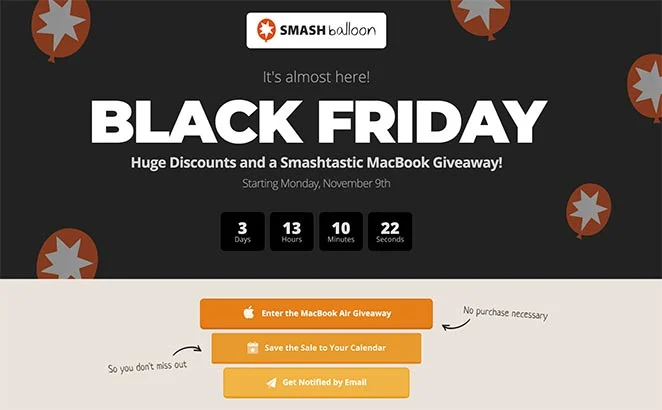
Running a giveaway is a great way to boost your website traffic, grow your email list, increase your social media following, and more.
This Black Friday sale and giveaway landing page from Smash Balloon features a countdown timer. Using a countdown timer on your landing page builds excitement and lets visitors know when to return to your site.
Takeaways from this Landing Page:
- Headline – Prominent headline to grab attention.
- Countdown Timer – A countdown timer builds excitement and creates a sense of urgency.
- Notifications – Notification opt-ins like adding the sale to a calendar or getting an email encourages users to return to the site.
- Giveaway Widget – A giveaway widget from RafflePress lets users get extra giveaway entries for performing specific actions like signing up for your email list, visiting a page on your site, or following you on social media. This is a great way to boost engagement on your blog.
17. SeedProd – Thank You Landing Page

A thank you page is typically shown after a user has performed a specific action on your website like providing their email address in exchange for a free resource.
You can take advantage of thank you landing pages to build relationships with your new leads and convince them to take another action. Like in the example from SeedProd above, social profiles are linked and users are encouraged to visit and follow them.
Takeaways from this Landing Page:
- Simple Design – The design is very simple, putting the focus on what matters.
- Copy – The copy thanks the user for performing the action which strengthens the relationship.
- Social Media Profiles – Adding social media icons let users easily check out their profiles and follow them.
Now, do you want to create your own landing page like these amazing examples?
Here are some tips!
What Makes a Landing Page Effective [Best Practices]?
All successful landing pages have the following elements:
- Headline – A strong headline grabs the attention of visitors instantly.
- Benefit-Driven Copy – The copy on your landing page should demonstrate the benefits of your offer and tell visitors why they should opt-in.
- Easy-to-Read Formatting – Use subheadings, lists, and bullet points to make your copy easier to skim and draw the eye down the page.
- Media – Images and videos make your landing page more engaging to visitors.
- Signup Form – An email optin form, registration form, or contact form lets you collect leads easily.
- Call to Action – Use eye-catching CTA buttons and CTA copy to get visitors to take action.
- Social Proof – Social proof like testimonials and reviews will build trust with potential leads.
- Urgency – Encourage visitors to take action faster by creating a sense of urgency. You can do this with phrases like “limited time offer” or by using countdown timers.
So, how do you pull all of this together if you’re not a designer?
How to Create a Landing Page Design Fast!
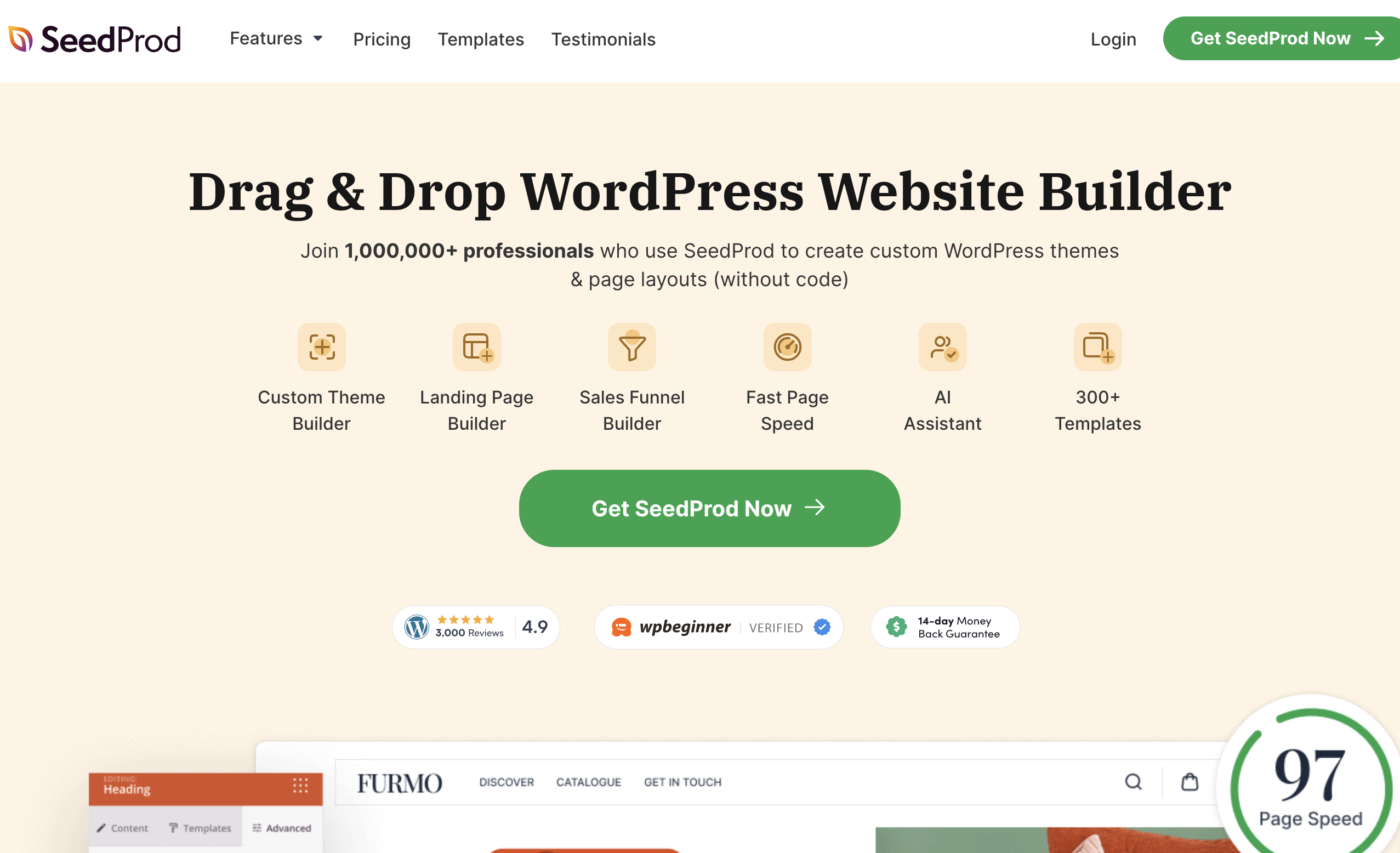
If you’re ready to build your own landing page, we recommend using SeedProd.

SeedProd is the best WordPress plugin to help you create landing pages, quick and easy.
You don’t need design or coding skills to create a high-converting landing page because SeedProd’s drag-and-drop builder makes it super easy. And there are tons of different types of landing pages available with SeedProd.
Simply drag pre-made landing page blocks, such as:
- Email opt-in forms,
- Contact forms,
- Countdown timers,
- Headlines,
- CTAs,
- Social profiles,
- And more,
And drop them in as you wish to optimize your landing pages.
SeedProd even offers a ton of professionally designed landing page templates (and over 300 templates in general), so you can start generating leads in no time!

With SeedProd, you can have a landing page that’s just as high-converting as the examples in this list.
Great Landing Page Design Examples in Closing
We hope these amazing landing page examples inspired you to create your own. What’s your favorite landing page? Let us know in the comments below.
If you liked this article, check out our post on the best contact us pages on the web as well.
And don’t forget to sign up to our email newsletter so you can get useful content like this sent right to your inbox!