 One of the beautiful things about running your blog on a self-hosted WordPress setup is that you have complete control over its design and functionality. If you can think it, it’s probably possible.
Last month I decided to make a few changes to my WordPress theme in order to see if I could improve the reader experience at the same time as improving (or at least not hurting!) signup rates.
Today’s post goes over those tweaks and outlines a few lessons that I thought you might find interesting for you own blog’s design and operation.
Shall we take a look?
Changing your blog’s design can be scary!
I wanted to start this post with a little confession: I was super scared about making these changes to the Blog Tyrant theme.
When something is working it is often tempting to kind of sit back and just let it do its thing.
Before tweaking the design we were making a decent affiliate income around the blog, good email sign ups, and was getting some very nice traffic from Google each month.
Unfortunately, sometimes when you make changes to a blog you can unknowingly affect all of those things.
In the end, however, I decided that it was important for me to keep testing. Unless you test out your ideas you’ll never know whether they will work or not. And given that so much of this blog is about online experiments, I decided to give it a crack.
So, we made a backup of the blog before all the changes and decided that we’d just whack it back up if things went awry.
By the way, you can easily make changes like this yourself with a WordPress page builder plugin.
An explanation of what’s changed
Alright, let’s have a look at some of the changes that we made and then after I’ll go into some details about the results that we’ve been seeing.
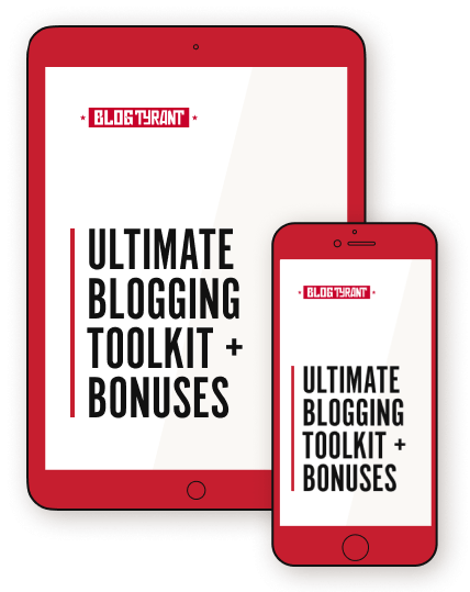
1. Re-designed the free eBook cover
The first step was to modernize the cover of the free eBook that I giveaway to everyone who is kind enough to subscribe to my mailing list.
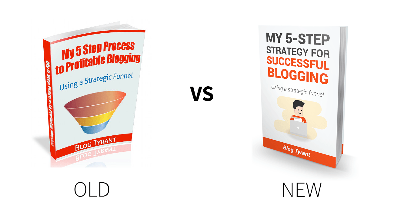
The old one seemed kind of gimmicky and I wanted to incorporate the new little Blog Tyrant character that I have been using around the site lately as an exercise in brand development. He’s had some nice feedback and I’ve wondered whether the cartoon is more approachable. I found a good designer on Fiverr and we went from there.
2. Updated site-wide footer
The second major change I made was to design a site-wide footer that has the sole purpose of leading people to this simple mailing list landing page.
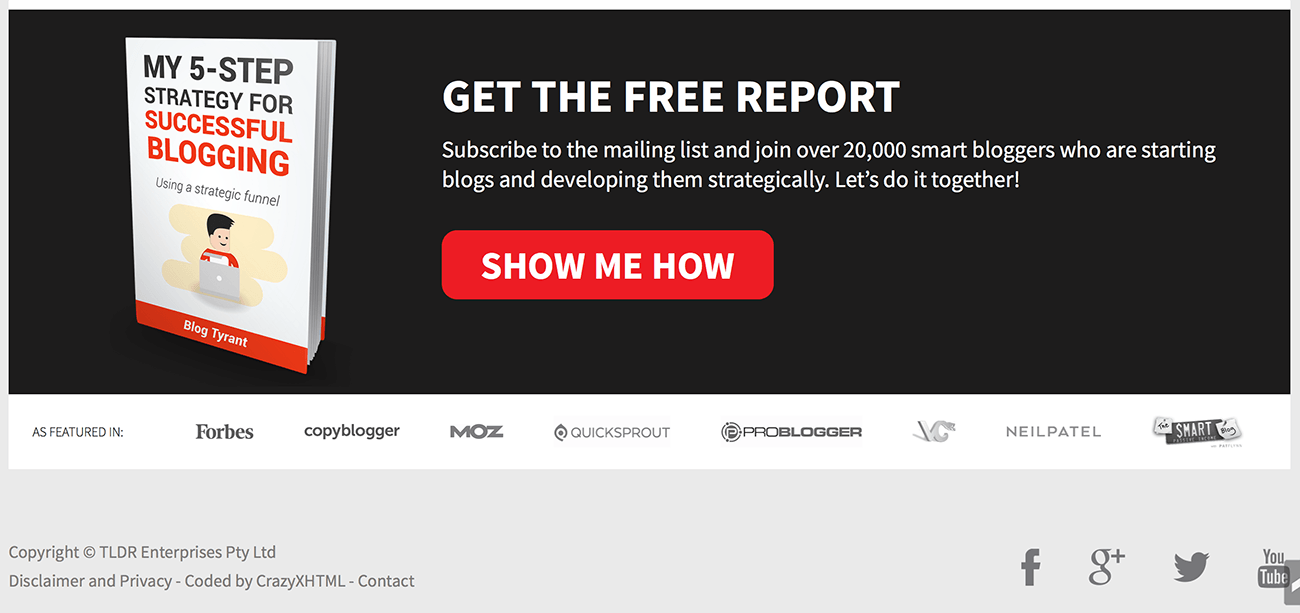
I kept the text simple, and utilized a big red button in the hope of making it eye-catching. I also added a row of logos along the bottom of the site as social proof – a technique to help reduce fear in the mind of people who are thinking about signing up.
3. Updated the header toolbar
This was a major change to the layout of the blog, especially for mobile users, but was done with the goal of pushing more content up above the fold in order to improve user experience. I also scrapped the old HelloBar-style promotion that I was running in favor of a new right hand side button.
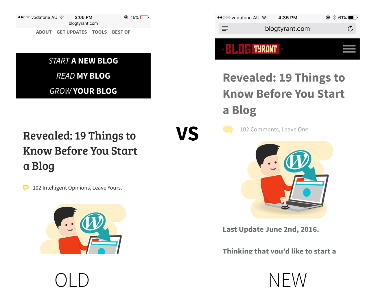
I couldn’t exactly match up the old and new mobile screenshots as their was an iOS update in between. But, as you can see, the old responsive design was pushing so much content down below the fold in the name of having a bigger logo and the menu instantly present. The logo isn’t even showing, I’ve scrolled past it.
The new design shrinks the logo and puts the menu neatly behind a standard drop-down menu which is now pretty much identifiable by most mobile users. I’ve also “hidden” the HelloBar promo for mobile users so that it doesn’t follow them around and take up screen space.
4. Scrapped the sidebar in favor of a single-column post design
This was the change that worried me the most. I won’t include a screenshot comparison because you’ll be able to see the change directly as you read this post.
What I noticed is that the sidebar really wasn’t doing much for conversions. The sidebar opt-in form performed pretty poorly, and the sidebar links were not a popular way to navigate around the blog. I really like the way Medium and some others are keeping the focus solely on the content and decided to do the same.
That being said, I had two major concerns. Firstly, I had my photo in the sidebar previously and I wondered whether removing it would take away some element of trust/human contact that it provided. Secondly, would removing all of the sidebar links have a negative impact on my SEO results as it would represent a loss of links. I’ll talk about more of that below.
5. Updated the “Best Of” page to be more interactive
Previously the “Best Of” page was called “Popular Posts” and it was just a list of links. It’s now a mosaic-style responsive design that has a selection of articles that I want to display.
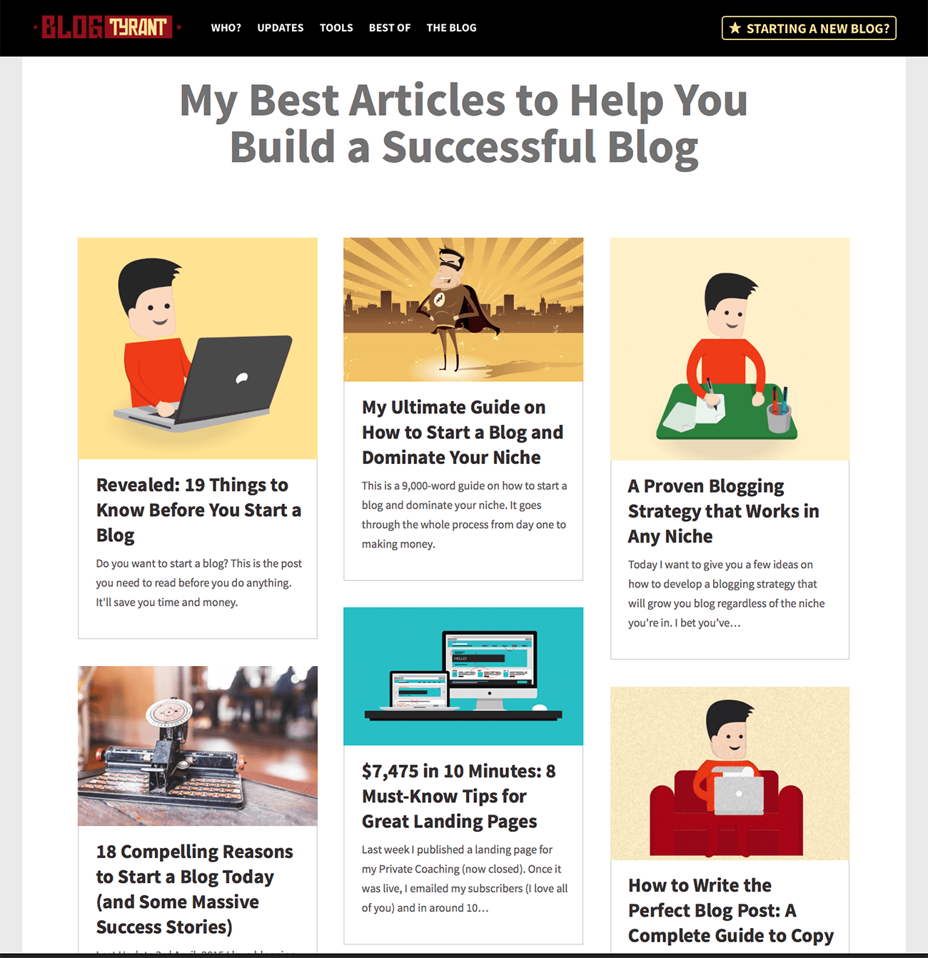
I’ve always tried to use my theme design to funnel people to areas of the site that I want them to see and I decided to follow through with that goal on this page. The page now visually represents the brand more, and each article is one that I want people to encounter without leaving it too much to chance.
What effect have these changes had?
Let’s take a look at how these design changes have impact on various things around the blog.
Increase in landing page conversions
Firstly, conversion rate for the mailing list landing page increased significantly by simply updating the eBook cover and lifting more content up above the fold:
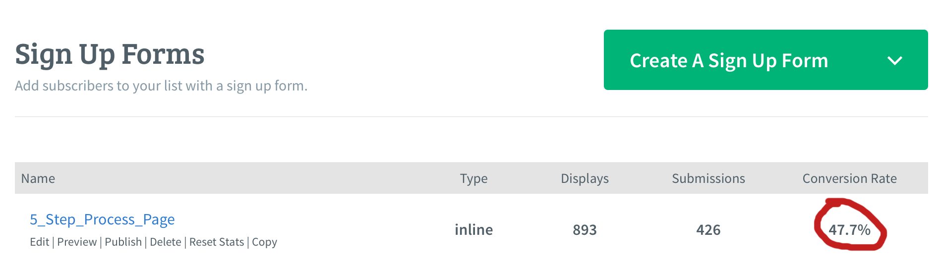
As you can see, nearly 50% of people who visit the page sign up for the mailing list. Although this number alone doesn’t give insight into site-wide conversions, I am pretty happy with that number for an individual landing page.
Increase in homepage opt-ins
Similarly, the homepage opt-in form has increased from 2.6% to 4.2% without making any changes other than pushing it above the fold by about 500px by removing the old header and swapping it for the new one.

I know other people get a lot bigger conversions with their homepages but I’m pretty happy with this increase, and the opt-ins seem to be of a high quality (they don’t just sign up and then unsubscribe).
Possible minor increase in Google traffic
In terms of Google rankings, it’s a little bit early to tell whether it’s had a positive effect. As mentioned last week, there are a lot of seasonal changes going on with Google traffic, and there has also been a bit of an algorithm update reportedly in play.
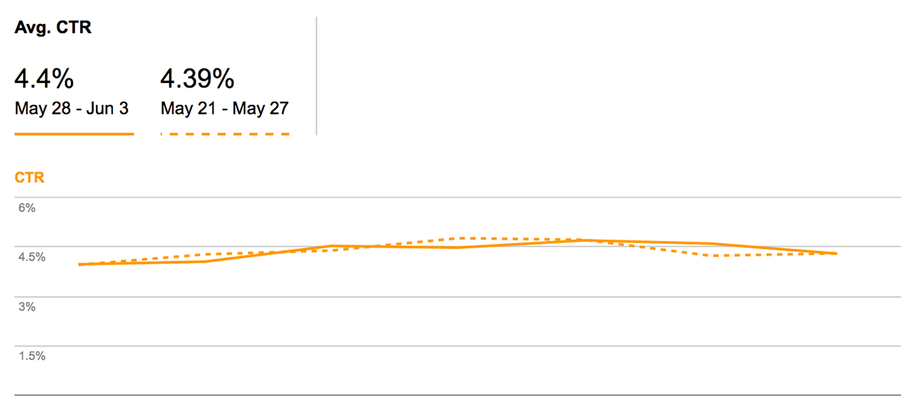
I had a look at a lot of different areas in my Google Webmaster Tools and most are either consistent or slightly better. As you can see above, the change is minimal but I’ll be keeping a close eye on it to see whether things change.
Increase in site-wide earnings
In terms of earnings, I’m not comfortable sharing the numbers and stats individually but we seem to be up around 1.5% from the same period of time before the changes were made. This is quite positive due to the seasonal changes that I mentioned before.
Some lessons from tweaking the blog’s design
I thought I’d end this post by bringing up a few points that might be important to remember if you plan on tweaking your blog’s design at all:
- Host your own website
I know I say this a lot but you really are so limited by what you can achieve if you are working on a free blog. By hosting your own site you can add or build your own plugins and scripts, edit your theme or even build your own. BlueHost has a $2.95 special for Blog Tyrant readers if you want to get started. Learn how to set-up WordPress in our how to install WordPress guide. - Make your readers happy
The main thing I wanted to get back to with this design was focusing on user experience. I wanted to remove the clutter so that the site is easier to read, and make the flow of the site more simple. It seems as though it’s having an effect on conversions even at this early stage, so I’m hoping to keep figure out ways to simplify the experience for those who area reading (which is what the site is about). - Make mobile a priority
We have to start thinking about the mobile experience beyond it being just a secondary thing to desktop. Google is now weighting searches differently for sites that do mobile well, and as more people become comfortable shopping online we’ll see a dramatic rise in the importance of good responsive design. - Conventional wisdom doesn’t always apply
It’s vital to remember that the marketing truths that you hear about blog design and conversions don’t apply across the board. It’s good to measure your stats because you might change something based on conventional wisdom only to find that it has a poor effect in your niche. - Work with someone good
Don’t try and make all these changes yourself. It takes too long and you often end up making mistakes that set you back hours. Find a good designer and/or developer who you trust and can work with in the long term. You’ll find one recommendation in my footer. - Copy stuff
It’s okay to copy ideas from other blogs that are doing well. Take a look at the other blogs in your niche and see what they are doing and if there is any way that you can improve on what they are doing. When you do this, of course, keep the point about conventional wisdom and testing in mind.
What changes have you made to your blog design?
Have you ever made any significant changes to your blog’s design that led to an increase (or decrease) in sign ups? I’d be really interested to learn what you changed specifically and what other areas of your stats or website it affected.
Please leave a comment below and let me know.
Now I’m inspired 🙂
thanks
Glad you enjoyed it, Jack!
Really interesting ideas. I would be petrified to jetison my sidebar, but will consider it. Also the footer idea is very tempting as well. Thanks, as always, for the great input. And love the new design!
Yeah, I’m still unsure about the sidebar. Thank you.
I’ve been toying with the idea of no sidebar and focusing on the simplicity of the content for my blog, but am scared to make the change as well. I’ve already freed my sidebar up, but now just have to take that extra leap!
I love that you’re still experimenting even when you are well established… that takes more guts because you’ve got something to lose. But looks like it turned out for the best!
Hi Yolanda.
Thanks for the comment. Did you have a personal reason for ditching your sidebar?
I like that the focus is on the content, and I feel like the sidebar is really just there to distract readers. I’m still not sold though – my sidebar still exists for now.
Now I want to bring mine back! Ha.
I think it’s kind of okay if it’s not sticky and just has a couple of things at the top, like what I remember yours was. That said, I currently have a sticky ad in my sidebar, so I’m a bit of hypocrite!
Just keep experimenting 🙂
Like the new header; much cleaner. I am viewing from my phone and much improved.
Thanks Stephen. Really appreciate the feedback.
Hey Ramsay,
Great content.
Past 4-5 days, I too changed my blog theme from hemingway to MH magazine. Would like to know how to change my existing theme? Does it need knowledge of html….?
Cheers
Yeah, generally you need to know a little bit of coding in order to really change major aspects of WordPress. Some themes have drag and drop functionality, but I’m not sure about your specifically.
Thanks for your quick response…
Great!!!
I’m also on my way to start my own blog. I have already designed it. But I think it’s Mobile Version should be better.
So I need to change the design.
Which theme should I use?
And which Backup Tool do you recommend?
Thanks again.
Hi Subhabrata.
Choosing a theme is pretty tricky – really depends on what you want to get out of your blog. The default theme is quite good, but you might also want to check out something like StudioPress as they have excellent options.
As for backups, my server admin has built a script to do weekly backups and store them separately so I do it straight out of the server. There are lots of plugins that can help though.
Good luck!
Thanks for your quick response.
I’m proud to be a regular reader of your blog.
I simply love it.
Thanks so much.
If you get rid of the sidebar altogether, how do toy promote your email list giveaway?
I love writing posts knowing they’re full width And this is the only thing stopping me.
Hey Simon.
My major email list promotions are an exit popup, footer box and the “updates” option in the toolbar.
Your responses are always lightening fast. Very impressive!
Your site and content is brilliant. I’ve just become a loyal subscriber : )
Really appreciate it!
Site looks really great and I dig the way the logo pops on the black menu. I’ve also been flirting with ditching the sidebar – why is this so freeking scary?!? ~90% of blog visitors are on mobile now and thus they likely don’t even see the sidebar so functionally it IS gone in terms of the experience of most users. It’s good to see that you didn’t get a Google penalty from the change. Maybe this will nudge me a few steps farther in that direction 😛
Probably too early to tell about the Google thing, but I think it will be okay. Are you really on 90% mobile readers? That’s huge.
Hey Ramsay,
To me, it’s a success. I admire your effort put in here.
Hooking your blog users up has a lot that must come into play. And an ideal move is to start with a good first impression. A poor design will of course end up either driving people away or slowing down your rates.
The first one, I must say was a neat design, but this new move makes it clearer.
I’ve learned few things in here for application. Thanks.
Francis
Thanks, Francis. Appreciate the feedback.
Ramsay, great article and it actually explains the real-life feedback and experience that you went through, massively helpful for the new and intermediate bloggers.
The topic close to my heart is the sidebar vs no-sidebar.
I started with no-sidebar, then put it back on. After careful consideration and just like you that I liked the medium-style, I have taken the sidebar OFF now again. I think I will settle with no-sidebar now. Great to know that I am not alone :)).
I enjoy reading your articles, this one is going to be shared with my little community as well.
Cheers
Let me know what results you get without the sidebar. I’d be interested to know.
I’m in process on a site redesign and I’m also worried. I need to remember that with a back up of the site as it is, I can always go back, so I need to bite the bullet and sign off on changes. (And because it never rains, it pours, we’re also in the middle of a downsizing living space move.) You’re eons ahead of me in everything blog/web- related (I’m an old dog learning new tricks), but I’m committed to trying to improve. One question: While the new side bar free pages work well for reading on hand held mobile devices, I find it difficult to quickly scan/read the way I’m accustomed to when the text is spread across the entire page width on a lap top/desk top computer. I know I could reduce the page width on the screen, but then the print is too small without further adjustment. I think my compromise will be to do page width content on landing pages which will have tile links like yours does, but individual blog post pages will have side bars. Do you think this a ridiculous approach?
PS: What plug in do you use for your “Email me ONLY if someone replies to MY comment” drop down. I love it!
Hi Suzanne.
Your gut feeling about the width of the content area is correct – studies have shown that people don’t read well when it’s past a certain width, although I can’t remember the actual dimensions. That’s why I kept my content width the same as if there was a sidebar. Take a look at all the single-column blogs (like Medium) and they do the same. It’s easy to code it like this though.
The plugin is called: Send email only on Reply to My Comment
I’ve been looking into different programs for a footer opt-in as well has a hello bar. I’m just not sure if investing the monthly fees for this is the thing to do. Ditching the sidebar may be the way to go. I agree with everyone that making changes is scary. Thanks Ramsay for always keeping me on my toes and for all your great ideas.
Hi Beth. People report really good results with programs like Sumo Me for that purpose.
I’m wondering about your no sidebar thing — is that better for mobile? (Now that I think of it… what happens to my sidebar when I view my site on my mobile device… hmm.)
I really like your new design!
How did you figure out who you would trust to do the redesign? I once had an absolutely god awful experience with someone who came recommended and who I met at a blogging conference. Worst part is — there’s people who can design (make things look pretty) and people who can code (make it work), and she could do neither. And I spent a couple thousand for the privilege of having my site F-ed up and then a couple thousand more to fix it.
All to say I’m gun shy. But I know I need to do a redesign soon.
Hey Tracy.
I did the design myself and had it coded by my regular coding guy from the company in my footer. I highly recommend them – in 10+ years of online business I haven’t found a better WordPress group at that price range.
Good luck!
That’s super impressive that you designed the site yourself. Thanks for the recommendation. I’ll check them out.
[ Smiles ] I love your new layout.
Scrapping your sidebar gave your blog a very clean look.
I gave up my sidebar approximately one and a half months ago; as a result of that, it loads faster.
Ah good point, I hadn’t even thought about load times!
My lead magnet used to be TWO ebooks. I always figured two detailed ebooks would be best. Then I changed it up, for a test, to a checklist. The checklist has worked out, in the long run, to pull so many more daily subscribers.
Why do you think that is? Simpler message?
Exactly. I think any time you are teaching people who are new to a field, they want something they can re-use. Much like a “20 things to do before releasing your next blog post.” Once they use it over and over only then does it become second nature.
Thanks for sharing your results. I am kind of a blog theme junkie and have changed my look way too much. I really like the single column look, but went back to two columns thinking I needed that ‘stuff’ in my sidebar. I don’t have enough blog traffic to even compare before and after stats and decipher what works best, so I’m glad you shared yours.
Glad you enjoyed it, Pat.
Hi Ramsay,
I’ve been curious about the changes since you’ve started tweaking all the tiny elements.
Your photo on the couch, the e-book cover, the section at the end of the posts (I liked the previous one which said “I put a lot of hard work in my posts…”), and the others.
Each time my immediate reaction was “Oh Ramsay changed xyz this time. It looks cool!”
Among all the bloggers I know, you’re most keen about details; kind of sharp perfectionist.
I would love to dive into details just the way you do!
We’ve been experimenting with some visual details on our coming soon page recently before starting out.
🙂
Hey buddy. Thanks for the feedback. Nice to see you around here.
I’m happy to receive such a feedback about the new design of your blog.
As you know, I really enjoy reading your articles because I always learn something valuable.
Yet, I’m surprised how much work you do with your blog. Today, I was trying to conclude my last article of about 4500 words, and I failed to finish it. Writing good articles is really a full time job!
I hope I will be able to delegate some work later, but my incomes are to small for now. Almost microscopic… So, your example is very important for me, and certainly for most of your readers.
Keep up your good work for our best. Thank you Ramsay!
Yeah good articles take a long time. Usually it’s worth it, though!
Hi Ramsay,
Is your mobile site separate to your desktop site?
Or is it just responsive site and you made some additional changes to the menu bar etc for mobile?
I asked a dev to tweak how my site appears on mobile (it’s responsive theme) but he said he can only make a separate mobile site as a subdomain, rather than tweak a responsive site.
Wondering what you knew about any of that.
Thanks
Joe
Hey Joe. That sounds like incorrect advice from the developer to me, but your theme may be different. You can generally use CSS settings to make mobile stuff appear differently. For example, you might have a line of code that changes a certain button or removes it entirely when the screen size is less than or equal to 500pixels.
Hi Ramsay, I found you when I changed to self hosted, and now that I’m considering format changes, you popped right up.
If others don’t see how you’re tuned into blogging, they will. You’re like a fortune teller in reverse. We think it, you do it, we get the courage to continue. Not a bad deal.
Thanks, David
That means a lot, David. Thank you. Feel free to email about any specific things you might like covered on the blog. I’m always open to it.
This is really interesting Ramsay
I took my sidebar away for a month and optins went down by 20%. I expected my high converting content upgrades to pick up the slack because there weren’t any sidebar distractions – but that didn’t happen so I put the sidebar back.
However, looking at it more closely I think that A. My content wasn’t engaging enough (that hurts!), and B. The content upgrades weren’t specific/relevant enough
So…
I’m now working on improving both these issues before doing a second ‘no sidebar’ experiment, and I’ll see where that takes me. I think the added content focus of ditching the sidebar makes more sense for increased sign ups – but it also exposes your content to increased scrutiny (if that makes sense!).
Cheers!
Loz
What other opt-in options did you have available to people when the sidebar was gone?
I had an exit pop, and also tried a Hello bar style drop down at the top. The most success I’ve had has been with clickthrough graphic CTAs that lead to a landing page 🙂
Very impressive site. I did like your sidebar though. Well, that’s another matter. Your site is easier to read and navigate. I do know my site needs some change but sometimes I just don’t know where to start. I will get there someday soon! Again, thanks for the share. As always I do appreciate your knowledge.
Thanks for commenting.
Fun to see and hear about your changes Ramsay! I recently started making a few of my blog posts the full width (no sidebar like this). My site (thefoxandshe.com) is very image heavy, so I figured that would allow the pictures to be viewed better. One thing I always wonder/struggle with is how to deal with the copy… Is it better to have it split up between images or all at the bottom underneath the images? And, does the full width column make it harder for readers to actually read? I never know! Would love any insight you have! Thanks again for sharing! Love the new footer!
Hey Blair.
Single column design on your site looks lovely to me. And I think breaking up images with text is a really good idea. The only thing I’d maybe consider changing is the font weight – it’s a bit bold for me and I think switching to something cleaner might add to the brand a bit. Check out something like Source Sans Pro Light on Google fonts: https://www.google.com/fonts
Thanks Ramsay!! I’ll look into the font, in the meantime, I’ve made the weight lighter which makes the links pop — I appreciate the suggestion!
Blair
Hi, Ramsay,
It’s amazing what little changes can do for a site isn’t it? I love the changes you’ve made, but I especially love how you’ve tracked everything and documented the specific effects. I recently changed up my site a bit to make it easier for readers to find how they can work with me, and it’s been working wonderfully but I do wish I’d paid more attention to the numbers right after I made the change.
Thanks,
Sue
What has had the biggest impact on your site, Sue?
Inspiring post, thanks Ramsay. Good timing, too, as I’m trying to figure out what to do with mine.
I’m doing some wireframing but I’m a bit torn between focusing on what most users are there for (eg. finding a hike to do, or looking to learn about hiking) and my own objectives (eg. list signups, selling hiking tours and the book I’m about to publish, etc.).
Do you think it’s a bad idea to have multiple CTAs above the fold on the homepage? Any suggestions on where to focus that part of my design?
I reckon sticking to one message is a really good idea. Get people on the mailing list and then later on you can hopefully introduce more products or offers.
Love it! I think you did a great job keeping it familiar for people who know you and accessible for those who are new. I also like the way you have the big opt-in at the bottom. A lot of people do that up top, which is fine, but you know that if someone has made it to the bottom, they’re more likely to be more engaged as a reader anyway. Perfect. 🙂
Thanks mate!
Hi Ramsay,
As I can that it is obviously, the old design is not good as a new design. I have kept an eye even on the single and small element . Which in return has helped you a lot.
Appreciate it!
[…] increased his conversion rate when he removed the sidebar from his site. Ramsay at Blog Tyrant also recently ditched the sidebar when redesigning his […]
Hi Ramsay
Love your new design and the changes you decided to implement. I like to tinker with my blog and have done a number of the things you mention here. The biggest one I’ve enjoyed is the removal of the sidebar.
Taking the sidebar away was a big change but something I wanted to do to make my site much more cleaner and focus the reader on the content itself. So far, it’s been performing well.
Thanks again for sharing your findings. Good stuff!
– Jeff
Glad to hear the sidebar-free design has worked for you!
Great advice! I started my blog a few months ago, and plan on switching to WordPress, and also updating my theme. With a more customizable and user-friendly website, I believe my stats with greatly increase! Thank you for the useful tips, as always!
Thanks a lot for posting this. Especially taking away the sidebar decision has boosted my confidence as I have always found sidebars to be disturbing. I think a lot of online news portals need to realize the importance of letting the reader focus on content. Sidebars hamper with the page’s responsiveness such that I have either left reading the article halfway or preferred another site. However, although this will need experimenting, can removing sidebars have a negative effect as well? If yes, can you kindly explain how? Or maybe another blog about this might help. I hope I am not overemphasizing on this detail.
That is something amazing. I’m about to start with Email marketing, so these tips and placement of form definitely going to help me to get good conversion. Thank you so much!
Keep the great work up!
Dude new design looks great! It’s modern, design elements blend together nicely, the footer is amazing!
Single column and no sidebar is the thing most site owners freak about. But even with all of your worries considered, stats will tell over time that it’s the best decision (especially for sites where content is evergreen, long-form, and educational).
Like the book cover as well- efforts in branding are starting to show, and the brand Blog Tyrant is already having an image that comes to mind.
Made me think about sitting down with my partner and going over some of design solutions we implemented years ago… Maybe it’s time to test.
Hey Ramsay,
I’ve been following your awesome blog for almost a year now and I have to admit you keep writing awesome stuff.
I’ve recently implemented some of your advice on my website and the results have been great, 3x more people are joining the list.
I just wanted to take my time to thank you for all the great information you are giving and that it is highly appreciated.
I was just wondering which fiverr offer you use for your character?
Anyways, have an awesome day and keep inspiring people around the world.
This new design is really wonderful. In past few years I have realized that sticking to a single theme is very difficult and thus I have switched to many themes. But did not realize much that changing the design could improve email signups. Thanks for sharing this wonderful experience here.
Hi Ramsay,
Just Love the Blog…!!!
Really Nice Blog with some really nice info, it was nice to see these kind of collections.
I have started a Fashion related site which translates today’s influences into tomorrow’s fashion, so can you suggest some useful points so that i can improve those particular points only, to gain some quality traffic.
Thanks
Personally I think the brown on black in your header sucks.
I hate brown.
Hi Paul. It’s red but thanks for the feedback.
Hi Ramsey, after recently setting up a new website I ran into the same dilemma over design and functionality, hopefully now mostly solved. As you stated a sites Mobile friendliness seems to be such an important factor now with Google penalising those which are not optimised for mobile users. I think this is probably one of the most important areas to focus on when looking at website design. Just thought I would chip in my 2 pennies worth 🙂
Thanks for stopping by!
Hey Ramsay! Thanks for posting this. It proves how little changes can bring you more results for whatever business you decide to run. Also very nice to see that by changing the e-cover of your lead magnet, you go a better opt-in rate. Salute!
Thanks Billy!
Is there a plugin for making blogs more mobile friendly? Or is it just part of word press updates? I love the interface and the design, you’ve really outdone yourself Ramsay! But my humble blog doesn’t look this user friendly or aesthetically pleasing via smartphone.
Hi Jeevan. You’ll want to find yourself something called a “mobile responsive” WordPress theme. This is a theme/template that is designed to alter automatically based on the screen size of the viewer. That’s the best way to ensure mobile readers are taken care of. Hope that helps.
Hi Ramsay,
I love this post because it shows that it can pay off if you pay attention to the experience of the users instead of just your own goals. I think too many blogs are starting to fall dangerously into that zone of not being readable due to all of the clutter and popups in their design.
I guess it can be easy to get too caught up in the “grow your email list” craziness that you lose sight of the fact that your readers need to be able to read your content first before you convert them.
I’ve foregone the sidebar and any type of social sharing links when someone is reading my content and created a dedicated sharing section under the content. While my site is still young, the bounce rate is hovering around 40% and user sessions are averaging 4+ minutes meaning people don’t mind being on the site.
That’s a good feeling. Glad to see the redesign is working out for you.
Yeah really good point. Some websites are going mental with all their pop ups. Glad to hear your strategy is working.
My blog is new. The first major change will be to do a custom theme. The moment that is done, them will come to here to share with you few results that I am getting. The article inspired me alot.
Custom theme is a big step. Don’t spend too much time on it.
Hey Ramsay,
The design looks much more awesome now that you have removed the sidebar. It helps us read the content better without any distractions.
Keep up the good work.
Thanks you, James. Really appreciate it.
I totally agree with you on self- hosting a website as it gives more control over our website. The thing in increasing signup rate is AB testing.
You need to AB test many elements of your website to know which one is converting better.
AB testing is profitable for blogs who have a good amount of traffic but for new bloggers, they should focus on traffic first.
What do you say Ramsay about this?
By the way, very detailed case study. Thanks for this.
I don’t think it’s ever too early to start testing, as long as it doesn’t take away from your main business which is producing content, etc.
[…] Source link […]
Ramsay,
This is some good stuff here. I totally agree with your article. I’m always testing things with my blog and that makes me move things around alot.
Your article just gave me a couple of ideas. Thanks for sharing these and congratulations on the amazing results.
Babs.
Hope it helps!
Hi blogtyrant,
i just found out your blog and i’m looking for some solid seo tips which i found out in your post “SEO for Idiots” i have started to follow mentioned steps, and i hope to see some results soon.
Thanks,
Have a good day 🙂
Glad you enjoyed it!
Removing the sidebar was a brave move . Well-done it will be interesting to see how your traffic changes if any.
Have you considered adding your opt in form inside your posts? i know back in the day you had it at the bottom of every post.
Yeah, it’s still there at the bottom, it’s just a button now. Seems to be working quite well in conjunction with the pop up.
Hi Ramsay,
Thanks for sharing your another success story.
I myself want to change the design of my blog but I also have a fear in mind that I may hurt my ranking in SERP or may lower the conversion rate of my affiliate sales.
Have you noticed any change in these two areas after changing your design.
Both are up at this stage. Might be too early to tell, though.
Great transformation on the e-book cover … it looks less MLM-like and more trustworthy!
Thanks! Glad you think so.
The new blog looks great Ramsay,
Not only does it look better, but it has increased your conversion rates my a large margin! This is why the design and layout of a website is so key.
Benja
This is my first time on your blog Ramsay.
I must confess that I’m impressed by the design and the great contents you’ve got here.
I have a question about your the series of logo you have at your footer. Logos like Copyblogger, Forbes, MOZ, Problogger, etc.
Do you really need to have contents on their websites before putting their logo on your websites or not?
Yes, while waiting for him to get back to you, I think you do.
You must have content on their sites before you do this.
Hope this helps.
Hey Ramsay,
First of all great design after changes.
read your details explanation about changes and how you can get the double sign-up strategy its really impressive. this is very useful for newbie blogger. i will share your post in my network and friends may be they will be happy to read this valuable article.
With these statistics, even half a serving is not healthy at all.
It is also easier for the doctor to detect any suspicious swellings,
because the tissue is soft. How many cups in a bowl of soup
If you desire a varifocal or longer focal length lens, you could be out of luck.
In fact, it has become known of these blurred images to end in incorrect registration numbers being identified, with 609 seeming for being 607 about the screen, by way of example.
Cctv mic Owing to terror threats, having CCTV in your house and
at offices has now end up being the need from the hour.
BY definition, Closed-circuit television known as CCTV uses surveillance cameras to transmit a transmission to a particular place on a restricted set
of monitors. Deciding what is the best CCTV camera to buy is certainly a important decision for
making and there are a great deal of considerations being
aware of.
This communication may take place over licensed frequencies to avoid the leaking of
information or breaking in by other users.
Just learn a amount of websites in connection with these
equipments. Baofeng bf-888s They work when disasters have knocked out other communication methods.
Andrew Wolfe,LMP brings 24 many years of advanced clinical experience and training for the show,
with insight and knowledge surpassing others in his
field. Baofeng uv-82 or uv-5r The electric fence can help your
pet understand its restrictions with your yard or places of containment.
And if you want even more help, search for a media training class or work with a professional publicist.