
One of the first things you do upon starting a new blog is create a navigation bar or menu. But what links should go in there? And, more importantly, do some links outperform others?
I have spent a bit of time playing around with this myself and have been quite surprised at what works and what doesn’t.
It is interesting to note that the “traditional” five links that almost everyone includes up the top actually aren’t always best.
Let’s have a look at what some websites are doing with their navigation bars and what lessons we can take away for our own.
The traditional navigation bar
Since the beginning of websites people have been putting the same five links in the navigation bars: Home, About, Services, News/Blog, Contact.
And that’s fine.
But it’s definitely not perfect.
These days there’s so much more we can be doing with that premium website real estate. It is not longer just a place to navigate around the main sections – it’s a place that can respond to different visitors, change for various platforms, display photos, etc.
We could be a bit more creative.
Some excellent navigation bars from around the web
Let’s start by taking a look at some of the best navigation bars that I could find and then finish off with some ideas, resources and a plan of attack for your own.
1. Airbnb – menu responds to login status and interactions
The first example is from Airbnb which has a great top navigation bar that shows different information based on whether you’re logged in, or whether you’ve made any bookings, saves, etc.
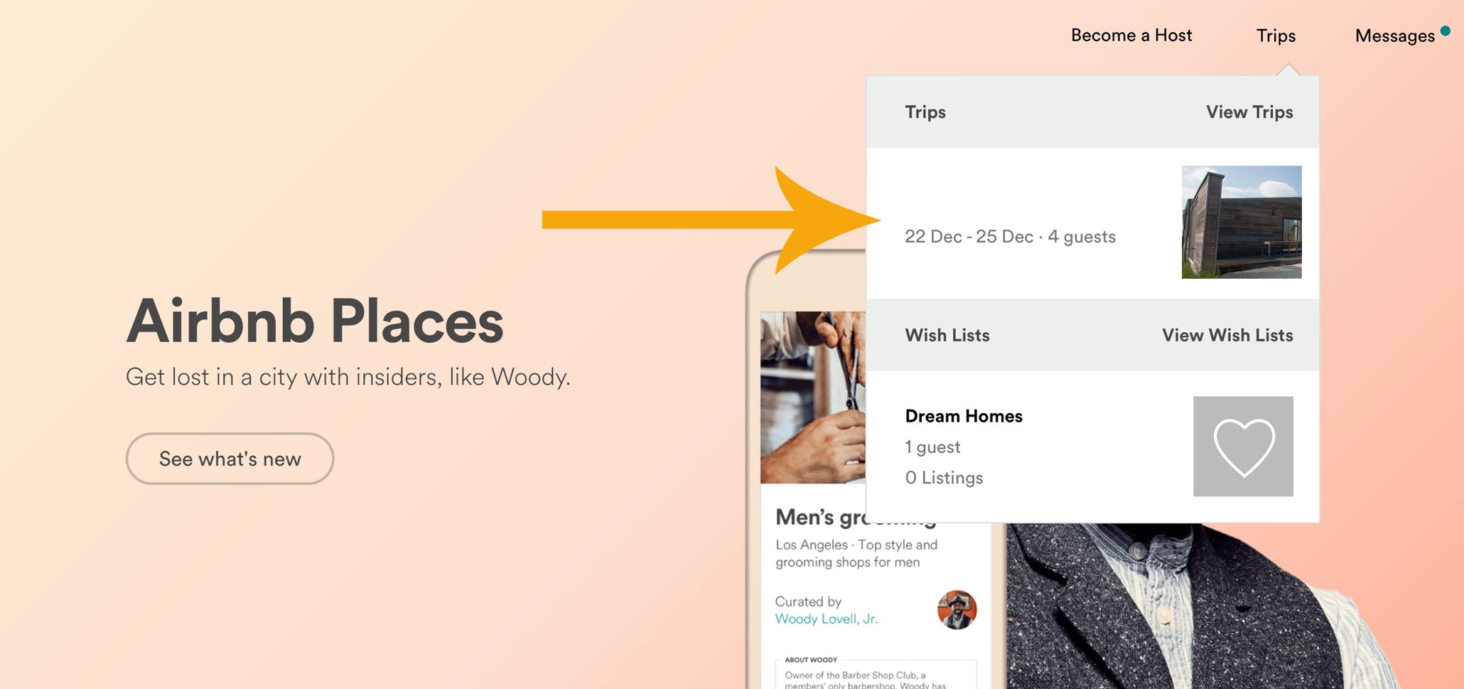
This is a really cool advanced feature that could be implemented in various ways depending on what content you want people to notice most at your website or blog.
For example, you might have a little section in your menu that shows people their saved articles or items they’ve interacted with multiple times. You could even have a section that shows popular articles right now and allows people to vote them up or share them on social media. Maybe there’s a plugin idea in that?
2. Smart Passive Income – animated features
The next example comes from Smart Passive Income where Pat draws attention to his monthly income by using a very neat animated graph that grows as the page loads.

This is a really clever way to highlight one of the most important areas of your website. Pat uses his income reports as a real brand builder and as inspiration for people wanting to make a passive income online, and adding a prominent feature like this would go a long way to drawing readers deeper, promoting other areas of the site, affiliates, etc.
Anyone notice and use the new navigation menu on SPI yet? Been implementing new strategies for better wayfinding based on your feedback.
— Pat Flynn (@PatFlynn) December 9, 2016
The interesting part is, because Pat is Pat, he is constantly testing the performance of his setup. I noticed this tweet about his navigation bar a few days after I started researching and writing this article.
3. Starlight – graphics and branding within the navigation bar
The children’s charity Starlight has really incorporated their branding into their menu well. As you can see, their are beautiful little illustrations that liven up the menu and make it more interesting and engaging.
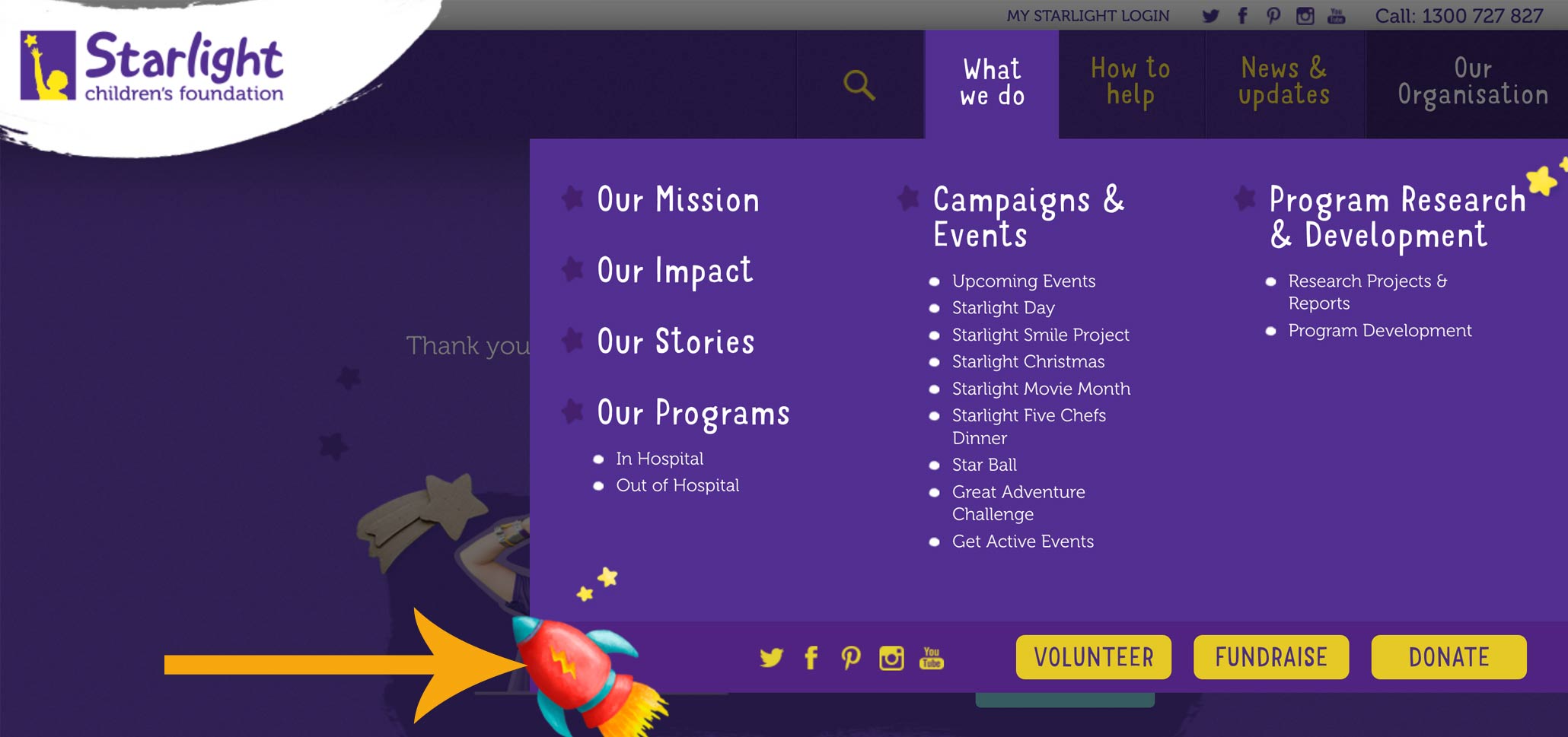
One other feature about this menu that I quite like is how the rest of the website darkens so that the focus remains on the menu itself – sort of like a lightbox. This also helps to draw attention to the three yellow buttons which are perhaps the main items, as opposed to just navigation.
Navigation bars and menus don’t just have to be plain areas. We can incorporate branding and design elements in order to make the site more memorable and distinctive.
4. Treasury of Lives – timeline doubling as a navigation menu
I wanted to include this example because it shows that a navigation bar does not even have to appear as a traditional navigation bar at all. The website Treasury of Lives collects biographies of Himalayan Buddhist teachers and as such it’s useful to show the era that they were around in relation to each other.
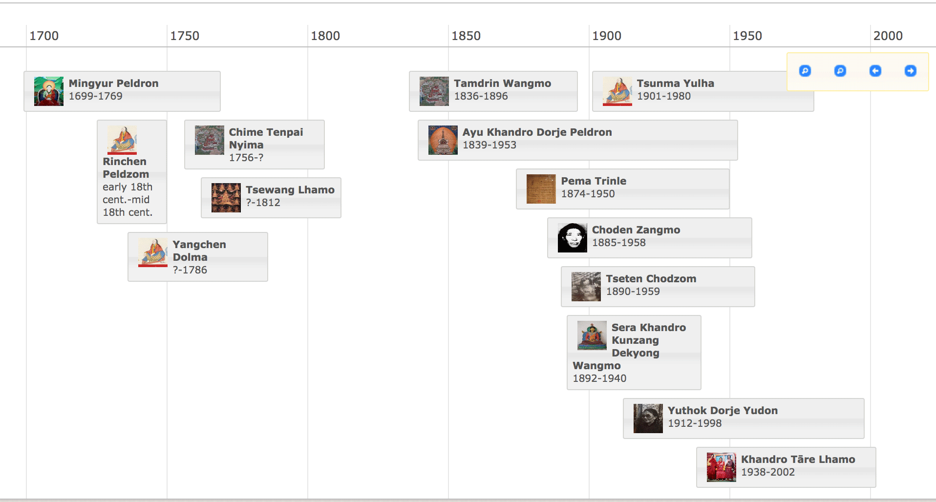
If you visit the site you’ll notice that they do use a traditional navigation bar, but I was thinking about how there would be some cases where it would be very unique to use this type of timeline style to function as the primary way to move around the site.
Of course, you don’t have to have a long history to make use of this format. I was thinking, for example, of doing something similar in terms of a blog’s progression and the stages at which you should install a plugin, add a theme, tweak this, change that, etc.
5. Google Fonts – space-saving menu
Google usually does things pretty well (sorry Google Wave, yuck) and at Google Fonts you get a great example of a menu that saves a lot of space by not really being visible until you decide to interact further with the content.
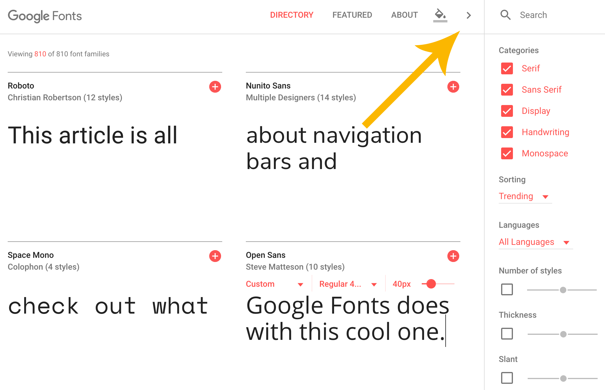
I like this option because it leaves the emphasis on the content itself – especially given that their content on this site is interactive. Having a sidebar that allows you to change the way content is displayed can sometimes be gimmicky (I don’t think changing background colors is that useful), but other times it can be a really good way to enhance what is available (don’t miss my full guide on how to edit your WordPress sidebar).
So, what should I put in my navigation bar?
After all of that you might be wondering about what in the heck to put in your navigation bar!
Well, the good news is that it doesn’t really matter – there are no hard and fast rules.
The bad news is that the only way to find out the ideal combination is to do some testing – and that can take time. Sites like Visual Website Optimizer can help you out.
Being strategic with your choice
One thing you want to do is think carefully about which specific content/page you want visitors to find easily and then build your navigation bar around that, removing everything extra.
Remember, you know your content better than your readers and as such you should help them find the right stuff. That’s part of this blogging strategy.
For example, I’m currently testing a scroll-activated button on the top right that can send people to different pages that I want to target. I’ve even removed things like Contact from my menu and put it in the footer because emails are not a priority for me and take up a lot of time.
Being helpful with your choice
The next thing you might want to consider is how best to serve your readers in the particular niche that you are in.
For example, if you are an online store it might be better to have a huge mega-menu with all the categories, styles of product, shipping options, etc. available so that the entire online shop is accessible within on or two clicks. Etsy is an example of this done well.
With more complicated menus you need to be sure that it still works smoothly on mobile and for users of different screen sizes so as to avoid any confusion. Sometimes a mega-menu on mobile will add a lot of clicks.
Being distinctive with your choice
The last option I want to talk about is the idea of just doing whatever works for your brand and will help it to stand out from the crowd.
If your blog has a short bio of you in the sidebar on every page then maybe you don’t need to link to an About page in the navigation bar. Or, if your logo acts as a home button then don’t take up space with another Home link. Or, if your services is a little bit more complicated than most think about putting a Get Started or Take it for a Spin page.
What is in your navigation bar?
I’ve left this article quite open ended as I genuinely think the best way to determine what goes in a navigation bar is to test it for each individual blog or website that you run and see what works.
That being said, I’d love to know what is in your menu, how you decided on those links, and how they’ve been working out for you. Please leave a comment below and let me know.
Useful post. We have an interesting navigation when you scroll down, what do you think about it? Thanks.
Hi John. I like the icons. There’s a little gap at the top on my screen. Is that meant to be there?
Are you sure there is a gap? If 1px white line, is that just your browser? Or maybe you can show a screenshot so I can fix it
Macbook Pro 15inch + latest Firefox: http://imgur.com/a/QeStg
Ok. There could be a million reasons it is doing that on yours but not mine, but I looked at my code and chose a better solution. Before I was using margin-top: negative pixels. May be a resolution issue.
The much better solution rather than negative pixels, is top: 0;
Now try it, please tell me if it is fixed.
LOL again you deliver content just for me, with near-perfect timing! I am gearing up to launch in Feb (hopefully), and I’ve been thinking about navigation a lot in the last few days…. I have a strong desire to break with tradition, and there’s some good food for though here 🙂
Awesome! Hope it helps!
These are awesome ideas! I love #2 and #3. My navigation bar is sleek and traditional, but I set it apart buy using a conversational tone. Example:
Welcome! | Let Me Introduce Myself. | Hello again! | You deserve it! | Need Resources? | Keep in touch.
After clicking on each page, you’ll find the typical page titles for any needed clarification . (I also published my first post with the guide of your help and gave you a little shout out. Thanks!)
Hey Carmen. FYI your comment was in spam – might be due to the bit.ly web address.
Thanks for the shout out! I’ll have a look.
Thanks for letting me know. Sorry about that.
Back in the day, we called that “mystery meat navigation.” It’s generally recommended that your navigation links be clear and concise. Most of your links don’t tell me what I can expect to find when I click them. Then again, if it ain’t broke…
You’ve given me a lot to think about. I’m definitely a newbie at all of this, and I agree. I’d much rather have a clear website than confused visitors. Thanks for the constructive criticism!
Hi, Ramsay,
I switched things up on my Author Site recently. I don’t really have a navigation bar anymore. However, I have images that are linked with all of my info.
What do you think?
Jennifer
Hi Jennifer.
I like the concept.
I would suggest maybe using some higher quality photos and making them more of a feature. I think you really want to put your best foot forward if that’s the approach you are taking. The images are quite blurry for me on a retina display.
I’d also suggest maybe a font that is in line with your book branding so that everything is consistent across all platforms.
Last thing! For SEO and clarity purposes I really think you need some kind of logo or header explaining where people are.
Hope those suggestions aren’t too unwelcome.
Thanks!
Great input! Thank you so much.
Your advice is always welcome…
Jennifer
Having the same navigation options on every page is a must. If someone lands on anything other than your home page, they won’t have (an easy) way to get to another page.
I was about to sleep when I recieved your email…I thought I should read it now in bed or I’ll forget about it….I completely agree with you that it totally depends on what works for someone…I also noticed animated graph on Pat’s site when I visited it and it was very attention grabbing….why are you not using content upgrades in your posts? Everybody is using them…
Hi Abdullah.
I haven’t found the content upgrades particularly useful for long term conversions and they take a lot of time to put together.
Just add checklists to list posts or your most popular posts…they do not take too much time to create…
Thanks for replying Ramsay..
One of the reasons I keep coming back…you don’t annoy people with useless content upgrades or obnoxious pop-ups and/or push requests.
This is a critical part of any website – I have adopted a deliberately simple approach, using a very plain theme – the menu is a straight text, perhaps I should go for a prettier cooler look! I am considering using a radically different theme, all food for thought. Great post Ramsay!
Hi Michael. Glad you enjoyed it. I would definitely consider removing links from your menu so that it doesn’t go over one line.
Good call, sometimes I become blind to my own development issues! Trimming right now. Thanks Ramsay.
I actually just finished up the navigation bar for my new website so this post comes at a great time.
I went with this: Start Here, Shop, Blog, What I Love, Work With Me
For my brand (teaching mothers how to make money blogging), I think my navigation line up works.
By the way, I LOVE the “WHO?” on your navigation bar. I’ve never seen that before. Very creative! And I’m guessing your “tools” page is your resources page?
Nice choices! Yeah, that Who? page seems to work well.
Hey Ramsey,
My blog is simple but yet convert like crazy.
One thing that you pointed out is having two homepages(logo and text based)
What parts convert like crazy?
There are three pages that convert pretty well.
About | Resource page | Start here.
Cheers!
Ramsay,
It’s a wonderful blog post. Almost two years back, I stopped focusing on Affiliate Marketing and Google Adsense after I added a text-link of ‘Hire Me’…
I was offering my freelance writing service. It turned out to be a life-changing step because it made my blogging strategy upside down. Then, I kept on testing it. I was able to attract the prospects and get customers without worrying about the number of visitors.
I’m glad you talked about this.
Love it! Congratulations.
Another goldmine! How you come up with these rare post ideas, I don’t know but I will tell, this blog pushes me to the limit. Keep up the good work Ramsay!
Thank you. They usually just come out of things I’m working on.
That’s a unique perspective!
If often look at the tiny elements of websites and admire their effectiveness – either in the form of content, site design or ideas – they’re innovative.
Though I think of implementing some of them on my blog, I don’t, as tweaking my blog always turns out to be a messy job.
Sometimes I’ve ruined it by trying to do all random stuff on my own, after which I’m trying to keep it ordinary.
Right now my navigation bar is similar to the one which could’ve existed in the Stone Age. Perhaps, I might be able to do all the cool stuff once I become capable of doing it, till then it’s going on.
As for navigation bars on other sites, I like those which make accessibility easier, like the contact bars on sites such as The Minimalists or Webby Awards – they don’t redirect you somewhere else just to follow or like, which I believe makes it easier to gain more followers.
Or when other elements disappear in a particular instance when you hover the cursor over a certain option – nothing special but it looks cool.
There are lots of other nice things people have experimented with. Aw! I’m unable to recall right now.
I agree about the disappearing elements. I really like Vanity Fair’s website for how they do that in a visually pleasing way but still has a purpose.
Right on time, Ramsay. I’ve been looking at my menu thinking it needs to change. Instead of a black bar between header and content, I’m moving it to a secondary menu on top.
Top is good.
Thanks, man
Let is know how it goes!
Thats unique Ramsay. Keep it up.
Thank you.
Great post, Ramsey! This is something that I haven’t really seen any other blogging experts talk about. The only thing I would add is that your navigation items should be clear and concise. Don’t try to be cute or clever. The last thing you want is your visitors to be confused or leave because they don’t realize that “Hit me up” (for example) is your contact page.
That’s a good point – especially as a lot of readers of English blogs now aren’t native English speakers.
Hi Ramsay,
You have done a nice job in gathering some excellent ideas to tweak the navigation bar. As like most of the bloggers, I too have the traditional one with Contact, About Me, & Categories.
I agree with your viewpoint that we need to add some creativity to attract the huge eyeballs. I like the graphical navigation in smartpassiveincome.
Thanks for the awesome inputs, have a good day!
Hi Ramsay,
Nice share. At least i learn something new, every time I visit your blog.
Thanks fro sharing.
And Happy New year.
Hi Ramsay,
I have been working as a full-time blogger for a long time. I have been a follower you and I have also improved many of the techniques to make a good living out of blogging. I have a long way to go. 2017 will be my year and I have new ideas, which I’m going to implement.
Ramsay wish me luck and thank you for your contribution.