Did you know that you have less than 1.5 seconds to convince a reader to stay on your blog?
Internet traffic is notoriously impatient, and it is getting worse. This means that what you put above the fold is more important than ever.
In fact, it can be the difference between the success and failure of your blog, website or squeeze page.
In this article I am going to show you a few things I am testing in regards to how you can take advantage of impatient traffic by manipulating where stuff appears on your blog.
What does “above the fold” mean?
Above the fold refers to the area of the screen that you see before you scroll down. So, everything you see on your screen when you load a new website is the area above the fold.
Now, the important thing to note here is that the area above the fold is different depending on the screen size of your readers.
This issue is complicated further by the fact that smartphones and tablets now make up a growing proportion of blog readers.
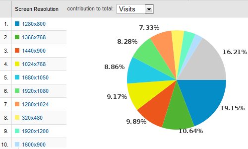
Blog Tyrant’s readers use a huge variety of different screen sizes
The image above is a screenshot (with some clipping to make it fit) from my Google Analytics account that shows the screen resolution of my readers over the last few weeks.
You can find this by going VISITORS > BROWSER CAPABILITIES > SCREEN RESOLUTIONS. As you can see, there is no outright winner. Sure, 1280×800 has the highest percentage but it is by no means a majority.
There also seems to be about 5% mobile phones in there.
I’ll talk more about this issue as we go on into the other areas of the article.
Why optimize? Why are readers so impatient?
The modern web user is massively impulsive, impatient and unforgiving. As I said in the opening paragraph, this phenomena is getting worse.
Why is that? Why are people so impatient and what does this mean for our blogs?
Well for starters, people are getting better and better at using the net. When I was in high school we didn’t have Google, we just had Alta Vista. Kids these days grow up with Twitter and Facebook and Smart Phones and as such they are much better at speeding around looking for information.
The second reason is because people are addicted to information. We need new updates all the time. We need quality entertainment and constant news updates on whatever it is we are interested in. This information overload has caused us to become finely tuned (read: impatient) information gatherers. If something doesn’t look good right away we close the window. Sometimes we don’t even open it.
We need to actively present your content in a way that gets people’s attention and engages them so that they don’t just click off right away.
How to take advantage of impatient traffic
What I want to do now is give you some concrete ways that you can use the area above the fold to make sure that you aren’t losing impatient readers.
1. Put your main call to action up high already
What is the goal of your blog? What are you trying to achieve? That focused and well designed call to action needs to be in a high position on your blog. I have said it many times before. Make sure that email subscription form is the highest thing in your sidebar. Don’t put your categories or your archives up the top. Don’t put someone else’s affiliate program. Put your own stuff there.
It always surprises me as to how afraid people are to promote their own products and eBooks. It doesn’t make any sense at all. Why are you nervous about promoting something that you worked hard on? Why do you want to sabotage something that you know will bring you success? If it is because you don’t want to appear “spammy” or too aggressive then I highly recommend you get over it. No one thinks Mercedes Benz is spamming when they make ads of their incredible new machines. The same goes for your quality product.
2. Get rid of all ads
Yep, I’m putting it out there; saying something that not many bloggers are brave enough to. It is time you got rid of your space-sucking adverts that make you next to no money and take up valuable real estate. Unless you have sold space to a premium advertiser I really think there are better things you can do with that ad position.
Here’s my logic. The top part of your blog or website is so valuable because you have a finite amount of space with which you can capture a new visitor. But as it stands you are selling that space to Google Adsense or some other affiliate for chump change. Wouldn’t it be better to use whatever room you have to convert those people to long term readers? Wouldn’t it be smarter to give someone a chance to become addicted to your content before you sell them out for a few dollars?
3. Keep your main content layout smaller than 1024 pixels
Basic web design standards tell us that all of your main content should be no larger than 1024 pixels wide. Why? Because if you go wider than that you run the risk of isolating people with smaller screens.
Let me give you an example. Let’s say you get your blog redesigned and the main sidebar falls outside the 1024 pixel safe area. In that sidebar is your email subscription offer. What you now have is a situation where about 15% of the population might miss your sign up form. It is a mistake that is totally avoidable.
If you ever get your blog redesigned make sure you specify that the main content area must be no larger than that 1024 zone. It will be another few years before everyone is running a big screen.
4. Keep your branding carefully consistent
Do you know what branding is? I mean really know? Its not a logo. Its not a name. It is much more than that. And you need to make sure that branding is used carefully.
Now, when talking about above the fold optimization you need to think of branding in terms of your whole vibe. What I mean by this is that everything you do reflects upon your branding. Its your colors, your fonts, your language. Its the tone you use in your copy, the way your ads are structured and how you relate to people. And because so many of us link our blog intimately with our persona it means we have to be very careful about creating that brand.
If you muck it up you run the risk of creating an untrustworthy site or confusing your reader. For example, if you create an eBook cover that looks nothing like your site’s colors or logo you might find that your readers think it is an advert for someone else. You need to make sure the branding above the fold it super tight.
5. Give yourself another layer
This point is going to be somewhat controversial because I know a lot of people have strong opinions about pop up windows. But, in all honesty, it is one of the most powerful ways to increase conversions on your website or blog because you are giving yourself a whole new layer with which you can encourage people to sign up.
The interesting part? I have never once had any complaints about my pop up.
If you missed it you can see it again by deleting your browser’s cache and then visiting Blog Tyrant again. It is a carefully designed advert that promoted my free eBook as a way to get people to sign up to the blog. And it has about a 6% to 8% conversion rate. It brings me hundreds of subscribers every month.
6. Make your header smaller
Blog Tyran’t header is actually too big and something I need to sort out. Take a look at the world’s biggest blogs and websites and you will find that the logo doesn’t take up very much room. It might only be 100 pixels high. That’s all you need.
The reason for this is simple: if your logo and header is too big you take away room above the fold that could be showing off your content. Your logo might get people slightly aroused, but it is your amazing content that is going to really turn them on.
Don’t take up too much room with your headers. I know some of you are. I’ve been watching.
What’s the special announcement, jerk?
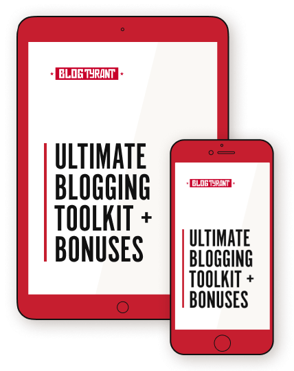
Now I know a lot of you have been having trouble setting up, customizing and tweaking your WordPress themes – especially in the area above the fold. For this reason I have decided to do something to help you out.
In a few days I will be launching the brand new Tyrant Themes website – a site devoted to bringing you free themes that are professionally designed (by me) to help you build a successful blog.
There are a lot of WordPress themes out there. Probably tens of thousands. A lot of them are rubbish. A lot of the free themes come with a bonus set of adult links embedded in your code somewhere. And some of the designs do your business more harm than good.
Enter Tyrant Themes.
These themes are designed to support your goals. I don’t make them to just look nice, I make them to convert readers and show off your content. The first theme is called Email Assault and is all about helping you capture as many email subscribers as possible. If I can help you do that, I am certain I can help you work from home in a few years. Here is a preview.
Click for a bit more of a preview
For a long time I have wondered why more themes aren’t designed to include an email capturing area. Well this one does; right in the hottest spot on the website. You will be able to enter in your Aweber code and eBook cover using a simple form and away you go.
If you want to get this theme for free when it is released you need to be on the mailing list for Tyrant Themes. This will also allow me to notify you of any new themes that will be released over the coming weeks and months.
What are we talking about today?
What I really want to do is open up the comments to all of your “above the fold” and WordPress theme problems and questions. Is your current WordPress theme working for you? How could it be improved? Do you have any ideas for a good WordPress theme? Have you made any changes above the fold on your blog and seen any significant changes? Please leave a comment and let me know. I think we could learn a lot from this one.
Top photo credit: telmo32
Please note that this is NOT the big secret product launch that I have been hinting at for a while now. That will come later this year. Tyrant Themes is just something I needed to do to help you guys out.
You’re crazy my friend. I like you! 🙂
No questions for now, although I’m looking forward to your launch date, already subscribed.
Keep up the wonderful work.
You’re a good bloke Tyrant, no doubt about it!
Looking forward to seeing the new theme and have already signed up.
P.s. liked the post too, I didn’t even know I could check screen resolution.. going to need to play with analytics a little more I think!
Thanks Shaun. I haven’t forgotten about our email. I’ll get there!
Cool mate, I know you’ve been busy
I’ve been using Suffusion, but I’ll try these themes on my test blag as they roll out.
How did you find Suffusion?
That’s one of those weird double questions…
I found it through the wordpress.org featured themes page, and I found the quality to be high. It’s like Atahualpa with CSS instead of tables. Much easier to customize.
Also pretty snappy. I’ve been watching traffic trickle in from StumbleUpon and it seems like most people get it gully loaded in 2-3 seconds. That’s on a shared host with no CDN (using W3 Total Cache though).
BT,
Damn you are a multi-talented dude. Great and informative blog. Themes and such and you still haven’t unveiled your secret surprise.
Above the fold is a great way to go, I appreciate all the solid tips here. Going to go and check that I meet all the requirements. Thanks!
Have a great day!
Thanks Steve. Maybe not multi-talented, just have a lot of time. Ha ha.
Great post BT, man…I can’t believe how many awesome things you can learn from GA that I DON’T take advantage of.
This is pretty awesome and informative stuff as usual! Thanks man! 🙂
Thanks Shaun. Glad it helped.
Well first of all I want to encourage everyone to vote for Blog Tyrant in the upcoming Australian Blog Competition.
bestaustralianblogs(dot)com(dot)au
I have already nominated this blog, but my hope is that when the Tyrant wakes up he has a ton of nominations in his inbox 🙂
Ok back to business. Awesome news and thank you. I had the adult site links in one of my plugins. Nice.
Now if there is one thing I would request with a theme is a comprehensive set of instructions… Where to change the colour, how to install a new header picture, and text widget for pictures in the sidebar as well as a list of plugins for SEO and other optimizations required to make it sing.
That is all, please include a supreme idiot’s guide to customizing the theme including well everything.
I totally agree with the problem about email capture as well, the plug ins look really really horrible. I even went so far as to create my own wicked looking email form for the bottom of posts in a CSS simulator. When I plugged it into my blog it looked like crap, it stretched out or it shrunk. I am still working on this problem…
Ha! Teach me how to develop a blog and sell it for big money and I’ll give you half. Get 10 people together, we all buy domain names according to your helpful instructions and then work on the blogs for a year. If we sell them for $10,000 each thats $50,000 for you. That’s a wicked and well deserved payday for you. Sign me up!
Thank you for saying it, Rachelle.
“That is all, please include a supreme idiot’s guide to customizing the theme including well everything.”
Seriously. Every time I’ve considered buying a premium theme in the past, I didn’t because I found out I’d have to be a CSS superstar to make it look anywhere as good as the sample. (Current theme excepted.)
For my author website (using my super-secret pen name that anyone could track down), I actually found a template that had an entire site devoted to how to tweak the template to make it look tricked out like their author site. Even had all the custom widget authors need already written into the code. Unfortunately, it was totally worthless for every other site I run.
$50,000 for coaching you lot? I’d still have to think about it. Ha ha. Jokes.
Thanks for nominating me Rachelle – that’s really nice.
Hopefully this themes business can help a few people out with these WP issues.
If I could just find someone to handle the marketing aspect of blogging while I focused on the writing, I’d be happy. A coach might be a bit much though.
Get those same 10 people together and figure out who are writers and who are internet marketers and you reach the same objective, except it’s more effective because everyone’s working on the aspect in which they excel, boosting overall productivity through synergy. Even though a writer can do internet marketing and an IM can write, neither will do it as well as the other person could.
This is the kind of thecnical information I always look for but nobody seems to offer. Little details make huge difference but many bloggers don’t pay attention to them.
Thanks for doing it, BT.
Just one question, the first theme you are going to release is designed to be used only with Aweber?
I keep struggling with Mailchimp (not that I like it, but it’s free to start and I have a tight budget)and definitely, Mailchimp users need more resources.
Cristina
Hi Cristina.
I have designed it for Aweber specifically but it will still work with others.
The reason I don’t encourage people to use Mail Chimp is because you can’t include affiliate links in your emails. This can present a big problem to your revenue stream down the track.
I read that somewhere else and e-mailed them for clarification. They said it’s fine as long as it’s to supplement normal newsletter content.
The conversation was several e-mails with me getting clarification on several things, so I made a post out of it. Do you mind if I link it here when it posts?
I would post it here, but it’s all nicely formatted with bullet points and block quotes.
No problem at all.
And it’s up: http://www.mkronline.com/digitalconquest/mailchimp-affiliate-marketing/
I also emailed them for clarification. They only close you down if you spam affiliate links out. If it’s in the course of the regular content or to supplement it, they don’t do anything to you.
Oh I see. Cheers.
Still don’t like Mail Chimp at all. It’s ugly and it’s hell to tweak it.
Also, I’ve heard and seen horror stories. A guy I know lost his list without any previous warning. He was just sending a free video course and got banned. He can’t even access to recover the list (which is his, not Mail Chimp’s).
I will change to Aweber as soon as I can. In the meantime I will read your post, MKR.
Whoa, the thought of getting rid of the advertisements on the side of the page….it hadn’t even crossed my mind to ditch the 125x125s. You just see them everywhere (except here, now that I notice it) and I just assumed people were cool with it and wouldn’t mind.
Something to ponder. I’d like the extra revenue from having them there, but I think your argument about using it to promote your content first and foremost would probably pay off more eventually instead.
You always do a good job of coming up with things to consider. Thanks, man.
No worries Jamie.
Perhaps test it for a while and see what works better?
Agree with Tyrant’s comment. If the ads aren’t getting clicked and converting, then maybe they’re worth ditching.
I’ve fiddled around with the placement of mine. The ones that convert best are the ones on the footer of my posts, and the 250×125 ones on the upper right-hand side (tho that one is set to join the newsletter at present).
Anyway, test and reorganize 🙂
Interesting. My footer things across about 20 sites convert poorly.
*loads Rics site to steal format*
Tyrant: Surely it’s product and audience in this case…no? The ad I was running was Darren Rowse’s 31DBBB. It was in the footer of my posts at one point and converted decently. I was using the 250×125 ad.
Well,Ty, if you were within reach, I’d hug your neck.
I sooo need a better theme, one that’s free. Just haven’t been able to find one on WP. Mine fills up the whole page leaving nothing above the fold. Of course I need more than just the theme, but hopefully I’ll be able to use one of your inventions to good advantage.
Thank you so much for being so generous, and caring.
It’s not very creative, but the default wordpress theme (Twenty Ten) is very clean from a typography perspective and specifies the size of your header so it isn’t too big. For my eFiction site, I use a theme based on it called Third Style. It doesn’t have all the bells and whistles I’d like in a perfect world, but both are free and decent stand-ins until you can find a better free (or paid) option.
Thanks, Jen. Will take a look.
Thanks for the cyber hug. I got it.
Make sure you give me some details about things you need in a theme as I will be making themes based on what people need.
* Styling individual widgets
* Styling individual posts/pages
Both things a lot of free themes lack.
I need whatever works best for getting affiliate sales…but have no idea what else. Depending on you to plunk something miraculous down… in blue and yellow and whatever goodies are needed to do a decent job. Not asking for much, am I? I’ve GOT TO make some money with this thing soon.
I like the comments within comments like you have. I’d also like to be able to put a small picture in the header beside the name of blog.
Also a lot more people are browsing on laptops, like me… and with a whole 6″ by 9″ screen real estate your “fold” just got a lot smaller.
On my sweet 20″ iMac (hidden downstairs far from my 3 year old) browsing and the “fold” means something entirely different.
Just something to keep in mind as more and more people surf using different devices.
Fair warning: This is going to be a long comment because I can’t answer your questions in a few concise sentences.
For above the fold, I think my current theme (Genesis) is fairly good. Two columns offering content summaries above the fold – which works well because I have two primary categories worth highlighting that way. It also gives me a header widget where I’ll be able to put a product banner once I have something to sell. What I hate about it is the content slider I had to remove. (And I loved having a dynamic element to showcase recent posts.) It stretched across the entire site and pushed my sidebar down with the content, making a subscription form go under the fold. Another of their themes uses a slider that only pushes down the content, but the functionality of the slider itself sucks.
What I’d like to see in my dream theme would be:
*Edgier color schemes. I’m writing about dark topics, yet all the themes like to offer happy, pastels. (and I hate pastel) Those themes that do have darker schemes are oblivious to the fact that no one can read red text on a black background. (Pity…the gothic theme was awesome.)
*Easier header uploading. I’m not a designer and I don’t want to be. I also don’t want to upload some busy header I pay a fortune to design. All I need is the ability to upload a picture (probably thumbnail size), and have the theme pull in the site’s name and tagline to the right of it. Preferably, I don’t want it to take up the entire top either because I like having a widget up there.
*Put the About the Author section where it makes sense after the post. I don’t know what some themes or plugins are trying to accomplish, but they put my bio in random places that look ridiculous.
*Add the related posts, sharing and subscription options into the template as an option for being at the bottom of each post. All the plugins tend to conflict with each other and you have to hack code otherwise to make it look semi-decent.
*Don’t hide the Editor pages. There is nothing more frustrating to me than trying to edit the footer information only to find out that the creator has it on lockdown. It’s my site. If I want to take away the 50 million links and gawdy colors some designers stick in the footer, I should be able to. At the very least, it shouldn’t stick out like a sore thumb against the rest of the template if I can’t change it.
*Build in the code to import Tweets and the Facebook fan page box into the sidebar. It’s always a pain to keep tweaking the width to get it to fit in the sidebar.
*Keep the content area large. I don’t want my screen cut in half so that short paragraphs look mammoth after all the text wrapping. Content is the focus, not the sidebar (that only needs one column, not two).
*Footer widgets. Preferably 3 instead of 4.
*Menu bar. Let me pick which pages AND categories get to go up there. A stacked menu bar would also work.
*Picture continuity. My current theme gives me the option to resize every picture to a thumbnail so that all my pictures are uniform on the front page and within posts.
I think that’s it. Except for ninjas. I like ninjas. I would use a template that had ninjas. Actually, I have a project in development that needs a ninja site…probably two ninja sites.
I also need a ninja preferably a ninja whacking a tenant or landlord depending on who is causing me grief at the moment
Great feedback Jen.
Interesting point about the content width. I’ve always sort of thought that smaller widths are easier to read as we are used to book pages.
Thoughts?
My theme is at hardcover width, so I don’t see an issue with it.
Ultimately, it’s a matter of perception. Smaller widths make the content appear longer – which people with short attention spans don’t always like. Paragraphs look bulky. Text looks stilted once you add a picture because you can only fit a few words next to it when it wraps…and it takes up too much space when you don’t wrap.
But the biggest negative perception issue with smaller widths is that your content is less important than the sidebar. And what are we doing in our sidebars? Sales. We’re selling our products, email subscriptions (even though they’re free), affiliate products, etc. Even if you’re at a 50/50 split, the perception is that you care more about making sales than providing useful content. Yeah, we’re all trying to make a buck, but we don’t need to hit readers over the head with it.
People already know we’re trying to sell something, but making the content much wider than the sidebar has the psychological effect of minimizing the importance of sales to the reader. Products are still highly visible, but they see the site owner as less of a greedy salesperson and more of a person they can trust. Since readers don’t really know us, all we have is their perception of us.
I like content 3/4 and side panel 1/4, but you do run the risk of the side panel being off the screen.
I am using Theme Junkie theme’s. On a few of my sites. Stylish and a lot of customization possible…
Oh, I forgot to mention that I HATE your pop-up, but have just been too nice to say it. Even though I’ve already subscribed, it pops up each and every time I come to the site. Major turn off. Its only saving grace is that it doesn’t open a second window or hide the X to get rid of it. :/
Jen how often do you clear your cache?
Only once, but that was after it started popping back up on me again.
Its set to appear only once per IP address. Are you changing IP addresses Jen? Are you a secret agent?
Shouldn’t be.
Secret agent? No. I’m a ninja.
Tyrant: GREAT post with a list of solid things to take into consideration! I think when we’re building our websites, we’re quick to think “oh this is important…this too…oh, let’s not forget that” and next thing you know, your site is overloading with so much stuff that’s it’s hard to distinguish what’s important (especially to the first time visitor).
Incidentally, my post today was on First Impressions as well and why they matter. I shared a tool: clueapp.com for running a quick test to see what first time blog readers get from your content. Maybe you’ll find it relevant and useful…
P.S. Congrats and looking forward to seeing what you’re building over at Tyrant Themes!
Thanks Ric. Another great suggestion! Love it.
Funny, never really been called “Ric” before… Most people call me “Ribeezie”. All good tho 🙂
Taking a page out of Glen’s Viper book 🙂
I am a sucker, I signed up too so all good.
I tried to set up mailchimp (I know I am a tightass Dutchie) but freaking difficult so I need to save some for Aweber.
Anyway, keep em coming!
What is Glen’s Viper book? Someone else mentioned that but I have no idea.
Not a book literally.
But creating lists etc. I believe you read his last post didn’t you? http://cloudniche.com/ to increase subscribers etc by giving away stuff.
btw. to release your themes this should be something for you: http://cloudflood.com/ (you probably saw this but none the less_
Ah I see!
Thank you.
No I don’t read cloudniche.com but I have heard of cloudflood.com
Glen is a very, very clever guy. Shame about the haircut though. 😉
We’re currently using a Woo Themes theme for WP. Melinda from SuperWAHM expressed her dislike of their themes, but didn’t offer any reasons. The code is pretty intense, but I think that’s mainly to provide dashboard access to lots more options that aren’t normally available.
I think our ‘above the fold’ on the homepage is pretty good. Or at least I hope.
Although – we use our homepage as a homepage. A short description of what we do before a list of our blog posts much further down.
You obviously have a preference for using the blog page as home – but is there a time and place for a homepage such as ours?
Hi Chris.
Yeah I don’t always use the homepage as a blog. Its just the vibe I wanted for this site. Sometimes when you are going for a more complete website feel a static homepage works well.
Hehe, I can’t get past ‘The Castle’ references
Seth had a good post about the attention span.
http://sethgodin.typepad.com/seths_blog/2011/03/un-essaim-de-puces.html
That is an interesting take on things…
Great details in this article! Thank you. Do you think all these rules apply equally to personal development as they do to blogs focused on blogging, traffic, etc.?
Absolutely. This is the only blog I have about blogging. I have a lot about other niches and the rules are universal.
Just so you can incorporate into this new venture, I have a free theme that gave me the choice between fixed widths and flexible widths.
I was considering getting the ads off the individual posts because I have a few readers with visual challenges. It’s no longer a consideration. It will be done. Thanks.
Let us know how you go with the changes.
As usual great stuff with nuggets of wisdom. I’ve signed up for Tyrant Themes, I think it’s a great idea. I don’t mind even subscribing to a yearly plan on the lines of Elegant themes. Keep going!
I wonder how long I will go before selling out! Ha ha.
Asking to be paid for providing value is not selling out. One of the problems I have with buying things like themes for instance is that you have to buy them up front then if it’s a pile of crap you’re stuck with it.
How about if you let me test drive it for a while and if it’s good I’ll pay you or remove it.
For instance I was going to buy Market Samurai but I couldn’t even get the thing to install during the free trial period, it takes them several days to respond to emails meanwhile the clock is ticking and every day I get an email telling me to buy it before the free trial runs out. It’s infuriating, I’m hardly likely to buy a thing that won’t install on my computer right? Plus I have other things to do than to fool around with this stuff.
It’s not about money, it’s about fear, fear of being ripped off and stuff not working. My time must be respected as valuable. If you give me a thing and I have to spend 10 hours on it, I bill out my consultation time at $150 per hour. As far as I’m concerned, you owe me $1500 plus damages plus another $1000 for pissing me off. 🙂 (Yeah I wish I could charge that all day long)
My theme cutline was vaunted as having an active support forum to help with issues. That forum was shut down a long time ago. So even free is too much to pay for it. Premium themes have the same kinds of problems except they have not only aggravated you they have taken your money too.
I’m glad to pay for good trustworthy information.
Interesting. So you expect support and so on to be part of the cost no matter the price?
Support and so on is already part of the price. The difference is who pays it… me? or the developer?
I don’t need fancy squeeze pages and stuff to get me to buy stuff. I need stuff that works well and I’m dying to give money away to get it. Trust is the issue.
Every hour I spend tinkering on my blog is an hour I don’t have to do what I make real money doing. I can make money but I can’t make time.
If I had a great deal of success hiring this stuff out with good results, I wouldn’t do it myself. I have no idea how much migrating my blog cost me because my contact form was broken, 4 of my 6 emails didn’t work and because they all come to one account I didn’t even know it. I paid $100 to get it migrated but how many customers did I lose? Every customer represents at least $1000 and most are more. It broke in January and thank god for your review because that’s when I found out it was broken.
Everyone thinks people buy Apple products because they have sexy design. That may be true of some people but I buy Apple products and gladly pay more because they damn well work. I used to work in an office with 15 year old Macs all networked together and without fail everyday we went in there we pushed the on button and they worked. My PC was an entirely different story. I don’t have one stinking PC in this house even my laptop is a Hackintosh. They work.
When I originally picked my theme that was a big plus that there was a forum. Same with bluehost. I can go there right now and someone will chat with me to resolve my issue. I would pay extra for that.
So you can’t separate price and support because they are both part of the value equation.
I get paid for results. It’s a brutal world I live in. I don’t ever get paid for trying I get paid when I succeed only.
One of the biggest mistakes I see internet marketers make is that they don’t charge enough money. And they try too damn hard to sell stuff and people don’t like it.
If you have something that is valuable that really solves problems people will beat down your door to get it as long as they trust you.
I also hate to critisize but it’s a bad business practice not to charge money for something. It trains your customers not to respect you or your time. Especially with something like a theme, which will to be truly useful require support for people. How will you feel when you have hire someone to manage the emails and calls for help? You cannot continually give without getting back. So if you’re going to make it free and great than give a 6 month trial. Then people have to pay. Otherwise the entire operation is not sustainable over time and that is important not only for you but for the customers too. Maybe I don’t understand the whole free theme business model.
I need as your customer to pay you money so that in 10 years from now when I need something from you and your business you are still there with the electricity on and the sign up. That’s just the way of the world.
I agree with Rachelle. I won’t even consider buying a premium theme without support. Hands down, Genesis has the best support forum (and the fastest response times) I’ve ever seen. Personally, I’m more likely to pay more for a theme because of guaranteed support. Otherwise, I’m just paying for lines of code that, honestly, I could coerce my husband into writing for me if push really came to shove.
Also, if I had the choice between paying a low-ish price for the theme with limited support (say 6 months or a year) and a higher price for a theme with unlimited support, I’m paying the higher price because I tend to buy themes based on what I’m going to need in the future, not just what I need now. My event planning and finance sites should have already been launching, but I’m behind…which means my support needs are also being pushed out, if that makes sense.
And I also agree with Rachelle about squeeze pages. They’re a huge turn-off to me because I don’t care what everyone and their brother has to say about the product. I just want to get to the cost after I read the features (yes, I read features, not benefits because the features list is fact instead of hype) and I hate having to endlessly scroll to get to what I want to know. If the product is really worth the money, you don’t have to sell me, just tell me. Of course, I’m a former salesperson though, so I probably don’t think like the majority of people.
Maybe you ought to write on making long-term money from blogs instead of selling out!
That’s definitely information I’d like to read. None of the sites I have in the works are something I have any intention of building up to sell. I’m ultimately looking for longterm income streams, not a quick payday.
How about a subscription support forum? Say 10$ per month.
If people need help they can sign up. 100 people have already signed up for the free theme.
As people deal with issues that arise a body of knowledge forms and over time there is a searchable body of instruction there that you don’t have to manage.
Over time as your theme kicks ass, more and more people will get it and if 10% sign up for the forum that becomes a stream of income that at the very least pays you to manage it.
Then do an affiliate program… see how this works? I’m quite sure there are bloggers out there who want to promote a program like this one. Because when you start out on the internet you have no idea what you need and reluctant to spend. Having the option there for people who need it is the key.
You are so wise for someone so young — excellent idea for a “call to action” at the very top of the blog. Another call to action, besides signing up for email, is to put leave a comment link next to your byline. I had already read your post in my email and then needed to click on the headline to get to the full post. I didn’t need to read it again and scroll through 62 comments (although I did read some) to get to the Leave a Reply section. So give your readers the opportunity to comment in two places — at the top and at the bottom — of your blog. And, BTW, I’m going to check the width of my blog. Good thought.
Good idea Jeannette. Thank you.
great article and information…I got rid of my ad sense
box as I wasn’t getting any profit from it anyway. cleaned up the sidebar…was thinking of putting more of my own photos which would take them to my prior posts within my blog…trying to get to 200 followers is harder than I thought! 🙂
Feeling bad I haven’t chimed in…
BT, thanks for building the themes. I’ll definitely use one for my next project (new site topic still in the works).
I finally got around to offering a newsletter on my site today, with a free ebook offer. (Just click my name above and you’ll see it). Well, I had the “sign up with feedburner” thing with no free bonus and I was good for about one signup every 3 days. My new newsletter block with eBook has been up for 3 hours and I’ve had 6 new subscribers.
Great tips in your post. I MADE SURE my ebook cover theme matched my site colors and included my logo.
I’ve also moved a lot of my right-side blocks to the footer of my site and added a photo of myself.
Also doing my first company-sponsored giveaway next week!
Your sign-up block and ebook cover look fantastic. 🙂
I’m really hoping I’ll be able to get mine up this weekend. Not loving the Feedburner look.
Looks great, Chris. I’ve seen you use Mail Chimp. Did you do the newsletter+ebook block yourself?
Yes. I’ve used a mailchimp block on another site so I know how to modify the code to give me what I want.
As for the ebook cover, I grabbed a vector image of drums, an image of my logo and used a free online cover creator to put it all together.
I can definitely see the value in pop-ups, as long as they are well designed and not circa-1990s strobe-like fluroescents. 🙂
But I find that there are so many sneaky scripts associated with pop-ups that I always close them in a panic, afraid my PC will become infected.
You really never get any complaints? Like I said, I can definitely see the benefit, I just wouldn’t want to be tagged as something less than reputable…
Thanks – love the posts.
Hi Matt.
Yeah, honestly, no complaints. I have even had people email me to tell me it was appearing behind the videos when the videos were on the homepage. Helping the pop ups!
Really good to know – and very interesting.
Thanks again!
I use it too on my site, and I expected lots of complaints, but I’ve yet to have had a single one and I get 40-50% of my email subscribers from it. I’m pleased with it.
Hello Tyrant!
I simply use the default TwentyTen theme, heavily customized with a child theme of my own.
I like to think that the reason I went for this option is because of my awesome CSS skills, but I’m sure it’s because there were just too many themes to choose from.
As to comments on the above the fold area… it should make the visitors understand what your blog is all about in 3 seconds or less.
Nice work Cosmin.
[…] Above the Fold: How to Take Advantage of Impatient Traffic […]
Hello tyrant,
A nice site Aussie! Here is my “1.5 seconds” Plato and Aristotle would have create the “allegory of the tyrant,” except they would have learned from you!
Your thoughts and information relating to “above the fold” are very intriguing to me. This is something I am reviewing on my own site. I found your pie chart on screen resolution very interesting as well.
Tyrant thank you so much for the information, as I am in the process of learning the very points you mention. Thank you very very much…
Your admirer Hali~!
Thanks Hali. Glad you liked it.
Thank you for such worthwhile content, as always!!!!
Off to revise my darn page again 🙂 Cheers…
I always look forward to your posts. I learn something new that I can implement right away. Thanks tons for sharing your knowledge and keep up the amazing work.
Looking forward to seeing your templates!
Tyrant,
Thank you for another thought provoking post.
Perfect timing as I re-develop my blog.
Your eBook is a cracker too.
Cheers, Adam.