 Notice anything new?
After 154 posts I’ve finally said goodbye to the original Blog Tyrant design to make way for the new and (hopefully!) improved responsive design.
Long time readers of this site will notice some familiar elements, but also a lot of changes.
And I know that can be annoying (for me it’s bloody terrifying!).
When one of your favorite blogs gets a new design it can feel like your best friend just got plastic surgery and you now struggle to relate to them. It’s a weird feeling.
So, in this post I’m going to talk a lot about my thoughts behind the new responsive blog design and why I designed it myself from scratch.
I also really need your help.
Read on, dear friend.
What was wrong with the old Blog Tyrant?
Well, nothing really.
That simple design (which I tweaked from a free theme I found) served me extremely well. Some of the things that happened while that bad boy was on duty:
- Over 11,000 visitors in its third week
One of my original pillar articles went to the front page of Delicious and brought in a flood of traffic and subscribers. - Over 10,000 email subscribers in a year
The first year brought in over 10,000 subscribers thanks to some in depth posts, a slightly unique brand and a crap load of guest posting. - Over 10,700 comments from loyal readers
The absolute best part of my job is hearing from the Troops. The comments have brought me so much joy over the years and, for some reason, this little blog has one of the most active commenting groups around.
I don’t say any of this to brag.
The main point is that it is so exciting to know what you can achieve with a little old WordPress blog and a free theme. That is one of the reasons I promote a self-hosting set up to new bloggers – you just can’t achieve that on free service.
But times have changed…
Going responsive is necessary for many reasons
These days a responsive WordPress theme is something that is extremely important because a huge portion of readers are visiting on mobile devices.
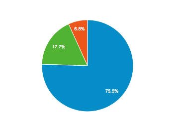
Last month around 20% (the green slice of pie) of my visitors visited on their mobiles, or one of those great big Samsung things.
While the old site looked okay on a mobile, there were a lot of things that were less than perfect. So what were my main reasons for wanting a responsive design?
- Pleasing the Google monster
Believe it or not, Google has actually stated that mobile-friendly websites will rank higher for people searching on mobile devices. This can potentially mean more traffic. - Simpler reading for my long stuff
A lot of my articles are really long. While it was possible to read them on the old site, this new design makes the content a main feature with a bigger font and nicer spacing. - Subscriber focus
My main reason for wanting a responsive blog was to make sure the subscriber options didn’t get lost. The old site was insanely hard to navigate if you wanted to opt-in correctly.
But just having a responsive design wasn’t enough. I really wanted to change the structure of the site so that I could control the user flow.
That’s why I decided to design it myself from scratch instead of using a free or paid WordPress theme that anyone can buy.
So let’s take a look at that thought process.
Thoughts and motivations behind the new design
As I started designing the new site I realized how many different elements needed to be addressed.
It’s funny, when you have a free theme you kind of ‘make do’ with what you’ve got. But when you design it yourself (or pay a designer) you start to get really pedantic about the whole thing wanting to make it strategically perfect.
That’s never going to happen.
There are always going to be things that I don’t like about this design, or any design that gets produced.
The main motivation really should be just this: I must use my best web knowledge to build something that converts.
So what were my goals?
- Make sure the old readers feel comfortable
Okay so this was the single most important guiding principle for me. I knew I needed some extra functional elements to modernize the site but I wanted to be certain that all of my old readers still felt at home. As I said up above, when a site you like gets a new design it can feel really weird. - Enhance areas that the old readers enjoy
Along that motivation, I wanted to make sure that the areas of the old site that we’re popular got enhanced. This mainly meant making the comments more of a feature with more space and attention given to your discussions and avatars. - A deliberate opt-in funnel
Email subscribers are the bread and butter of this site. I wanted to make sure the new site funnelled visitors to the right places so they could subscribe for the right reasons. I’ll be testing a few different versions of this over the next few weeks. - Strengthen the distinctive branding
The couch in the forest has always been a huge selling point. People mention it to me all the time. I wanted to make that more of a focus and to line it up with the “work from the couch” branding that I think appeals to people. I’ll be getting new photos soon (at the insistence of my fiancée) as I’m about 10 kilos lighter and three years older now! - Make consuming long content more enjoyable
The posts on this site are really long. If I am going to expect people to read to the end I should at least make it as clean and simple as possible on all devices.
Here’s a deeper look at some of the main changes and my thinking behind them.
A live experiment in WordPress theme design?
The more I thought about it, the more I realized that any new design would basically be a live experiment.
Would my rankings get affected?
Would email subscriber numbers increase?
Would affiliate sales decrease?
Will my old readers still enjoy hanging out here?
Ultimately I just had to take a punt that I had an alright understanding of best practices on the web and that the new design would be a step forward as opposed to a huge mistake. And I can always change the things that don’t work.
Keeping that experiment in mind, if there is anything on this site that you really love or really hate (or that just plain doesn’t work) please leave a comment and let me know.
I really don’t want a design that I’ve done to affect our wonderful community.
1. The new homepage layout
The main change to the site is the new homepage layout.
This was a really big deal for me as I really wanted to add a big photo header with an opt-in form (get ready for photos of my face looking at the button!) but I also felt hesitant taking all of the recent posts off the front page.
Previously I’d shown 10 posts on the homepage. That had caused an increase in page view when people had landed on the front page – presumably because they have more to scroll through and more to grab them.
But the lure of the big opt-in form seemed like a good enough risk. I’d heard from people that those header opt-in forms sometimes convert up to 15% of traffic.
That’s huge.
An online entreprenuer who has over 100,000 subscribers even told me on Skype that “… if you don’t have a homepage header opt-in form you’re an idiot!”
So let the experiment begin.
2. Triple header main menu
The triple header main menu (Start a New Blog, Read My Blog, Grow Your Blog) is an idea my fiancee and I had when we were in Barcelona last year.
I was really looking for a way to divide up the site into areas that funnel new readers to areas that promote the best content without confusing and overwhelming them.
The page called Start a New Blog is something I’ve been wanting to do for a while. I get a lot of emails from people asking about how to set up a new blog and now I can refer them to a clean page that lays out the main things that they’ll need.
I could have just used a regular post like I do now but my hope is that this design with the arrows and video is a bit less intimidating.
Read My Blog is obviously now the place where the “traditional” blog of mine sits.
The page called Grow Your Blog is something that will be evolving into a bit of a new idea in the near future that will hopefully excite a few people.
All up, we wanted the three sections to immediately show/cover beginner, intermediate and advanced topics so that no visitor type would be left out.
3. More white space
White space might not seem that important but it is something that I really wanted to use a lot of. In fact, the initial design we tested had no “container” meaning that the content area had absolutely no boundaries. It all just floated on the screen.
We added back the container to give the biggest screens a bit more definition but I have still kept it as minimal as possible.
There are a few reasons for this:
- Content focus
White space can really only be achieved when you remove a lot of clutter. I want to keep the focus of this site on its strong point: the content. You’ll see I’ve even removed sidebars on the inner landing pages. - Flow
I really love the idea of flow. I want a new visitor to hit my site via Google or a referral and know exactly where to go and not be interrupted (unless I want them to be). - Simplicity
Sometimes the information I offer on Blog Tyrant can be a bit overwhelming, especially for new bloggers. The white space was intended to make the experience of digesting that information much cleaner.
As I’ve mentioned above, a lot of this stuff is just conjecture and I’m really conducting a live test. But that’s okay, that seems to be the business I’m in.
4. Bigger comments and avatars
The comments section is, to me, the best part about Blog Tyrant. I love the discussions that we have in there and I really wanted to find ways to enhance that community.
- Bigger pictures
I wanted to make the photos slightly larger than normal so as to make the faces of each commenter more prominent. I had hoped this would help us recognize each other more and/or give your brand more exposure. - More space
Again, the comments mimic the main body text and have a lot more space. In a way, I didn’t want to distinguish them from the articles that I write. - More features
In the future I’m going to be adding a few features. For example, I’ve thought about having a “Editor’s Choice” feature where I can highlight your comment and give it a badge of honor if it is particularly helpful or insightful.
If you have any other ideas about how to improve the comments section I’d really love to hear it. Let me know down below.
5. Better opt-in form and landing page control
One of the main things I’ve touched on is the fact that I wanted to make sure the funnel was really tight.
This means that (for the next little while at least) I’m going to be testing a method whereby visitors click the LEARN MORE button in order to find the opt-in form. That will give me more of an opportunity to pre-sell the benefits of the mailing list and hopefully increase engagement.
There’s now an opt-in form in the footer as well with some strategically placed social proof above it to see if I can make use of the people who scroll to the bottom of articles and then want something else to do.
Mobile responsive means more room for mistakes
The thing about responsive WordPress themes is that there is a lot more room for things to go wrong.
The reason for this is because there are so many different shapes and sizes that your design must now cater towards. Blog Tyrant now looks different on a smartphone, tablet, laptop and large-screen desktop.
That’s quite a challenge.
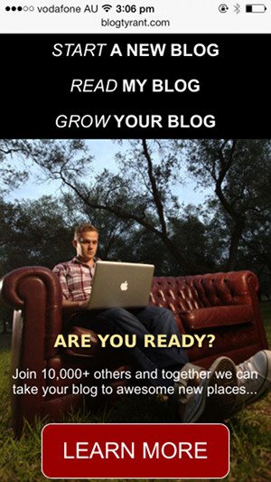
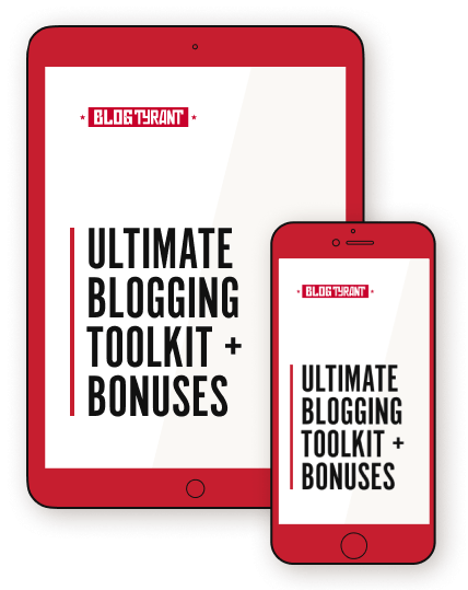
The above screenshot is how the site “stacks” for mobile phones. It requires a different photo and a collapsable menu so that each item is large enough for a finger press. This is all different again when you do the iPad version.
I absolutely haven’t gotten all of it right just yet, I think it will take a while. But my main strategy has been to study the blogs and websites that do responsive design really well (think Brian Gardner, Chase Reeves, etc.) as well as the sites like Smashing Magazine that produce a lot of quality information on best and worst practices.
You can’t please everyone…
The other big thing that I had to keep reminding myself was that it will be impossible to please everyone.
For example, I sent the design demo in advance to a few long-time readers of this site, as well as to a few internet marketing buddies of mine. Almost all of them came back with different positive and negative feedback.
In the end I took on board as much as I could without compromising my goals and then decided to leave the rest up to fate (A/B testing).
Working with a developer I can trust
I can’t finish this post without talking about why it is vital to work with a developer who is an absolute expert in their field.
I’ve been working with Viktor from CrazyXHTML for many years on side projects, charity jobs and some other client work. In every single job he and his team have delivered the work ahead of schedule and on budget.
In fact, there have been many situations where Viktor has done things with WordPress that I had no idea were even possible. As a result I think I’ve recommended him to at least a dozen people over the years, all of whom have raved about his service.
Blog Tyrant is my baby.
I really wanted to make sure I could trust the developer to have my logins and to keep that information safe. And I really wanted to make sure I had access to someone who would make changes quickly and without fuss if I needed them.
Viktor has always been that guy.
Can you help? (and some giveaways)
At this point I really would love two things: feedback and a share or two.
I’m really excited about the new design and would love to get the word out there so I can collect as much data as possible in a short amount of time about how people interact with the site.
Please share a post or page that you like (any one will do) on Twitter, Facebook or Google+ and I’ll pick two people at random and send you $100 via Paypal just to say thanks.
Most importantly, I’d really love to hear what you like or don’t like about the new design. Start with the glaring “I’ll never use this site again because…” issues and then work towards the more gentle stuff.
Promise I won’t cry.
I am like most people and don’t like change, but I have to say, after reading your article and sharing it on my FB page, I understand the need for the change. I applaud you, for as a blogger I know how much work is involved. Good luck!
Thanks Denise.
I’m a bit the same. But it had to happen.
Thanks for stopping by and sharing!
Well said Denise!
Congrats Ramsay! The new design looks crisp and fresh–beautifully done 🙂 When I started my blog I had no idea what a responsive theme was, but I picked one anyway on the advice of a friend. I’m SO GLAD I did! Your new responsive design is simplified and easy to follow–here’s to another 10,000 members.
Thanks so much Stephanie! Glad you like it.
Ahhh mate – it’s bloody brilliant.
It’s also weird synchronicity as I’ve been redesigning my site [as you know] and I’ve been aiming for a cleaner look as well.
Next step for me is to get a techie to build in an opt in form in the banner.
LOVE the design and the content is always top class.
Just G+ and Tweeted to my world about the changes.
Well done and I know how much time, energy and passion goes into changing the look of our ‘babies’.
Hope you rewarded yourself for all the effort.
Cheers
Liz
Legend! Thank you.
Hi Ramsey,
“Goodbye old friend.”
I got really nervous when i saw that subject. I thought you were shuttin’ down the blog ;( oy-vey!
Great to see you’re back with a new design!
keep up the good work helpn’ us folks.
😉
Oh I hadn’t thought about that! Far out. Ha ha.
That was my first reaction too! Good headline hook hahaha.. 😉
i have learnt a lot from Ramsay Taplin .I will post my success soon. am already on the move to start my blog.i have the products alredy, Ramseys advice really turned me on.thanks.nice design
Hey Ramsey,
For the most part I really like the new design. The homepage is kick-ass. Nicely done.
The only feedback I would add is that I’d like to see more in the your sidebar. There is almost too much white space. I personally prefer my reading to be hemmed in slightly. Although I am reading off my laptop not my phone.
Otherwise it’s rad!
Hi Elizabeth.
Great feedback. I’m actually thinking about adding a scrolling element that follows you down the page kind of like Pat Flynn has.
The landing (home) page looks great!
Thanks Elena!
Thanks Pamela!
Great design!
What I like most is that I can still recognize the blog in Memory of the old design. Well done!
That is such great feedback! Thanks Phil.
Ramsay,
I feel like I have so much to say, but I’ll keep it short and simple. Brilliant! I have been wanting to make changes like this for the last year on my blog. I’m going to go over yours with a fine-toothed comb and make notes.
Ok, now for bugs. I tweeted using your buttons at the bottom and my tweet read “Simple Share Buttons via @blogtyrant” It didn’t share the title of your post. Google + worked and Facebook worked.
Things I love: the white space for sure! The header and the 3 categories at the top.
Suggestions: The two links at the bottom were nice, but maybe change the wording? “Read the rest”…of this article, maybe? I was a bit confused between “Read the rest” and “Read the rest of the blog”. Also, on the home page, maybe move the Classics under the Latest Blog post? I didn’t know the Latest Blog post was there until I scrolled down further.
Great job! I can wait to delve in more.
xoxo
Beth
Hi Beth. Viktor and I are trying to figure out that Simple Share Buttons thing right now! Thanks so much.
Ramsay, it’s late – for you. Go to sleep. In about 8 hours, wake up, have a nice breakfast, and then check out the comments. I’m sure mine will be lengthy.
SPOILER: I like it.
Chris the World Cup is on man! I haven’t slept in two weeks!
Looks great. I’ve been trying to redesign curt-rice.com for a couple of years, but it’s just been impossible to find a designer i feel comfortable with. either they aren’t experienced enough to know straightforward solutions for my needs, or they are so experienced that they have a queue of customers so long they never get to me, or else they’re in the happy middle ground, but have such different taste that we can’t get together. This probably sounds like I’m hard to please, but I don’t think that’s true. I’m clear on what I want, but I think that’s good, not demanding. Anyway, congrats to you on getting a new design up and running.
And, yes, I think ‘editor’s choice’ for good comments is a good idea. Also, how do you profile it on your blog when you’ve given talks or been in the media?
Yeah that is really hard. It takes so long to find the right person.
I have a few logos down the bottom of the site for the features.
Sometimes we have to be dragged kicking and screaming into the future but it’s worth it when you do it right and it works. Thanks for the great read!
Love it! Thanks Phillip.
I’m your long time reader. I guess you like compliments but what actually you want are genuine opinions (criticisms) on the new design.
However, I may make you disappointed.
I feel your new design is better than your previous one many many times!
Especially the white space. Make your content easier to be digested. I have to say that, compare to the old one, your old design is messy. Your new design is awesome.
You can make a floating bar at your right column to show your best content or make your subscription form to float since your aim right now is to get more subscribers.
I liked your new design. And please add more content in the blog, I want more! (154 is not a lot anyway…but they are insightful.)
Thanks so much! That is really great feedback. A few compliments never hurt. 🙂
Thanks Ramsey, you always have valuable information. I like this format but have to say I’m a bit with Elizabeth on this one. I fell like I’m getting lost in a sea of white. Otherwise it is very fresh and clean.
Thank you Jill.
I love it. It’s modern, easy to navigate and fonts & whitespace make it pleasant to read. And all important parts are still recognizable.
Why did you go with separate subscribe page and not direct opt in form on blog posts? I suspect you could get less subscribers that way, but the ones that subscribe will be more valuable to you?
Is this the “sister blog” you were mentioning in here https://www.blogtyrant.com/blog-help-2014/ I thought it would be another site heh.
Hey Ramsey,
The new site looks terrific way to go. You know change is good so go out there and knock them out!!
Thanks for all the help too!
Coach Nye
Thanks Coach!
Looks good Ramsay but I think you need to redesign your sidebar opt-in form
What don’t you like about it Rahat?
So maybe I lurk a lot but always read your posts and share them.
The new design is stunning. My favorite part is the “Triple header main menu” with the succinct messages – start, read, grow. I just love that part.
😀 But three steps to reading this post? Yes, I’ll do that because there’s always something to take away from your post, BT. Great for reducing any bounce rate, eh? And I almost always end up reading at least one more post here. Mission accomplished, I guess.
Congratulations. Please do continue to rock.
P.S.: That photo of you chilling on the couch somehow always makes me smile.
Hi Vidya.
What do you mean by three steps? It should only be one click from anywhere really. Maybe two from a Page.
Click 1. Email link to home page
Click 2. Blog Home Page scroll down to post and “Read the rest”
You are right! 😀
Today’s email alert took me directly to the post.
I want to start by saying you did an amazing job!
I absolutely love the new design. And as someone who has been following Blogtyrant for a while, I don’t feel lost at all.
I love the homepage and how you show classic posts, it looks very cool. And although it’s not useful for me as a long-time reader, it’s awesome for new readers.
The big amount of white space is great too, it allows me to better focus on the content and not be distracted.
But, I feel the header could be better. The white space there seems useless, and some links you put there would be better in the footer IMO.
For example, do many people use the contact button? I could be wrong but I don’t think that many people use it.
Although after reading your blog for a few months already I guess you tested that and decided that this “contact” link belongs there.
I would also imagine something more graphic in the header. Maybe a bit less neutral. Something which would make a strong impression on first time readers and immediately give them an idea of what this blog is about.
I love the three main choices you offer “grow your blog”, “read my blog” etc. And I don’t know if this was in the old design or not. But the “read my blog” sounds too unclear to me.
I have been reading your blog for a while so I know it offers lot’s of a value, but otherwise my first reaction after reading “read my blog” would be “what for?”. It’s just too vague and doesn’t really communicate any benefit IMO.
Other than that, I love everything. And these are actually some minor “problems”.
Thanks so much man this is really good feedback. I wasn’t sure about the menu items myself. What would you like differently about the logo area?
I would imagine something more visual, and less empty space.
For example you could move the logo to the left, as well as the links and add a search form on the top right corner. It would be very useful.
Or you could use the top right corner to show some social proof. And write something like “10 000 tyrant troops already used my advice, why not you”. Or something like that. It could probably prevent a few people from leaving the blog too early.
Again these are only suggestions, I don’t know if these will work well.
Love the responsive design. Now I just need shorter posts. :p
NEVER! 😛
Hi Ramsay,
Congrats on the new design. I think the move to a responsive design is positive. I wouldn’t launch a new blog or blog design today without a responsive layout. A few things that I like about the new design:
– the consistent feel from the old design (logo, colors)
– the navigation.
I think the 3 main links (start, read, grow) will serve you and visitors well.
Thanks Marc. Really appreciate it.
I LOVE the new design!! Everything looks so savvy and professional. In the past, your good looks kept me coming back. NOW (sorry to break it to you) your SITE’S good looks will keep me coming back!
Way to be brave. It isn’t easy to reconfigure everything, even if it’s for the greater good. Your old site was familiar and, like, my buddy. But it still feels, underneath all the crispy clarity, that the original Blog Tyrant is hanging out, so it feels like a gain rather than a loss.
Congrats! You’re movin’ on up!
Ha ha. You always make me smile.
Congrats on the lovely new site design! I only have a few points of feedback and they’re more like nitpicking but I’ll toss them out anyway 🙂
1) Your social media chicklets in the sidebar are so grey they almost disappear. I would darken them a few shades just to make sure they attract the eye.
2) You’ve got 3 primary options in the sub-menu above:
Start a blog (solve a problem)
Read my blog (just for giggles?)
Grow your blog (solve a problem)
This might have greater synchronicity if all three options were targeting a specific purpose (currently just 2 do). Start, grow, monetize? Not sure what the third one should be but read my blog seems a bit vague compared to the other two.
But overall I think it looks great. Good luck!
Thanks so much Alexis. That’s very interesting.
This grabbed me. I shared it with my friends in the Copywriter Café on FB. I’m finally at the point where I’ll be setting up my own blog, too. Thanks.
Thanks George.
Lookin’ dashing m8
Did you design from scratch or tweak?
Hey Greg. All from scratch.
I have to say Ramsay that I have always held your blog up as being something to aspire to, maybe not in terms of the content per se, but the way you operate and manage it – I don’t want that to appear sycophantic, if you knew me you would understand I am not put together like that…but credit is due man. Your change over to this responsive design is good sense, and the white space and easy to read text are pleasing to the eye – my own blog/site/membership dedicated to the topic of WordPress and online business building was cluttered – and I remembered your approach and culled a lot of it -much better! Always a pleasure to read mate…keep up the great job.
Thanks so much Michael. That means a lot.
Also, your expression changes on the home couch as you pull the screen in.
HOW’D YOU DO THAT?!
Ha ha. Just set a different photo to appear when the screen gets to a certain size. More Viktor magic.
I like it. It is very similar to changes I am thinking about for my blog to better serve my business. Streaming visitors according to what they need. After all when you start to have a lot of content, letting visitors pick and choose is not a good idea.
Once again I bow in the shadow of your greatness.
Thanks Rachelle. Great to see you here again.
Ramsay, I’ve been moving in this direction too. Tell me about your choice to keep the sidebar… especially one that isn’t sticky given how long your posts typically are.
Hi Joe.
I think I’m going to add a floating opt-in form there at some stage. People seem to want some content container on the larger screens.
Thoughts, bugs, notes, etc.
Desktop display version:
1. Tighten up the header (logo, menu,blog menu) by slimming up the white space.
2. Front page header button for “learn more” points to URL “/v2/10000-others-top/” but then re-directs to “10000-others-top/” – Might want to fix the button link. I’m going through something similiar with a permalink change.
3. Front page: “That’s me up the top.” Should read, “That’s me up top.” (Unless it’s a regional slang phrase.)
4. Front page, after the latest article, it says “read the rest” and then a button that says “read the rest of the blog.” I was initially thinking you had two links to the blog post. Find a wording difference between the two.
5. Button at bottom of front page to “learn more” does point to the right URL.
6. Drop link to “Designed by Tyrant Themes.” You are only pointing to the home page and you don’t sell any themes. Don’t be like Michael Hyatt and talk about your upcoming theme which comes out after three years of “coming soon.”
7. The full blog page, with excerpts: I’d color the “read the rest…” text something else so people are drawn to it. As it is with black texts, it looks unfinished.
8. Theme / Feel. The logo is blocky. – block text, sharp edges. The “Who Is the Blog Tyrant” gray box is blocky. Your photo within it is a circle. The sign me up button has rounded corners. Same with footer “learn more” area. Comment avatars are square (blocky). Feels unfinished.
9. As a funny note, the “who is the blog tyrant” gray box on the sidebar with your photo as a circle reminds me of the pizza flyers left on house doorknobs.
10. Double “share icons” at the end of a blog post and then under “Learn more.”
11. Use button color and font consistency. It’s red for “learn more” but yellow in a different font (I think) for “Sign up now.” Same with the button on the “Updates” page.
12. In the main menu, you have the “Updates” link. This takes the user to a different page than the “learn more” page. Don’t know if that’s right or wrong. I wasn’t sure if “updates” was for news, latest blog posts, or getting updates.
iPhone 4s:
1. Add a small line between posts on the blog view page. This way, people see “Read the rest…” a line, and then the next title. Right now, it’s about an inch tall of white page. It feels like it’s missing something.
Invaluable. Thanks for taking the time to look through it all so thoroughly. I really appreciate it.
I remember looking at some of the fave cars I wanted to get someday, looking at the new design, and thinking, ‘I am not sure if I want this car anymore, now that its design has been altered.’
But then some time passes and slowly you find yourself falling in love with the new design – now that you have the reasons why the design had to change and your decisions aren’t rooted only on emotions.
So, not complaining.
Will you be adding related posts, as well, at the end of posts?
Hi Philos. Probably not because I want the emphasis to be on the opt-in form. But I might make the ones in the sidebar scroll along with the reader.
I absolutely LOVE the redesign! And I’m one that hates change. This is a huge improvement and I saw nothing wrong with the old design.
First, I love the couch photo and hope you keep it. A pic of you looking at the opt in button is supposed to draw readers to the button. But the pic of you on the couch depicts at a glance what the entire blog is about. Everybody wants that lifestyle. Keep it!
Curious as to why you went with black and white pics on the home page. I love b&w but not here.
I hope you don’t use a scrolling side bar like Pat Flynn. That is actually irritating to me, like some stalker following me when I’m trying to read.
Love the new comments format.
Also love the black bar at top with the 3 main topics. Genius.
I was also confused by the “Read the rest…” and the “Read the rest of this blog.” red button right under it. I clicked the button when I wanted to read the rest of that post which then meant I had to click the Read the rest again. Please consider changing the button to say something other than “Read”. Maybe “More Awesome Posts Here”. You’ll think of something catchier I’m sure!
Again amazing design!
Thanks so much for the kind words! I’m glad you like it.
The photos on the homepage go color when you put your mouse on them. Maybe it should be the other way around?
I love the new design! I haven’t checked your site in a LONG time, but I look forward to reading through all of the new (old) posts, haha! ^_^
Good to have you back!
I’m diggin’ the changes, man. I especially like what you did to the comments section. I think the bigger photo’s and text is going to do a lot to boost the community feel. I can see what people look like now, and that’s great. Without even realizing I was doing it, I clicked on a few peoples names because their faces made me want to see what their site was like.
To be real though (not that I wasn’t being real in that last paragraph, haha), I think that all of us really appreciate how real you are with us. Ramsay, regardless of your design we are going to keep coming back. So, feel free to keep testing, tweaking, and finding ways to get more subscribers, even if it means screwing up here or there. So rest easy, cause we’re not going anywhere. You’re content is too valuable for us to jump ship because we don’t like a text color, or because we think a picture is too fat, haha.
So, cheers to the new design my friend. Now go get them subscribers!
Hunter
That means so much to me. I really, really appreciate that. Thanks so much for writing it down Hunter.
I love what you gave done to your site and I have noticed that it seems blazing fast and very fluid…excellent indeed!
Thanks Arnold. Yeah, she seems to be loading in under 1.3 seconds which is nice.
As a copywriter, I guess I have to throw in my two cents about one important thing missing throughout your blog: strong wording, and calls to action.
What I mean is that you need to give very strong, specific reasons as to why readers should subscribe/read your blog/ or join the troops (separate sign up page).
For example “grow your blog” is a great name for the page, but the text there isn’t strong enough for why readers should sign up. It should start with the difficulties people have in growing their blog, detailing their frustrations, hangups, etc.
Then it should list the solutions they’ve tried, why they’ve failed, what solution you offer, and why yours is better. Then it should give social proof (10,000 subscribers!), and explain why you’re especially qualified to help them. Finally, your button text should never say anything as vague as “sign up.” Use something like “start growing your blog” or “start” or “get ready to rock your blog” or whatever.
It really is a landing page, and though it doesn’t need to look fancy, should be written as a sales page (because you’re trying to convince people to do something, even if it doesn’t cost them any money).
Also, you can cut the text in the sign up box to just say “email.” Less words, better conversion.
As for your feature box, it looks great! Very eye-catching. I would, however, change the text, make it stronger, make it clearer about why people should join your team. “Awesome new places” sounds catchy, but it’s not quite specific enough (love the social proof though-that’s pretty convincing).
Actually, I just checked out your “learn more” page. It’s on the right track – though I think here you again need to be more specific as I said earlier.
I think I would make your “grow my blog” similar, but I would make it a resource page for people to check out the posts which will help them grow their blog. You could list the first 10 posts they should start off with, or you could have them sign up for an email course based on those 10 posts, so you could drip-feed them info. Or, you could do things Copyblogger style, and create an ebook out of your best 20-30 posts for those interested in growing their blog.
Anyway, that’s a lot for now. Hope that helps! Feel free to email me if you’d like some clarification. It’s been fun to see your blog grow – I’ve been with you for a few years, and have enjoyed watching the Blog Tyrant community develop.
This is really excellent advice.
The grow your blog section will soon be something very different. Overnight it’s converted at 11% which isn’t too bad but could be better.
I do need to tighten up the calls to action. A few things are a bit off message. I’ve got a new free eBook coming out soon which is about a very specific strategy so I’ll try and bring it all together then.
Thanks again. Gave me lots to consider.
You got me with the title – I also thought you were pulling the plug on the blog :/
Ok I for one really like the new design, visually its much more crisp, it looks fresh and its easier to focus on reading.
I personally like the new menu systems and I love your “start a blog” section – very professional and great designs.
I read this originally on my mobile and I agree that it is much easier to browse and navigate.
The site defiantly feels like the Blog Tyrant I know and love but its just an updated better version – it reminds me of Copyblogger in some ways and thats a good thing.
I look forward to the grow your blog resources.
Paul
Hey Paul.
Yeah that email scared a few people – including a few personal friends who thought I didn’t want to see them anymore! Whoops.
Thanks so much for the feedback.
I checked it out on my iphone and here on the computer and will check out on ipad later. I must say I am very impressed with the changes. I am not one to like change too much unless of course it is good change. I like how the comment pictures are bigger. I like how I see a picture of you right away when I look at it on the cell. I did have difficulty in the past with your site when checking with my phone so I always opt to leave it until I got home to look on the computer.
I am a photographer so I gravitate to pictures so the addition of more pictures is fantastic! Well except for the one of your cat *wink*
So all the improvements are grand! But you can have a beautiful incredible site and have useless context. This is not you of course. I was happy to put up with the struggle on your site in the past because I loved, loved, loved your context! But now you have a great site and great context. The only thing I thought was it had a bit too much white space but that could also be the photographer in me and I love color. But the white space is very clean and lots of spaciousness to read easier so it isn’t a negative comment.
Thank you Ramsay! When will we meet the fiance? *hint hint*
Thanks so much!
The white space might be a little too much – especially if people are reading for a long time.
I’ll post a photo of her soon!
One more; on my iPhone the logo is the normal web logo and so it’s a little blurry. Upload one that’s 2x the size and then set width and height in CSS for high def devices and to use th 2x logo. 🙂
I’ll let Viktor know. Thanks again.
I’m expecting Google Analytics to follow your lead and appropriately add a new mobile device type to their list of measured phones and tablets: “one of those great big Samsung things.”
Congrats on launching the new blog design. I know you have been working on this for a while, making thoughtful and strategic decisions. It’s inspiring!
Ha ha. I’m surprised they haven’t already!
Thanks Scott. And thanks for doing the early testing.
‘Twas my honor. Great to see so many other testers here now, too!
Ramsay, It looks great on both my 27 inch monitor and my Nexus 7!
I really like your idea of using a visual flowchart to lead new people through setting up a blog. I will be stealing that idea for my lawn mower site!
Keep up the good work!
I’ll let you know how it performs first before you go and make any big changes! 🙂
Site looks great mate,
Really like the front page layout, definitely got the ‘current look’ and hope that it gets plenty of mentions as a result! You don’t lose too much in responsive mode either, which is always nice on a phone 🙂
Keep killing it!
Thanks Shaun. Hope you’re enjoying the storm!
Hello Ramsay,
I love your new website design.
When I go to click one of your pages above your blog subheadings located on your home page, I cannot seem to find a link to bring me back to your home page other then clicking on your header image.
Take care,
Erin 🙂
Thanks Erin. Good feedback!
Hi, Ramsey – i am taking off my marketing hat and putting on my reader’s hat! Won’t give you website-review-like comment but more how i felt as a long-time reader of yours 😉
I am one of those 17% in the green pie – I very rarely open your site on a computer and read it primarily on a tablet. I am also one of those people who don’t like change! So, you must have done a superb job with the redesign because I didn’t miss a thing and i didn’t get confused in any way while doing my ‘usual interaction’ with your blog…
Usually, I click the direct link to the new post in your email – that’s what I did and it all went smoothly.
But! (Yes, there is always a but…) – out or curiosity I went FIRST to the homepage and that is what got me a bit confused. (FIRST is key here because I browsed the site before I read the explanation of the redesign…)
First the top part with start a blog, read my blog and grow your blog wasn’t clear. After reading your explanation – I find it brilliant to streamline the visitors flow this way (I will do it myself, that’s how much I like the idea!). But it’s not executed well, I guess…
On mobile, at least – I didn’t even understand those are buttons and active links to pages… I saw it as a big black square with some words in it, and was wondering what could be your resoning to explain the benefits of your blog in such a way?! An easy fix might be just to make those ‘button-like’ – to be clear on mobile those are active links that lead somewhere for something…
And the other thing that confused me (a few people mentioned it as well before me) – the ‘read the rest’ and ‘read the rest of the blog’…
When I clicked read the rest of the blog button, I was redirected to the blog homepage… So I had to click once more to get to the blog post itself… (Maybe that is what somebody meant when she mentioned you need to click 3 times to get to it)
Now, it is true the button says ‘read the rest of the blog’ but you are expecting too much of the reader… We don’t put much thought in it – we click. When I see read the rest.. I just expect to read the rest of what I am reading (in this case – the blog post)
So definitely differentiate the wording (e.g. browse the blog) and add a text link after the blog post intro to link to the full post (e.g. read the full post). It will clear all the confusion instantly.
I saw in the comments a lot of people praise and hate the white space and something about the sidebar – I do NOT see any of it on mobile… I mean, the white space is fine, just the right amount; no annoying sidebar or anything…
Which reminds me – please don’t put that aweful stalker sidebar which follows you up and down the page… It’s super annoying, intrusive and quite possibly will ruin the experience with your neat site 😀
I tweeted the post – sharing widget worked fine.
Oh, and one more thing – the classics posts. I thought they are black-and white because they are “classics” – the lack of color didn’t bother me. But I saw in the comments someone told you about it and you said when you hover with your mouse, they become colorful.
Well, on mobile we don’t have a way to hover (I think) – they never become colorful. Thought you should know this effect is not active on mobile and you should decide whether black-and-white or color should be default. As I said, I liked it black-and-white because of the association with ‘classics’.
And I thought I’d be brief LOL
Speak soon and keep the posts coming!
Oh, oh, and just one more thing – after leaving the comment, I wanted to browse your recent posts – but there is no way to go back up to the main navigation or anywhere (except the classics). And with hundred comments – I have to do a lot of “scrolling” on mobile… So maybe a ‘go to top’ quick link after the comments would be nice 😀
This is all awesome feedback! The thought about the black buttons on mobile is interesting – I hadn’t thought about that. Thank you for the idea.
Love the new look! Now I have to go check it out on my phone and iPad. If this has made it better on those devices, I salute you! There are a few sites I’ve stopped even bothering to try read on my phone because it’s too hard and distracting. Also cannot emphasize how important all the white space is. We live in a world that is constantly blinking, flashing and interrupting us. I love that you made it pristine and clean. Then again I’d still visit your site even if it was a jungle of visual trip wires. You have built trust with your peeps that has naturally fostered loyalty.
So glad you stopped by TJ!
Site looks great. Like the big head/funnel, will have to try that on my site. One minor annoyance is having to click a link to read your first blog post. Seems your putting your users one step away from the content. I also wonder, and this could be totally off, is if you should change the photos for your “classic” content. They look so much like those “blog ads” you see at the bottom of many websites that it took me 3 looks to find them – I just naturally scrolled over. I’m also a big fan of the white space and like the start/read/grow dynamic as well.
Very interesting point. I think I’m going to have to get some heat map click tracking happening on those.
Looks awesome, Ramsay. So clean and simple. Love it.
Thanks man!
Always great content. I am searching for a similar blog page and have downloaded several themes but none as clean looking as yours with the functionality.
Thanks,
Will
Thanks Will.
Studiopress has some nice ones.
Very excited for you! I love the new look, thank you for sharing this!
UX hat on, a few things other people haven’t pointed out:
Your navigation doesn’t signal which part of the site you’re on. If you’re in the ‘read my blog’ section, the navigation for that bit should be yellow and the arrow as an active link. (WP is a pain for a lot of the nesting stuff, I know).
Hover underlines are hard to do well: the general rule seems to be have them on both normal and hover states or not at all (just change the colour). There’s loads of different ways to make it work with CSS and the like, Medium did an extensive investigation into how to make links look nicer, google it for their result.
Finally, maybe it’s just gone in, but the ‘start a wordpress blog’ sticky ad at the top of the page looked to me everything like an ad (clicking on it brought up a popup which my browser blocks by default), and I CAN’T GET RID OF IT. It’s not styled like the rest of the site either. To be honest, it puts me off reading. I guess you’re doing this for testing but at least make it sound as if it’s still your site. Urrgh, pet peeve.
Hi Vicky.
Thanks so much for the feedback. Very helpful.
The menu items do stay highlighted when you’re on that page. What browser are you using? Works for me in Chrome and FF and Safari.
The HelloBar is a bit annoying. They just convert so well! I’ve set it to open in the same window and not scroll anymore. See how that goes.
I always view your site on my desktop but I checked out your new theme on my iPhone and it looks really good. The one difference that stands out to me on the mobile version’s homepage is that you have to scroll down a bit to find the latest post. Not sure if that’s an issue for you but that’s just my observation.
Also, is there a way to link the “leave a comment” to the bottom of the page instead of having to scroll all the way down? Maybe it was like this on the old design but I really felt like it was an issue with this post because of all the comments. It’s not that I don’t mind scrolling through all the lovely people’s comments, I think it would just be good if it was easier to get to. 🙂
Other than that, very nice.
Hi Melissa.
The default WordPress option is for the comments text to take you to the top of the comments because people might want to read through them. Might be worth testing your idea though. Thank you.
Great job with the redesign… i find myself reading blogs more and more on my phone so the responsive design is a must… Google is starting to give responsive sites love too – good move all around!
Thanks Steve! Appreciate it.
Thanks so much for sharing this excellent info! I’m seeking forward to see much more posts! bedgfaecfgdc
Wonderful work! This is the kind of info that are meant to be shared across the internet. Disgrace on the search engines for not positioning this post higher! Come on over and consult with my website . Thank you caedaeafebea
[…] Goodbye Old Friend: Why I (Finally) Designed a Responsive Blog […]