Did you know that your blog has certain hot areas that get more attention than other places on your blog? Did you know that the way you use these hot areas can actually have a significant impact on how successful your blog and its content will be over time? Well now you do. In this article I am going to show you where these hot spots are and, more importantly, how to use them to your advantage.
What exactly is a hot area?
Before we jump into the potatoes of the post I want to talk a little bit about what exactly these hot areas or hot spots are. Basically we can say that they fall in to two categories or types:
- The eye catching areas
These are the parts of your blog or website that the eye naturally gravitates to. Web designers will tell you that you can manipulate where the eye goes using clever design and I agree. But that being said, there are several areas on a blog that people’s eyes are used to landing. These areas are important. - The high clicking areas
After the eye catching areas you have the high clicking areas. These are the parts of the blog or website that are more likely to get clicks by your users. Yep, you heard right. Not all parts of a website are equal when it comes to clicks.
If you can tap in to these hot spots and hot areas you will be surprised at how much more success you have with things like generating revenue, subscribers, interactions and so on.
The 3 hottest areas on your blog
So lets get into the juicy part. There are three super hot areas on your blog that you need to know and exploit to your advantage. As always, if you have any questions or objections I would love to hear them in the comments section.
1. The top left corner
The top left corner is traditionally thought of as one of the hottest parts on a website. Why? Because over the years web users have become accustomed to finding the important parts located in that general area – things like the about page, the logo and a description of some sort. Quite naturally you will find that your eye gravitates towards that section and as such it is one of the hottest areas on your blog. Your first blog post title is an extension of this hot spot as the first few words fall right in to the eye-catching area.
How to use it best
The drawback of this particular area is that it is normally already taken up with the stuff I just mentioned. But the one saving grace is that first headline. This is something that you need to think very carefully about: are you distracting users from the headline with a header graphic or some other piece of design? If so then get rid of it. Here on Blog Tyrant I make the headline crisp, loud and large so that there is not change that some other fluff will distract you from focusing on my best weapon – my writing. Clear out everything in your top left that isn’t to do with a logo or the first headline.
2. The right hand side, in line with your first title
I am actually expecting some debate over this one because a lot of people do not think that it is a very hot area. And in some respects they are right (more about that later) but for the most part I have found this to be a very profitable place on my blogs. On Blog Tyrant you can see that this is where I clearly place the most important thing on my site; the place where people can get a free eBook and give me their email addresses.
So why is this area so hot? Its actually not what you might think. The reason this area is so hot is because of your old mouse. Think back and remember what your mouse was like five years ago and the way you browsed web pages. What was missing back then? The scroll function! Back in those days we didn’t have the nifty little scroll thing on the mouse and as such we had to manually take the cursor over to the right hand side to make the window move. Because of that we are now in the habit of looking over to that area because that is where our cursor is most likely to be. Aside from that, this area is right in line with the title which is (as mentioned above) an extension of the hottest spot.
How to use it best
Now, remember I said that people were sort of right when they said that this area wasn’t that good? Well the reason for that is because it doesn’t work at all for ads like adsense or banners. Almost every blog you visit will have a 125×125 square advert around this area and for that reason people have become quite blind to them in that spot.
Content based items, however, work very well here because people are looking at your main headline and developing interest. If you give away a free eBook it should be advertised simply in this position at the very top of your right sidebar. I would go so far as to say that your email subscription box along with some well thought out copy should be the only other thing appearing in this area. If it doesn’t promote your content then don’t put it here.
3. The end of your articles
The end of your articles is the third hot spot on your blog and the reason is obvious: people are looking for something else to look at. If a reader has made it to the end of your blog posts then the chances are they want to interact in some other meaningful way. Even though this part of the site is below the fold I have found it to be an extremely powerful place to get attention to the right things.
How to use it best
Depending on whether you are running a blog or a website and what your goals are you will use this section differently. On Blog Tyrant I use the bottom of my posts to do two things; promote my free eBook by telling people that if they liked the article they will like the book, and by giving some other related posts to look at. On my product sites, however, I have a large square adsense advert there with the colors perfectly matched to the background of the website and the links in the post. They always get very good click rates if the content in the article is readable.
But what about all those social media icons? Shouldn’t they go there? Well, to be honest, I don’t really believe in them. I don’t think people use them. Social media sites are already easy enough to use and if someone is a regular on them I don’t think they need buttons to help them very much. I still keep them there of course, I just don’t make them too important.
A word of warning
Now for a word of warning. Everything that I have said thus far can be undone and untrue depending on a million other factors. For example, if you place blazing big Adsense ads in the top left corner you might find that people ignore the area pretty quickly. Or if you use a free theme that people have seen a thousand times before they might start navigating a little differently. Google publishes a well known heat map which shows you the hot areas on your site and, yes, they are different to mine because they are talking about Adsense units.
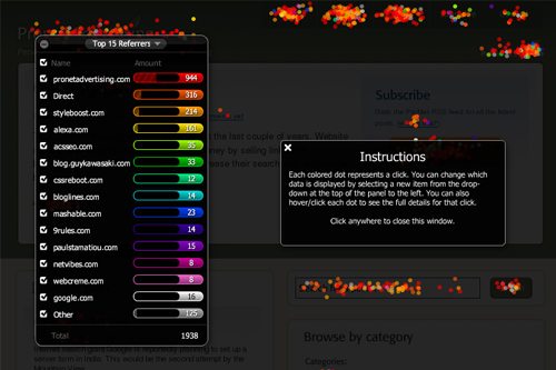
What you need to do is track and test for yourself. And the way to do that is with Crazy Egg. This is a very cool piece of software that allows you to see where people are spending time on your website. The image above shows their confetti feature which shows you all of the clicks that you have had on your website; each color representing something different. This is a wonderful way to take the guess work out of it all. As I mention in my new eBook, you need to start split testing this stuff and see which works better for you as an individual.
Conclusion
Hot areas on your blog are vital if you want to capture more email addresses, get more clicks on your ads or get your readers to delve deeper in to your blog. Make sure you pay attention to them and track and test different options instead of just guessing. If you have any experiences with changing the positioning of certain items on your site and getting a better/worse result I would love to hear about it. Please drop a comment and let me know.
Hmmm… I never thought about it this way.
I better go do some editing now 🙂
yeah, and thanks for the tips. You rock Blog Tyrant!
No worries Bilal. Hope your editing goes well.
Hi Tyrant,
I work in Asia and it’s interesting in that the heat maps are v different here.
Why?
Asians tend to read more text per page and/or scan vertically not horizontally like westerns.
Good to know if you plan to do biz in the east!
Ivan
That’s really interesting Ivan. Are their newspapers and whatnot still right to left?
@BlogTyrant – Very interesting article. I have been also experimenting with positioning of stuff on my blog and concur with majority of what you said.
Personally I have found bottom of the post area to be most productive for me. I had added email subscription box there a couple of months back and I have seen significant improvement in subscription. Additionally, I had spent some effort on creating floating buttons for content sharing – but to my disappointment I have not seen any significant benefit from them. I am not too sure about the benefit of right hand sidebar ( adjacent to post headline ) but I will not make a tall statement since I do not use adsense and never added anything specific there for readership.
Since you wrote this article – I am just curious to understand your perspective. On a scale of 1-10 how high would you rate the importance of hottest areas. I am asking this as my personal perspective on the same is as given below.
When I visit a website – I tend to give more attention to the core content and am very selective about subsribing/sharing the same. You gave example of ebook box – but from my experience I have seen that in the mad race to collect email addresses almost every blogger has started publishing an ebook and majority of times the content inside is not worth providing your email address. So unless the credibility of blogger is pre-established the hot area might not work for me.
Hi Shivam.
Excellent comment and tricky question.
I think I would have to rate the hot areas as a 8 or 9 importance. The reason for that is because if your content or headline doesn’t grab people right away you can lose them due to the hot spots being misused. Furthermore, you don’t want to miss losing a subscriber because you had the sign up area in a poorly converting area.
Tyrant
@BlogTyrant – May be I am missing something here. Here is my opinion. If I go to a blog and like the content immensely – I would like to subscribe to it immediately. Even if lets say I do not find the subscribe link readily( not in the so called hot areas ) – I might quickly scroll the page, find it and subscribe. I am assuming that the subscribe link is there on the page somewhere.
I am wondering — is it that the average visitor is so dumb that if he/she doesnt find the link in hot areas, wont even bother to scroll around for subscribing even if he/she has enjoyed the content? Are we looking just at the subscriber count or the real loyal subscriber?
Shivam I think you need to assume the average user is even less computer savvy than that. Typically I think that most people wouldn’t know you could subscribe to a blog by email. Unless you clearly display it at the right time and with the right copy and graphics you will lose them altogether.
Tyrant
[…] The 3 Hottest Areas on Your Blog and How to Use Them Best | Blog … […]
The left of pretty much anywhere on a site seems to be a solid place to be. I remember back when the 300×250 (I think those are the dimensions) Adsense ads were really big at the beginning of blog posts. Bloggers would align them left because to get to the text, the reader would naturally have to run their eyes over the advertisement. That would give them a chance to read the different ads and potentially click.
However, then what I see popping up is the use of a right sidebar where more ads go. I think the reason for this is because, fundamentally, ours eyes move from left to right. By ending at the right side, the last thing we see before we move to the next line of text is the ad so we are more likely to click.
I will agree with Shivam, though, about the e-book box. We are still at a time where people are flippant with their e-mails when it comes to a free e-book. However, I think the time will come where people no longer want a free e-book. They’ll have heard everything about “how to become rich” and now just want something that will make them rich. Maybe developing free PLR articles will be the next step? I don’t know.
Just found your site…Love it. Will totally be back.
Nice to meet you Jacob.
I thought the very same thing about eBooks 10 years ago. They are a totally worthless item in every respect except the content. So if you can write something very useful I think people will still download them – especially if the barrier is only an email as opposed to a fee.
Remember, the iPad and Kindle are making e-reading very cool at the moment.
Tyrant
This is a very true comment about the Kindle and iPad. I, personally, love to e-read. I think the problem I’ve found is that, within the Make Money Online or Make Money Blogging niches, the same information is regurgitated. It’s so reassuring when you find something fresh and I think that’s one of the reasons I already enjoy this site. Thanks for replying!
Thanks Jacob.
Appreciate it. Hopefully I can stay fresh for a while yet.
This was a very interesting article since I guess I haven’t paid too much attention to the placement of things. I would just look at other’s blogs and format mine in a similar fashion. But, I am convinced that I need to do my own analytics and tweak it to get the results I want. Thanks for sharing.
Let us know how your testing goes Freddy.
Hmm, more food for thought – I didn’t know about “hot” areas at all. And I have never even given a moments thought to the bottom of the page.
Once again, many thanks for sharing the info!
Hey Amanda.
Hope it helps. When I read your first sentence I thought it sounds like you didn’t want more food for thought! Ha ha.
Hey Tyrant,
Interesting article! Yeah I use the bottom of my posts for digg, delicious, etc, and reminding people to subscribe to my RSS Feed.
Hey Ryan.
Do you reckon anyone clicks on the social media links?
I need to add a subscription form to the bottom of my posts as well. I used to have the “Link Within” plugin enabled but frankly, I think the CTA to my newsletter would be best…
Hi Ricardo.
I had a look at your posts and there is a massive space dedicated to the Facebook button. Valuable real estate right there.
Go the subscription idea with some well layed out copy.
Tyrant
I’ll have to take a look at that crazy egg program you recommend. I’m not sure that I get that many views at the bottom of my page, but the top middle and top right seem to attract attention for me.
Let us know how it goes Richard.
Hey BT
Opened my blog and looked to see what Marc and I had done re: hotspots … spot on!
We took our social media links buttons off the blog a few weeks ago [partly because it was messing with the blog and partly because we don’t think our readers use them].
I might add a subscribe button there instead [we already have one at the top right hand of the blog page but it couldn’t hurt to have it as a reminder to people].
I agree about e books and believe that good content really is the key. I was going to sell our workbook on my personal blog a year or so ago and Marc suggested we give it away … hundreds of people have used it and loved it and that’s because it’s loaded with good content.
If I downloaded a crappy ebook [even if it was free] then I’d unsubscribe as the bloggers social proof and authority would have disappeared for me.
Off to look at crazy egg.
Hope your week is going well BT and you’re taking breaks from the computer.
best
Liz
I was beginning to wonder where your comment was Liz.
Your comment about free ebooks has me nervous. Have you had a look at mine and this is your way of breaking it gently?
😉
I just realised that I never downloaded your ebook for 2 reasons:
1. I liked your content straight from the start
and
2. I rss’d to my igoogle so I can see when you post straight away.
Off now to get ebook and will get back to you BT. And it’s a topic that would help me a lot.
I’m just back from working in Dublin so was a bit late commenting … although all you other commenters have left some thoughtful comments.
Nice community building here.
Thanks Liz.
The ebook download link is at the bottom of the email posts.
Tyrant
Thank you for this wonderful tips, This is my first time on your blog, I found this article is amazing, this is something I should discover since long time … oh god!
No worries Santel.
Hi Tyrant
I came here from Pro Blogger.
Interesting post about heat maps as niche blogging is something I am doing at the moment.
I will come back to this post and re read when my heads a bit clearer
Thanks for the tips.
Pete
No worries Peter. Look forward to seeing you around again.
Tyrant,
Awesome rundown of the hot spots. Some of this came as a welcome reminder, and some as brand new. I never honestly considered the top left as a hot spot because, as you said, it’s generally taken up automatically with logo, About page link, and the start of the headline. I’m wondering now… are you, or is anyone, aware of an example of a site that puts something else of value in the upper left, and how effective it’s been?
That’s a good question Justin. I’ll have a look around for that one.
I had never heard of Hot Spots per say, but I kind of figured some of the stuff out myself.
Thanks for clarifying it all- I will have to reassess my blog layouts 🙂
Good work Carolee!
G’Day BT,
Really interesting post. For years the web gurus have been telling us that what used to be called “reading gravity” didn’t matter any more.
What you say suggests it does. May I add That you shouldn’t clutter the top left corner. I saw a blog earlier this year that followed the top left corner hotspot idea.
Unfortunately,They’d used 5 different typefaces and 3 fonts plus four different types of “bullet points.”
Anyway, make sure you have fun,
Regards
Leon
Hi Leon.
Minimalism does work best. Its often the space that makes the content area important.
Thanks for stopping by.
Nice, another thought-provoking article from the Tyrant. Good to hear some advice about the layout of a blog that focuses on a select few points. Some of the advice I’ve read rotates around “Make it pretty!”, which is all well and good but not helpful when you don’t know what ‘pretty’ is.
Still, anything that makes me take a look at my work and re-assess it for the better can only be a good thing, so thanks 🙂
No worries Stuart. Hope it helps you out.
While we’re on this subject, I thought it might be interesting to share a free report I recently picked up from Michael Campbell, an IM expert for whom I have some respect, on his research into heat maps and ad placement. While not in any way exhaustive, it is interesting in that it provides some quantitative assessments of various options. Unfortunately, he didn’t cover the design I tend to use, but I still picked up some new information, and had some of my prejudices confirmed!
Here’s the direct download url, watch the break:
http://dynamicmedia.s3.amazonaws.com/pdf/Ultimate-Heatmap.pdf
Tony
Great share Tony. I’ll check it out tonight.
[…] Did you know that there are three areas on a blog where your eye naturally leads you? These are the key spots to place your most important copy, according to Blog Tyrant. The most interesting tidbit: place your “subscribe” or “Free Offer” information at the end of each post. People are always looking for something else to read/do when they get to the end of a post! The Three Hottest Ares of Your Blog and How to Use them Best. […]
Good article… and I’ve been thinking for a while that I need to update my header on my blog. Do you feel like it’s a detractor? Frankly, when I came to your site I took notice of how simple yours was.
Also, I finished your How To blog 2 part series and it was really good. You’re a really good writer! Thanks for sharing!
Hi Robin.
I think simple always works best. Keep the focus on your logo and your content.
Hope it helps.
Excellent post!
I have been planning on reconfiguring my site over the next couple of weeks so I will need to keep all this in mind. As it happens I hit a couple of these areas pretty well with important items now, but there is likely always room for improvement.
Thanks for the share.
Good luck Steve!
For me, I always look at the logo or tagline of the blog in the top left hand corner like you mentioned.
It’s always the first bit of the page that loads and so it gives readers a few second to decide whether or not this site is for them judging by the logo and the tagline – which shows them what the site is about and therefore if it should interest them in any way.
Forgot to add – for utilising the bottom of your post, the paid ‘Call To Action’ WordPress plugin is really useful but just a little line of text would do if you don’t want to buy the plugin.
What does the plugin do Jasmine?
It has leaves a box at the bottom of each post that has a specific call to action. You can customise the box to change it’s colour ad link colour etc. You can see it at the bottom of the posts on my site. 🙂
I haven’t heard about the Crazy Egg Software before, but will have a look at it. Will be interesting to do some testing of how the map changes when you change the layout of the page around …
Let us know how you go Renee.
Great article. I like to have my adsense in the sidebar though. Maybe it is because it seems most prominent, and it seems to work. But reading your article, it makes me wonder if it would work better else where. However, not sure where else to put it.
Also, What is your opinion on having more than on ad per page? Does it work, or should it only be one?
Hey Matt.
Two ads per page works great if you are building an Adsense site. If it’s a blog though you are losing valuable readers for just a few cents.
Perhaps you’d be better gathering email subs?
Tyrant.
Do you use a specific plugin to collect that info? or do you custom code?
Which info do you mean Matt?
wow thank you! Very informative article 🙂
No worries Sean.
[…] The 3 Hottest Areas on Your Blog and How to Use Them Best […]
[…] the signup area on your blog contains a good, clean, strong call to action. Put it in one of the blog hot areas. Make sure you use copy that gets people excited, and allows them to give you their email without […]
Thanks for replying Blog Tyrant.
With regard to your advice “keep focus on the logo and content,” how important is it to have a logo? I clearly don’t have one on my blog but would you advise that I do?
Thank you again.
Robin I think it is very important. But only if it is done right.