Blogging is a visual format. Images and photos play a huge part in how your readers perceive you and your brand.
The sad fact is that no matter how good your written content is, if you don’t display it well you will lose readers. And one of the best ways to ensure your content gets the attention it deserves is to use well selected and carefully chosen images and photos.
In this post I want to show you how bad image choices can threaten your blog’s success and a few ways you can do it better. I’ll even throw in a few examples from the big guys.
What makes for a bad image choice?
I should be clear right from the start that bad images choices don’t just mean out of focus photos or “loud” gif graphics that give everyone the heeby jeebies.
Bad images choices are actually a lot about strategy.
And that is why I used the Obama poster as the main image because it is an example of a brilliant strategy and one with some potential problems. So let’s talk about that for a bit.
The use of imagery in Obama’s campaign
Anyone who has studied English will know that imagery is more than just the photo you choose. Its the whole message that is portrayed. So when we look at Obama’s campaign material from 2008 we see that everything was carefully tied to the idea of hope and change. And they did it extremely well.
They used:
- Coloring – Colors like blue that are calming and royal.
- Leadership photos – Obama often has a far away stare and beaming smile in his photos that make him feel trustworthy, thoughtful and far sighted
- Fonts – Strong fonts that feel solid
Now, I’m not saying that it was the photos and images that won it for him but they did play a huge role in the Obama “brand”. And his genius team knew that early on.
One consideration to make at this point, however, is that Obama may forever be tagged with that “hopeful” brand that promised to bring about drastic change. From what I understand, many pundits blame his poor performance in the polls on the fact that perhaps people thought he could do more than was actually possible.
And so Obama’s campaign images are an example of both a fantastic marketing exercise but one that also might have a few problems. Either way, it was probably the most well carried out and influential marketing campaign in history. I certainly will never forget 2008, even though I am an Australian.
Images and imagery
This article is about the images that you choose but I really wanted you to understand (through the Obama example) that images are more than just decoration.
They can set the tone for your whole brand.
They can change the way people feel about what you do.
They can make you recognizable in a crowd of millions.
And, as the did for Obaama, they can radically differentiate you from the competition.
Bad image choices can have a massive impact on how people interact with your blog. I kid you not, there are blogs I will never visit simply because the choice of photos and images give the wrong impression.
5 Ways to do images better on your blog
Okay so now let’s take a look at some ways you can do all of this image stuff a lot better. Ideally, these changes should lead to better conversions, interaction and eventually profits.
1. Images should form part of your brand, not confuse it
I spend a lot of time choosing images for the articles I write. Usually I want the image to say something clever, perhaps even hidden, about the topic I am writing about.
Sure, not everyone gets this subtlety, but Scott always seems to pick it up when I do. And it makes for some wonderful commenting.
The idea here is that I want my chosen photos to be part of the Blog Tyrant brand. As soon as you see a post you should recognize that you are on my site because the style and layout of the photos is always the same.
To put it as simple as possible: branding is about communicating something to your customers. Its not your logo or your domain name, its what all of that stuff put together is communicating.
Example – Viper Chill
One of the best examples of this consistent branding through images comes from Viper Chill. Glen uses these little white men at the top of every post. Immediately you know where you are when you see them. A few other sites have started to copy him but most people know where they started.
The first person to do this really well in the blogging world (in my opinion) was Maki from Dosh Dosh. The site is now long gone but he used to use a Japanese anime character for each post. It was totally different and people loved it.
2. Images should enhance content, not distract from it
One of the biggest image mistakes I see on beginner blogs is people choosing huge portrait photos that totally distract from the content. They stick out too much and create a huge chunk of white space around them.
It looks ugly and it distracts from the meat and potatoes – your written words.
The images and photos that you choose on your blog should enhance your content, not distract from it.
Remember the old adage that a picture is worth a thousand words? Pretend that is true for a second and then go through your blog and imagine if your images were actually a thousand words of content. Are they up to scratch?
Each image should help your reader to understand something.
Example – Digital Photography School
The best example of this is over at DPS where Darren has a lot of tutorials. Each textual component is usually accompanied by a photo that illustrates the point being made. It makes for some wonderful, easy to read and nicely scannable content.
3. Images should encourage conversions
One of the most important places to think about your photos and images is when you are building a page or area that is aimed at selling a product or getting a sign up.
Photos on these types of pages need to convey certain emotions as soon as people see them. Things like:
- Fear – An image that creates fear might encourage them to interact with your solution
- Trust – A trustworthy image might be a head shot the face of someone in a testimonial
- Envy – Why do you think landing pages have photos of the things that money bought?
Pages that are used to convert people into subscribers or customers need to have extra attention paid to them.
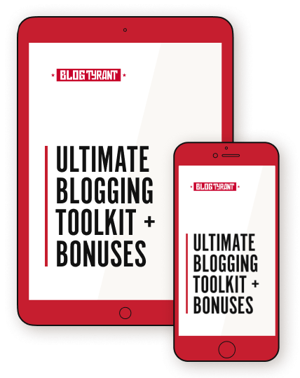
Example – Quicksprout’s new landing page
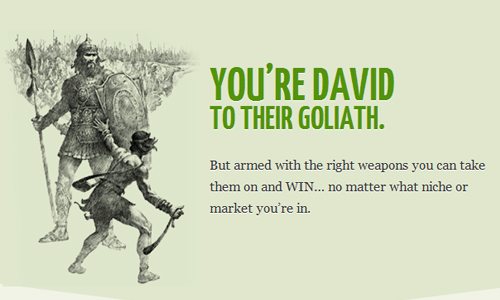
One of the coolest ways I’ve seen this done is on all round nice guy Neil Patel’s new landing page on Quicksprout.
You might have to get through an email subscription page to see it but it is a brilliant sales pitch for his new traffic product complete with amazing colors and graphics that really motivate you to feel energized about what he is selling.
My favorite image on the page is the one of me killing Goliath with my newly bought traffic product. Well, that’s what I felt like looking at it.
Example 2 – eCovers for your eBooks
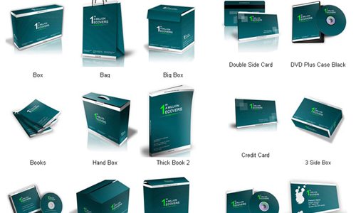
Another example of how images can encourage conversions is by taking a look at all the online marketers who add these eCovers to their landing pages to make it seem like you are buying something physical.
The reality is that you are buying a PDF or access to a forum but by adding these covers you can make it feel more tangible and more like it value for money.
Final advice and tips on photos
I thought I’d finish off this post with a list of advice and tips and resources that might help summarize the post and get you started on better blog images.
- Don’t skimp
Buy images for premium blogs. Dreamstime sells them for not a lot. - Use Photdropper
The Photodropper WordPress Plugin lets you add images from Flickr to your post and a credit at the same time. I use it. - Get Gimp
Gimp is a good free tool for editing photos. You need at least some basic photo editing tool to get by. - Size matters
Keep all of your images the same size (width and height) so people know what to expect. - Placement matters
When writing blog posts make sure you use images in the same spot every time so people recognize your style. - Create emotion
Don’t add images and photos for the sake of it. Create an emotion that will have a result on sales. - Use Stock Xchng
If you don’t want to spend any money you can try this site and selecting Royalty Free although the quality is not as good. - Base posts on images
Occasionally it can even be a good idea to write a post or two based on some super good images that you have. Its also a way to generate new ideas. - Tie them to your theme
If the color scheme of your photos is totally different to your WP theme you are in trouble. Make sure they match.
How are your images?
So how are your blog images going? Do they need work? The more I think about it the more I feel I could do better with my own selection of photos and graphics – especially in terms of keeping a minimal-feeling theme. Leave a comment and let me know if you’ve seen a blog do it particularly well.
Great post, might I also add PhotoDune to the list (new Envato marketplace) as a great spot to get images (on the cheap too).
I agree with Neil’s amazing landing page too, he really takes design serious with all of his businesses (KISS & CrazyEgg included).
Hey Greg.
Yeah, Neil is really good at what he does. Lots of fun to watch and learn from.
Thanks for the tip!
I’ve gotten some reasonable images from PhotoBucket, which has no copyright. I also have found some good images in Wikipedia (make sure an image is licensed for free sharing in the Wiki Commons. I also take my own. Make sure to set your camera for low res or the pixels will kill your load time.
I really enjoyed reading this post – you’re so on the money, BT. I also place great emphasis on carefully choosing my photos. I use a lot of my own and buy some from iStockphoto. You can pay-as-you-go which works well for me and it’s an easy-to-use and professional site.
The one thing I think you need to mention here is not to forget to properly credit images. Sometimes it can be incredibly hard to find the creator, especially if the photo has been Tumbled or pinned on Pinterest etc. This is still something I’m working on.
Oh, and where do you source most of your photos? I’m intrigued.
Hey Jane.
Thanks for the comment.
All of my in-post photos are from the Photodropper plugin mentioned above. Its great!
Squeee!!! A fun a topic.
I’ve just added a downloads section to whereapy because it can be tricky to find decent therapy photos and well it’s just a neglected area on therapist blogs.
Also, instead of gimp, you may want to try pixelmator – it’s a free month trial and then it’s only $30 USD and they keep current with updates/revisions – plus, I think they have a more intuitive interface.
Squeeee – my new favorite word!
Thanks Leigh. Awesome as usual.
I think I have got better at using images over time, most of my progress can be attributed to this site though! Big fan of Flickr, you just have to be creative with your search queries and try using the other categories like ‘interesting’ instead of just ‘relevant’ to find something that conveys the message you want and feels right too.
Thanks for stopping by bro. Am reading your post now!
Are you trying to tell me you don’t like the giant rat photo I have on my blog at the moment? Who thinks it’s a mistake?
http://www.landlordrescue.ca
LOL
I have some questions…
How do you get your photos the same size? I use photo dropper since I read about here. Still can’t get them all the same size although the quality is a lot better.
How do you keep the photocredits from being the first thing on your twitter feed?
I’ll have to look into those questions about PD because it all happens automatically for me. Might be a theme issue.
Thanks for the tips. I’m going to try Gimp. My blog relies a lot on photos and I really need to up the ante on how to present them in a more interesting way. Any more ideas?
Photoshop is really great but will set you back a few hundred.
I tried to visit your website but I think you might have entered the URL wrong?
I can testify to the power of photos. Before I set up my Marcus Goes Global travel blog (click on my name to see it), I wrote my travel stories as mass e-mails to friends. Pure text.
Later, when I switched to writing stories on a blog and including photos, the enthusiasm from my friends was overwhelming. At the start, I re-uploaded to my blog the same stories I had sent out before, except now they had photos. But for my friends, they felt like brand-new stories. They could finally see the places I had been describing.
One mistake I used to make was put my best photo for a story at the end of the post. Kind of a “save the best for last” as a way to reward readers to made it the end. I’ve since changed to putting the most interesting photo right up under the headline. A good example would be the picture of the ninja warrior I met in Japan.
As for choosing the wrong images, a blog I came across a little while ago springs to mind. It’s called “The Bad Blogger.” He writes about blogging and Internet marketing.
However, his photos of sexy women seem completely out of place. They’re wrong, and I don’t mean morally wrong. The images don’t fit with the content at all. If he was blogging about how to pick up girls or partying at clubs, that would be fine. Clicking on an article titled, “5 Common Punctuation Errors that Make You Look Dumb”–then seeing a lingerie-clad model–is jarring. Now that’s distracting. Ha ha!
I had a look at the Bad Blogger. Man that is just ridiculous.
I though Bad Blogger was cute and not so bad really. Clearly he knows who his niche is. There are a lot of bloggers who would really enjoy his site. Too funny.
Carrying ahead the Bad Blogger discussion, as Rachelle said he has great knowledge and in one way, his image selection has become a brand for others. This way or that way, he is going to be benefited from that
I guess it depends what you are willing to do in order to be famous.
Fair point. The Bad Blogger is like Maxim magazine meets Copyblogger. Man, I never thought I’d mention those two things in the same sentence. His site is definitely memorable, I’ll give him that.
Turning to best practices, Blog Tyrant mentioned Neil Patel’s new sales page at QuickSprout. You have to click past an e-mail opt-in page to get to it.
The page for the Quick Sprout Pro Traffic System is the best sales page I’ve ever seen. Everything about it screams quality. When I did some research, I discovered why. The people who built Neil’s sales page is the same team that created the launch site for Tim Ferriss’ “The 4-Hour Body.”
I run a local meetup group of online entrepreneurs, and I’ve thought of giving a presentation on sales pages, using Neil’s as a role model.
Look at how Neil claims authority right away in that headline: “When Amazon, Viacom And NBC Need More Traffic To Their Website, This Is Who They Call.” How many Internet marketing gurus can say that?
Then Neil immediately jumps into using scarcity, then builds trust with testimonials. Further down, he includes case studies. Even if you don’t buy his Quick Sprout system, it’s worth visiting his site just to learn how a master creates an effective sales page.
In contrast, do a search for “Traffic Voodoo.” It’s basically the same kind of information product as Neil’s, a system for getting traffic. For me though, everything about Traffic Voodoo feels off compared to Quick Sprout. The guy who created is supposed to be a successful online entrepreneur, so maybe I just don’t get it.
Apparently, what we might consider “ugly design” converts better for sales than beautiful design. Look up articles about Markus Frind’s dating site PlentyOfFish for a good example of this paradox. (Actually, it’s been re-designed to look better than before.)
Robert Scoble talked about this topic on his blog, calling it “anti-marketing design.” Personally, I think of eye-assaulting sites like Traffic Voodoo as “credibility-killing design.”
I love images and use them extensivly on my blog. 90% would be ours and occasionaly something I’ve seen that I love (and always credit). For me images are my starting point, if I don’t get that right I can’t move on with the post. Both my husband and I have backgrounds in photography so I couldn’t imagine my blog not having them.
One thing I find annoying is mega large images in posts, or multiple images of basically the same thing.
I think our images are a strong part of our brand, I’d love your thoughts if you have a moment to take a look.
ciao for now
Lisa
Lisa I’ve always thought you do your images well. Enough said.
P.S. If you need powerful but easy-to-use photo editing software, I’d strongly recommend Paint.NET (http://www.getpaint.net). It’s free, however it’s only available for Windows.
The program is community-driven, and I sometimes think of Paint.NET as the WordPress of graphics software. Volunteers have made oodles of plugins to extend its functionality. You’ll find them in the Plugins Forum of the home site. Good ones to start with are the Photoshop PSD file plugin and Boltbait’s Plugin Pack.
For my university’s web design program, I took classes in Photoshop. While Photoshop is certainly a must-have for designers, I think it’s overkill for what most bloggers need.
To learn how to use Paint.NET, head over to YouTube and look up tutorials. In particular, there’s one user named “kaunas163” who has created over a hundred video tutorials for Paint.NET. If I remember right, she once replied in a comment that she’s from Estonia. Her YouTube channel is my go-to resource for learning how to do things with this program.
Wow that looks really cool! Good suggestion.
Good stuff.
I’m not a fan of Gimp, but really love paint.net, which is also free.
And also give thumbs up to Stock Xchng for free royalty-free stock images.
Thanks Todd. Appreciate it.
Learning more and more each time I read a new post here is just one of the attractions of your blog. Another, obviously, is the engaging imagery you use and -for me – it’s become a point of interest.
It makes me “think” and it often inspires like-minded action on my own website or in my offline business practices; have you got any art hanging in your office that makes people “think” when they come through the door? And that allows you to influence certain opinions that they may have of you or your business or your skills? I do 🙂
Here’s a great, engaging example of a comment exchange between you an I on this very topic.
Now this is a great way to start the weekend, BT. Reading a post you wrote about your own strategy and thoughts behind image selection is great!
Thanks Scott. I have to confess I try a little bit harder knowing you’ve got your keen eye (and intellect) on it.
Hey Tyrant those are some great ideas there I have read in recent days. Pictures as you rightly pointed out have the potential make impression. Using it the right way can be more powerful than any use of words you can imagine because after all each image is worth thousands of words. But unfortunately many of us end up using images the wrong way.
Thanks Tyrant, you nailed it right at the right place.
Thanks Martin. Glad you liked it.
I’ve always found that if you want your blog images to generate their own traffic, you must use original photography rather than use stock photos. A really good photographer will adjust the photo metadata embedded in the image to match your article keyword phrase.
Search engine algorithms reduce quality scores for sites that use unoriginal content and will not index stock photos with search results. In a world where content is king, the crown is worn by those that are unique and original.
Yeah that is really true. I once had about 3,000 searches a week coming from one photo alone. Good point. Can’t believe I missed it.
I always thought I was spending way too much time choosing photos and/or editing them with Gimp. Nice to know all that time is not wasted time and really is important.
I have absolutely zero graphic design knowledge but I taught myself how to use Gimp and I love it! If you are a bootstrapper, then Gimp it a must, IMHO.