
Your blog’s homepage is actually not the first place that most visitors land. Generally speaking they’ll hit an individual post and then navigate back to the front. When they do that you have a unique opportunity to convert them to a subscriber or a customer.
Blogs and websites are getting more and more beautiful.
Traffic analytics and split testing tools are making it easier and easier to see what works.
So, what are the web’s best blogs doing on their homepages? What design, marketing and functionality elements are working best to convert new visitors into email subscribers or long term readers?
Let’s take a look.
Does a beautiful homepage mean it’ll work well?
Something that I have always found interesting (and a bit annoying!) is that an ugly website often converts extremely well while the more beautiful designs falter.
Of course, this is not a rule, but it does seem to happen occasionally and can provide some interesting insights.
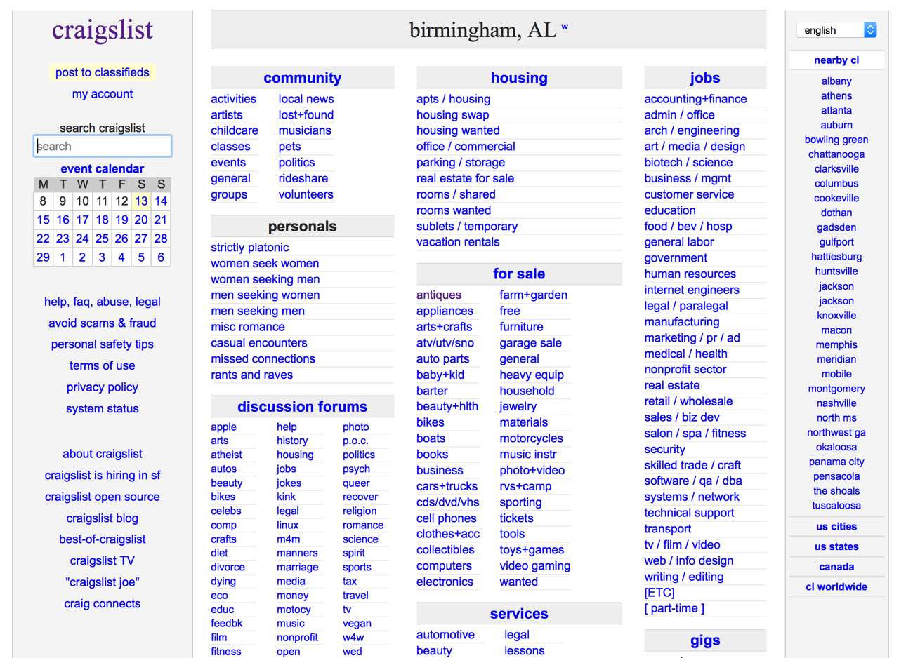
One example that I always think about is Craigslist. As you can see, it’s a bunch of blue links arranged in a way that looks like it is right out of 1999. But it works and, as we all know, Craigslist is one of the most successful websites on the net.
This balance between ugly and beautiful design is something I’ll be touching on a bit more below when we get to a contribution from ViperChill who noticed the same thing with his own experiments. But something to remember throughout this post is that you don’t necessarily have to have the most stunning, modern homepage in the world in order to make it successful.
The beautiful homepages we’re studying today
Now let’s dive in and take a look at some homepages from around the web.
I’m picking just a handful of homepages that I know convert extremely well in order to extract the lessons that we can apply to our own blogs.
Please note that I won’t be including the actual numbers in this article out of respect for the people who have contributed. Everyone has shared numbers with me, but I didn’t really want it to become a comparison competition as that would take away from the message.
1. NeilPatel.com
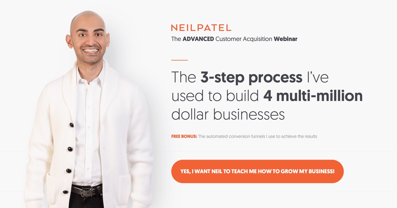
Neil is constantly changing his blogs and websites in order to improve conversions or make different offerings available to readers. This current version is one of the highest converting blog homepages that I’ve ever seen – especially for an opt-in field that requires a phone number.
2. ChrisDucker.com
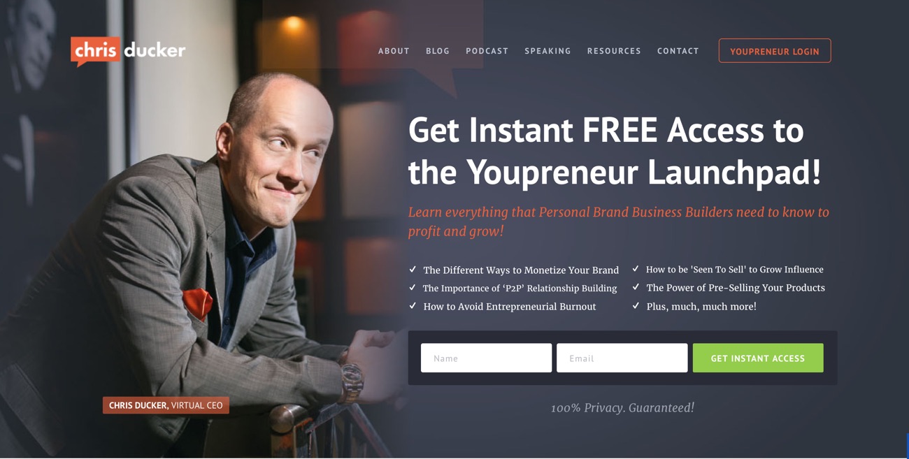
Chris recently switched platforms and with it came a brilliant new design. This homepage is converting extremely well, and a lot of it comes down to the strategic photo where we see Chris looking (literally) over towards his email opt-in form. We’ll talk more about this later.
3. MarketingInc.com

This is a side project by Glen and Diggy (best known for ViperChill) and is a good example of a conversion rate that was negatively impacted by making it more “beautiful”. Glen told me via email that the page converts at a whopping 45% – 64% depending on how it’s arranged. He’s noticed that the page converts much higher if it’s just a white background with no scroll and a single opt-in form – the kind we see on so many affiliate products.
4. Bodybuilding.com
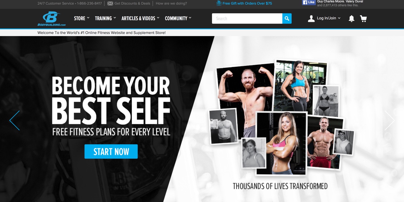
I remember visiting this website when I was obsessed with weight lifting back in the early 2000’s. That’s how well established it is. And their current homepage is optimized so tightly that it serves as a beautiful lesson for what can be done with social proof in particular.
5. WPMU DEV
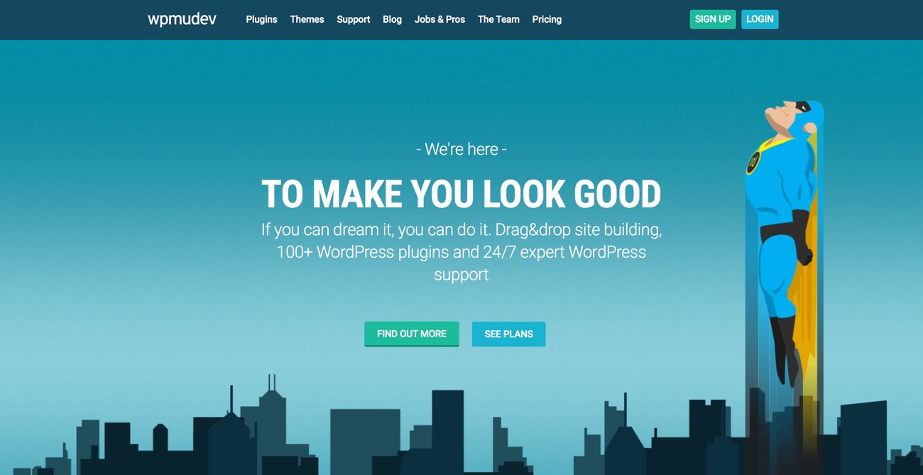
WPMU DEV is a website that develops their own WordPress plugins, themes, etc. and does it with one of the coolest brands you’ll ever see. The homepage is finely optimized for promoting these products and we’ll talk below about some things they do to ensure readers are delving deeper into their site.
6. AWeber
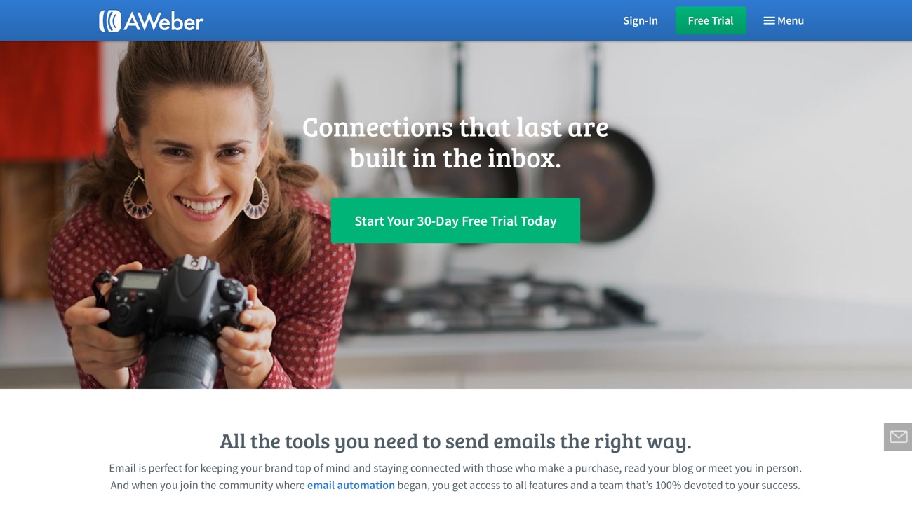
AWeber recently changed their design and with that saw massive increases in conversions. The numbers they shared with me via email are actually quite staggering, and it’s really impressive to see how they’ve managed to make a beautiful homepage design that actually works in terms of the numbers.
10 lessons we can learn from these homepages
Here’s a few takeaways from these beautiful homepages.
Remember, a lot of these features and functions can be achieved with the right WordPress plugin, or just a little bit of code from your designer. It’s amazing what can be achieved with WordPress and a few tweaks!
- Clear singular call to action
One of the most important takeaways for this whole post is the idea that you need a very clear call to action on your homepage. If you can make this a singular call to action it’s even better. The idea here is that a visitor arrives on your homepage and very clearly knows what she or he is supposed to do. Don’t confuse them with multiple offerings. The Marketing Inc and AWeber landing pages are a perfect example of expecting a single action from visitors. - Photos (eye contact)
Good photos are extremely important for the homepage. My own “couch” photo has been pivotal in setting this blog a part from others in the niche, and almost all of the blogs mentioned today use extremely clever photos to engage readers. Chris Ducker, in particular, is winning here because his eyes are looking toward the area where he wants to engage people. This has been shown to increase conversions in many instances. - Mobile responsive differentiation
It’s a shame that we have to still be mentioning it but having a mobile responsive homepage/theme is vital in 2016. We have almost as many people looking at blogs on mobile devices as we do on desktops and as such you need to make sure they aren’t bouncing away because the text is too small. We can’t just leave it there, however. A clever mobile responsive homepage will often be different to the desktop version as we recognize that people do different things on different devices. For example, I don’t promote BlueHost much on mobile because you can’t sign up for an account and complete the process very easily without a computer. Compare the above websites on mobile and desktop and you’ll see some interesting choices they make about what to leave out. - Well planned branding
One of the things you’ll notice about all of these homepages is that the branding is extremely tight. The colors, fonts, styling and images are all consistent and all in line with the goals and target market of the blog itself. This can be quite tricky to achieve but is very important as it creates a new sense of professionalism for the website which can lead to more conversions. Trust is extremely important when you are asking a reader to put in their email address, phone number or credit card. At a minimum we should test our homepages to make sure there isn’t any broken aspects. - Benefits (not just features)
There is a classic saying in marketing that you should focus on the benefits and not the features. This means you don’t need to list off all the items that people receive, rather you should focus on telling them how they will feel or what they will achieve at the end of it. Notice how Bodybuilding.com talks about “transforming your life” instead of the type of exercise plan you’ll get. This is powerful language. - Quality enticements
Almost all good homepages offer some kind of enticement to visitors to encourage them to sign up or go deeper. Chris Ducker does this extremely well by dot pointing all the different achievements that you’ll unlock by signing up to his list. It’s very difficult to ignore when it’s so clear an prominent. - Time sensitivity
Take a look at the Marketing Inc website and you’ll actually see a clock counting down the seconds until the next webinar opens. This is a tried and tested marketing technique that creates a small amount of anxiety in your readers – they know time is running out and they take action. If you can include a truthful and useful piece of time sensitivity in your offer you’ll often see a big boost in sign ups. - Scarcity
Neil Patel has a very limited number of places for his live webinar offer. Much like time sensitivity, scarcity encourages people to take action for fear of missing out on something valuable. This type of thing is literally hardwired into our brains from the days when food and shelter was scarce – if we feel like we’re going to miss out the brain sends signals telling us to act quickly. - Social proof
The fitness industry has been using social proof for decades in the form of the “before and after” photo. It’s simple and effective. Bodybuilding.com has based almost the entire space above the fold on this concept and you feel instantly interesting in clicking the button to get started and transform your body like the people on the right. Remember, these numbers have to be truthful and in many countries it’s actually illegal (not to mention unethical) to fake them. If you don’t have a large number of sign ups on your blog, consider getting some testimonials from readers or other bloggers and adding them to relevant places around your blog. - Endorsements
Something that I borrowed from Chris Ducker recently was the line of logos below my opt-in form that shows where my blog has been featured. These endorsements create a big sense of trust in new readers because they can see that other quality websites or publications have vouched for you. This helps to remove a sense of fear that people have, especially when giving out details like an email address. You have to remember that for a lot of people this is still a really big issue.
If you plan on applying any of these techniques to your own homepage I encourage you to test the changes you make to ensure that they are a positive impact. Remember, what works for one blog might have disastrous effects on another.
How do I build such a beautiful homepage?
If you’ve made it this far you might be feeling a little bit of “homepage envy” – that’s okay.
When you first start blogging (or have been blogging for a long time!) it can be easy to get stuck on one theme simply because it’s what you’re used to.
But there’s no point in that – the longer you stick to something outdated the longer you miss out on growing your mailing list, engaging readers and building a successful website.
You have three options:
- Redesign your homepage and get it coded up
If you are good at design you can design a new homepage and then hire an expert WordPress coder like these guys to code it up for you. I don’t recommend this option unless you are very sure you know what to include on the homepage in order to get the best results. - Hire a designer
There are literally thousands of web designers out there who specialize in WordPress and can create some pretty magical homepages. A full custom design might cost you several thousand dollars but getting a new homepage done up might just be a few hundred – especially if you can go to a cheaper coder for the technical side of it. - Buy a new theme
The last option is the simplest and the cheapest and, to be honest, will probably bring you the best results. There are some incredibly good WordPress themes out there now and a lot of theme devote a lot of time to getting the homepages as beautiful as possible because that seems to be what sells.
I want to finish off this article by giving you examples of two WordPress themes/WordPress frameworks that are both beautiful and easy to customize for your conversion needs. These are pretty safe options if you are looking to switch over.
StudioPress themes on the Genesis framework
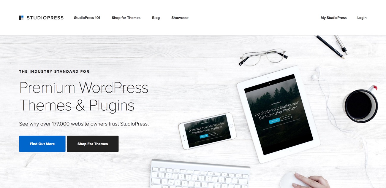
StudioPress and Genesis are two brilliant offerings brought to you by the fantastic but annoying jerks over at Copyblogger. In just a few short years these themes and the Genesis framework have become the go-to standard for WordPress – the quality is unbelievable and many of the themes are stunning to look at.
One of the thing I love about this stuff is that you know it is going to work because it is brought to you by guys and gals who really “get” internet marketing and how websites should work.
Getting used to the way they operate takes a little bit of time to master but it is well worth it in the end. I know at least one of the homepage examples in the six above uses this platform to great success. I highly recommend it and please note that this is not an affiliate link.
Avada themes from Theme Fusion
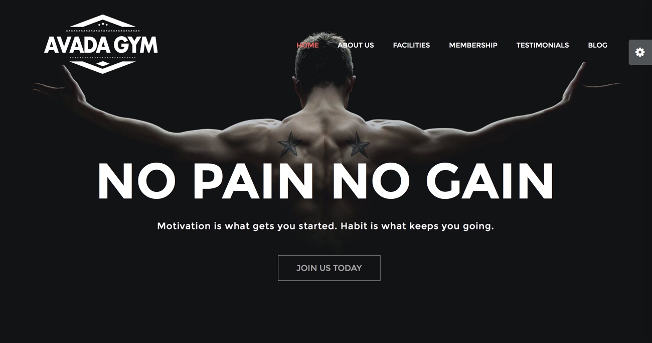
I have worked with Avada on a side project for a while now and the one thing it is absolutely fantastic for is the seemingly limitless customization options that you can choose from.
Again, it’s a little bit of a learning curve to get used to how they let you make changes within WordPress, but once you get used to it you’ll find it quite simple to navigate.
These are gorgeous themes and have a big emphasis on white space and big photos – which we know can be really important for conversions and building a comprehensive blog.
How is your homepage looking and converting?
I’d really love to know what you think about your blog’s homepage. Is it converting well? Are you happy with how it looks? Please leave a comment and let me know.
Next week I’ll be publishing a post that goes into some really huge detail about one website in particular that is absolutely killing it with their conversion strategy. Make sure you’ve subscribed to the mailing list so you don’t miss out.
A focus on utility versus aesthetics is something I’ve been experiencing more often. People do love the big hero images up top and, no doubt, designers can do some amazingly beautiful things with images and persuasive CTAs. But the question (or statement) I am getting is essentially: That looks pretty but how do I… (fill in the blank with the thing the person wants to accomplish).
Do users love big hero images? I’ve assumed based on their prevalence that that the data says yes – they’re great and effective. As a user I find them annoying. Thus my assumption is I’m an outlier?
Interesting perspective. Any examples?
Hello Ramsay, I was using the Avada theme to build my website http://www.pandapaperroll.com. Consider my website as a citation if you want 🙂
Looking good.
Frank, you font is too small when viewed on my Samsung phone.
I think my home page screams save me to any keen visitor that visits my site.I have been thinking of ways to revamp it and this is quite a timely post. Thank you for giving me ideas on what options I could choose from.Some had not even considered like changing the theme of my site.
Hope it helps!
Interesting perspective.
Hey Ramsay,
Great post. I actually wrote one on my blog about home pages a few weeks back, and used yours as an example.
My homepage is currently converting at 11.47%. It’s still the first version of the homepage that I designed a while back, so definitely needs and update. I’d like to double that conversion rate (at least) with a more compelling offer and not showing the blog until you click a “read the blog” link.
Simply haven’t found the time to change it up yet though. One of these days soon it will become a higher priority though!
Thanks for the good reminders!
11.47% is a pretty good conversion, isn’t it? Mine is 2% but while reading the post, I think I am one of those people who are comfortable (read: stuck) with the theme they have.
I personally don’t like “shiny” all-page type of homepages and thus, mine isn’t like that either… I did buy a premium Genesis theme and updated the homepage not long ago and when my boyfriend saw it, his first words were – “hm, did you at all change the theme or just update the homepage design?”
Great post, Ramsay – the list of things I need to do, which were inspired by your blog, is so big now… Thanks for challenging me 🙂
~Diana
11% is great!
All the websites listed here have beautiful hompages. I am a regular reader of NeilPatel.com and Bodybuilding.com. Apart from beautiful homepages, the sites also load very fast.
Yeah they are wonderful websites.
Wow!
I never saw things from that perspective.Do details really affect conversions this much?
Although I still don’t have any my blogs running currently (one is hibernating and the other one is yet building up) so I can’t say much about my experience with landing pages.
Yet, I’ll keep these things in mind while designing one.
Yeah they can have a huge effect. How have you been friend?
I’m alright.
I kind of messed up with migration so I had to temporarily stop my blog in order to fix it.
One thing that concerns me a lot is the way I have to spend time doing the stuff I don’t know about.
Much of the time is spent on learning the things with which I barely have any prior experience (sometimes it becomes a huge frustration). Still, trying to make the most out of whatever I can.
I really wish that all bloggers could focus on content more than anything.
You can. You just need to figure out some systems to make it work like that for you. It might mean simplifying your model or getting help from partners. It is possible. 🙂
Well I have been very happy but now you’ve challenged me, does it have a clear call to action, I thought so but..
btw just wanted to share how much I’ve been enjoying your writing style and advice for a while now, particularly smile to read a fellow Aussie’s site
Thanks, Erin. I’m glad you’re enjoying it.
Hello Ramsay,
Thanks for your beautiful posts. I’ve been following your site for a while now. Your site motivated me to set up two blog at http://www.ansacareers.com and http://www.eduansa.com cause i love writing.
but i have difficulty submitting my sitemaps to Google Webmaster as i always got an error respond, I don’t know if you can help me out.
Thanks
Are you using a plugin to generate the sitemaps?
I’m using SEO plugin by yoast. what do you suggest?
I sometimes struggle between making a really nice and beautiful and big logo- or hero-image for my homepage (http://perfectsimracer.com), and just being to the point like I am at the moment, currently using MTS’ SociallyViral, providing several “trigger” keywords above the fold.
While I really adore the aesthetic things in life (I am also a graphics programmer), I sometimes think that people landing on my homepage are annoyed by big images, and just want to see “How to become better” or about the best Xbox steering wheel ASAP, somewhat unconsciously sensible to trigger-words like “xbox” (e.g. http://perfectsimracer.com/best-xbox-one-steering-wheel-review/), “fanatec” and the like, which may be missed with an above-the-fold-image.
On the other hand, from the statistics I get, I see that the main-page is typically NOT the landing page, and seeing how the homepage still manages to get 30% of total views currently, and realising that this second sight is already a confirmation that they want to see more, I should perhaps try to make it cool and targetted, visually; we simulation racers love looking at race tracks, tires, cars and girls/dudes. Again, as this is the second sight already, I have probably filtered out the “one view and bounce in 3 seconds” kind of visitors anyways.
Having a fancy homepage sounds useful to enforce thrust and brand awareness, and to make the visit more of an experience that is to be repeated 🙂
This being my pet project, as I am a simracer and frequent user of my own blog, I should probably try this out for a while.
Sounds like you are well on your way to figuring out the best option!
Generally speaking and in specific niches this is spot on. If you are in the internet marketing space all of these points are important and all the testing shows these points are true to that space.
While humans are all the same in respect to what they respond to visually and through experience, websites need to address your avatar specifically. Most of my clients are in the real estate broker and agent space. Having an optin page with one call to action would chase a buyer looking for a home very fast. Yes, you need to have a call to action on every page but it has to be relative to what your ideal avatar is looking for. Just as the example shows for Craigslist. There is no one specific call to action on Craigslist but everyone who goes there knows they will be clicking on the links to get to what they are trying to find. A real estate website has to speak directly to an avatar who is either looking for a home or looking for an agent to list their home with. Most buyers are just looking for photos and descriptions of homes in the area they want to buy in. Expecting them to optin before getting what they want we have seen only makes them go to a competitor’s site who does not make them reveal themselves since they wish to do browse anonymously. It always go back to who your avatar is and what they will respond to.
Hi Katerina.
I get what you’re saying but would argue that, in those niches, the call to action would be based around those main actions, not necessarily getting an email address.
For example, a top “hero” photo on a real estate site might have just two options “Find your dream home” and “Let us help you” where the latter goes to paid services, quotes or whatever. I think the call to action can still be succinct and lead to better conversions than a Craigslist-style site where people are left to figure it out – unless, of course, that is what the site is.
Even then, though, there are a lot of benefits to getting people to join or sign up. RealEstate.com.au is one of the world’s most successful RE sites and if you join you can get suggestions, notifications, etc. based off past properties that you save, etc. The scope really widens.
Great comment. Appreciate the insights.
As with most tips and advice, all I have to do is rip it up and start over. In the world where people enjoy ripping sites up and rebuilding them that’s great, but I just like to write, maybe help out a bit, and get a little traction. What I hate the most is your advice is logical, sound, and probably what I need to do. Here’s to diving in the shallow end again.
You don’t have to do it all at once. Writing is always the most important thing – as long as your setup isn’t deterring otherwise loyal readers.
The five second rule, “You have five seconds to do three things: tell visitors they are in the right place, give them a good reason to stay, and make it abundantly clear what they should do next.” Five seconds, and it’s likely even less than this, isn’t much time. Three things is a lot of things to do. The examples you selected all follow the five second rule.
I thought the 5 second rule was about dropping food on the floor!?
That too 🙂
Thank you, Ramsay.
As always, I am taking away valuable information!
I like the look of your site. Your posts are more narrow than mine, and I like your call to action right under your pic and brief bio.
~Jennifer
P.S. I have been referring people to your site all week!
Thank you Jennifer. Referring people is a really wonderful thing for me to hear. Thank you.
Hey Ramsey. Thanks for sharing this!
Straight up, I love that you always deliver helpful intel instead of constantly selling like too many bloggers out there.
I hacked together my own homepage and it’s converting at 25%. I just need way more traffic! But I’ve still been playing with idea of changing it to try and get up to the 40% conversion rates.
What do you recommend? Should I wait and see how my current homepage converts after getting some serious traffic?
Dude, 25% is absolutely fantastic. I would be very happy with that if it maintains as traffic levels go up.
Hi Ramsy,
Homepage is really an important factor and something that promotes things well and get you the leads. I have never thought like that of homepage but indeed this was an eye-opener post. I think we need to change the theme to get this done.
Hope it helps!
Wow, and the expenses just came up. Well, I appreciate the info Mr. Ramsay, always eager to read your ideas. But I’m not sure new bloggers like me should rush into getting high priced homepages just yet. Although it’s important. Because most new bloggers don’t really know where they stand (niche) and blog blindly. Spending so much on a custom homepage so soon my lead to regrets later i.e when they finally understand what niche they feel more comfortable with and it doesn’t rhyme with the homepage.
Just my opinion.
Hi Ramsay,
Great post. Most of these I’m very familiar with, but I love your #8, scarcity. Similar to time sensitivity, I see scarcity being used more in courses and webinars. You are absolutely right, it does make people take action, including me!
Thanks,
Sue
Thanks Sue. Great to see you again.
Great post! I like using Instapages for my inner pages to get the traffic to focus on doing one action when I’m doing any advertising.
I’ll check it out!
Another thing that is look trustworthy and appropriate to the content of the blog. Now I’m setting up my new site Thegoodgears.com – the gears and gadgets reviews.
If anyone has interesting themes, please let me know.
Thanks,
G’day Ramsay great post mate!
Another great post from you, Ramsay. I have been following Neil Patel’s blog for a while. He is quite well versed with internet marketing and knows how to convert visitor to lead or subscriber.
What a top notch!!!
You always hold me speechless and spellbound..
I have been following your blog for a while and let me tell you that it’s worth praising and applauding…
This is the first time I am commenting, Ramsay sir…
There is one habit of yours that is remarkable :you always reply of each and every comment.. Which most of the people don’t do..
I have been reading and researching a lot about blogging since I wanna become that myself… And I feel extremely fortunate when I find a real gold in this arena.. (don’t get confuse..yes yes..your blog is one of them.. )
By the way, lately, you have been laying emphasis on having written 9000+ words… Well, I read all the articles from top to bottom (I have read this one too, word by word )..
Thank you! I’m glad you’re enjoying.
Your post is really good and your examples for landing pages are really good but we should think about seo also. Landing page should have relevant content too because Unique content is the preference from Panda and quality inbound links are necessary for Penguin updates which become part of Google core algorithm. I really appreciate if you will tell me how should we add content along with attractive images and message. Your response will be highly appreciated.
I’m not sure the homepage is that big a factor for SEO considerations. Most of the time your traffic will come directly from a post.
The best known to me is Neil Patel but i am also going to check others too.
I’ve been shopping around for my first paid theme ever, and I was going to go with StudioPress because everyone raves about them. I’ve run across a few of Avada’s themes and saved them as “maybes,” but I haven’t actually explored them in depth prior to reading your post. HOLY hanna! Their website is AMAZING! They answered questions I didn’t even realize I had. Just when I thought “perfect, this is exactly the kind of customization I’ve been looking for,” they would list seventeen more options. So impressed. I’ve completely changed my mind. I’m definitely going with Avada, now. Thanks for sharing these tips!
Been a few days, how did it go?
Hey Thanks! you’ve given me quite a bit to think about 🙂
Let me know how it goes.
It’s been quite a while since I started thinking to start blogging. I’ve heard stories of bloggers and I admire how they do it. Now, I want to be like them again.
It’s fun but also a lot of hard work.
This is good information, I think its about eye catchiness, how easy to place order, how easy navigation etc. All these factors make any page rich for conversions.
Thanks for sharing this information. I’ll use it for my site.
Hope it helps!
Hi Ramsay,
Thanks for these tips, I am working on my design at the moment and need to put a bit more effort on the homepage so these tips came just at the right time… Thanks!
Glad it was helpful!
[…] 10 Strategic Lessons from the Web’s Most Beautiful Homepages […]
Thanks Ramsay for this amazing post ! I Visited your blog for the first time Today and Now, I will be a regular reader of your blog 😉
Keep on Going!
[…] 10 Strategic Lessons from the Web’s Most Beautiful Homepages […]
I spent almost 2 hours just looking through 2 of the examples you listed, exploring the services or products they were promoting. Just goes to show how good their homepages are!
Btw, I discovered your blog a week ago, and I started blogging about 3 weeks ago. I’m really enjoying my experience so far. Just wanted to thank you for pushing out quality content that keeps me coming back.
Cheers,
Nic
Hi Ramsay, Thanks for this great post, and always read your post, kindly right one post about your daily activity, Like when you study, and when you right your post etc.
Very interesting, I was looking for information and examples on how to improve a home and this article, for me, is just perfect
[…] one way I get ideas about what I could improve is by looking at what the world’s top websites are doing and seeing if I can emulate some of their ideas or […]
Thanks ,for sharing useful information !
Good to hear you found it useful!